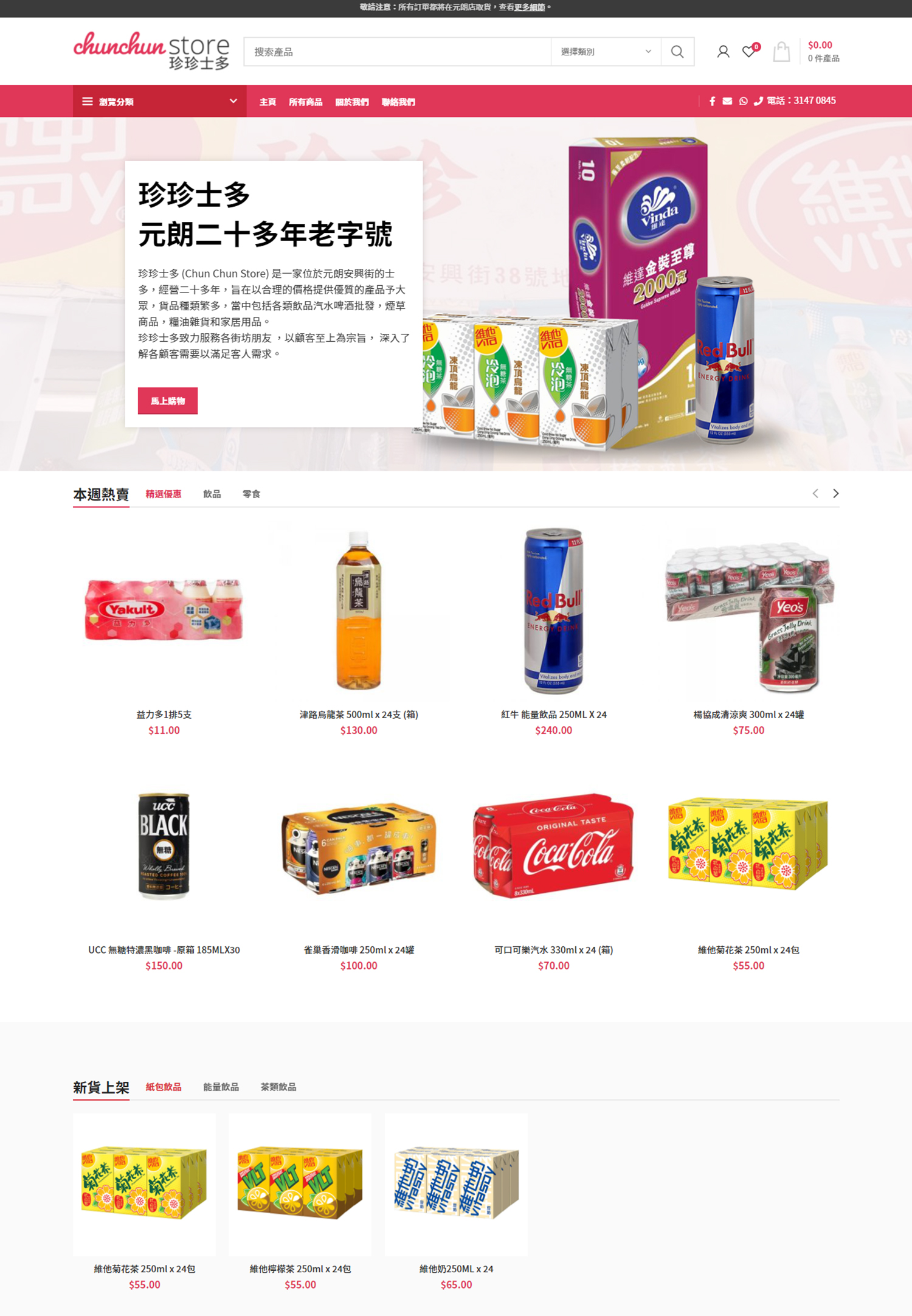
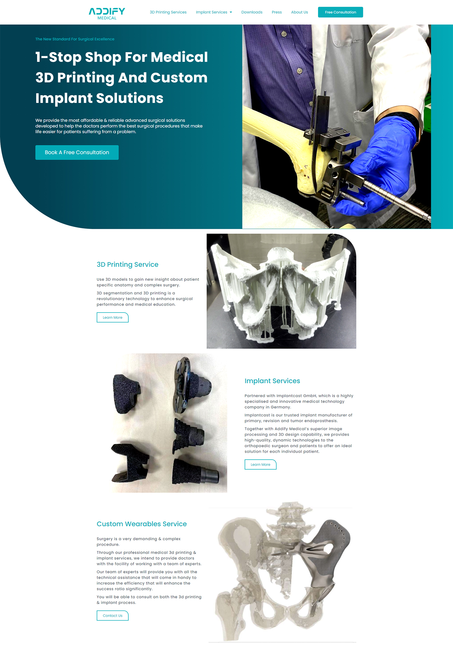
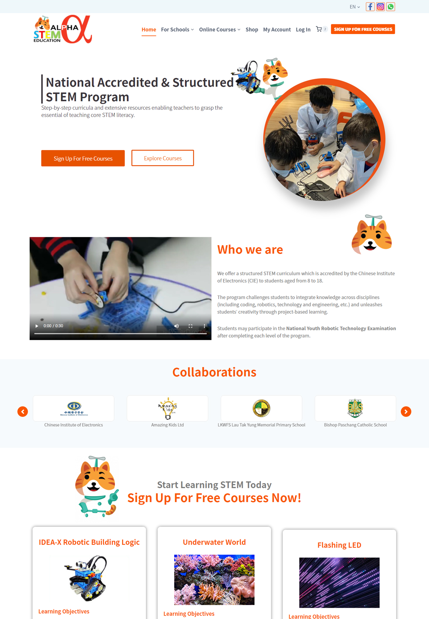
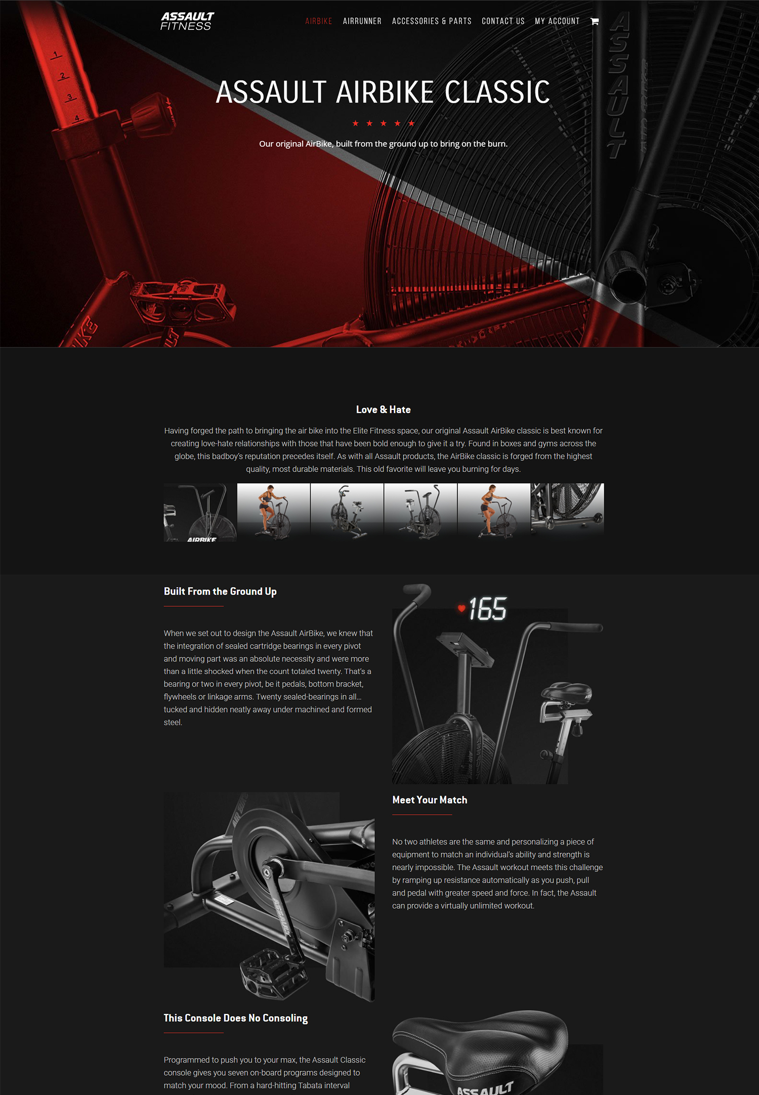
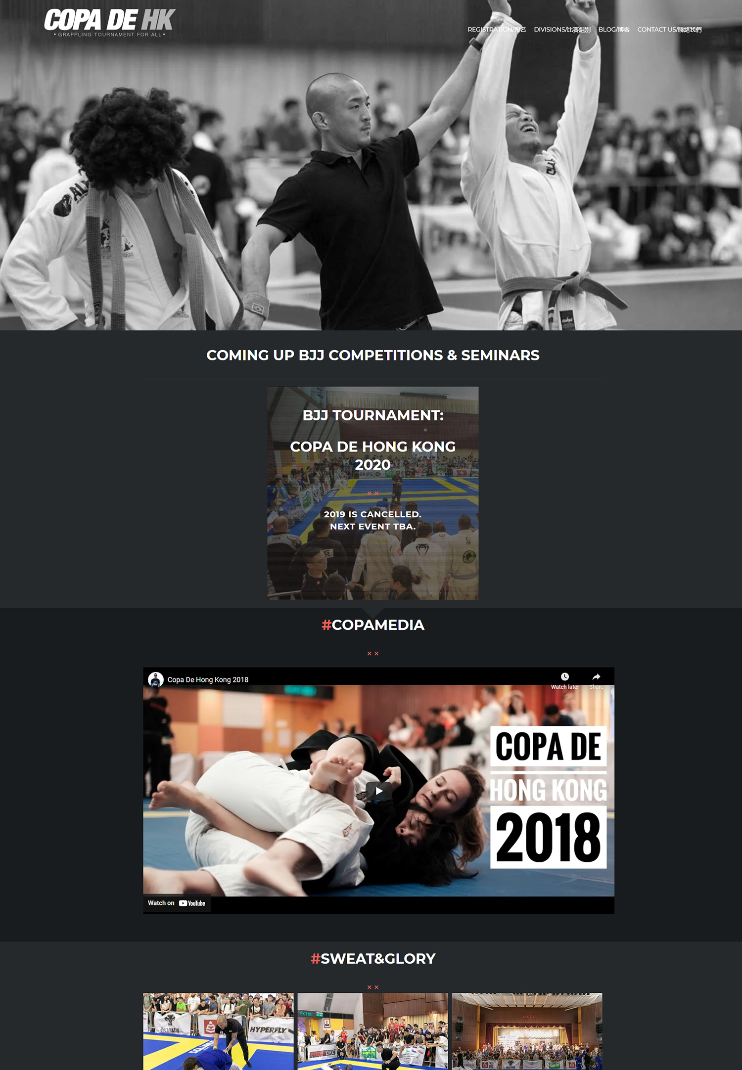
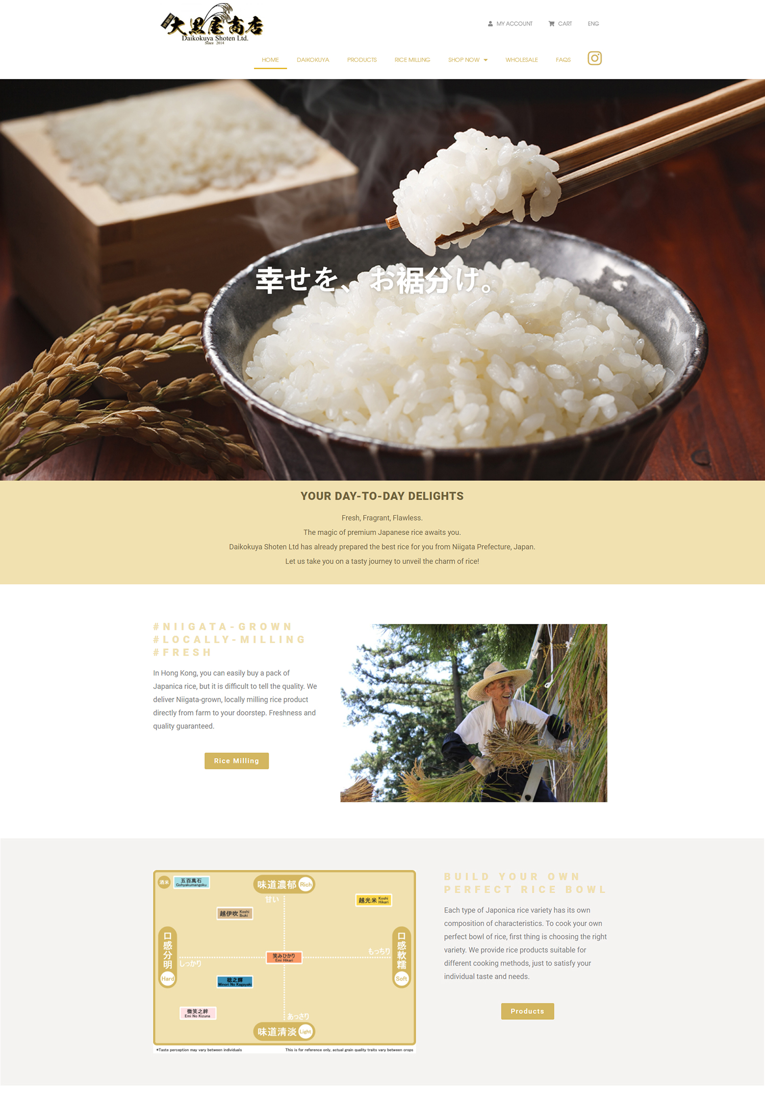
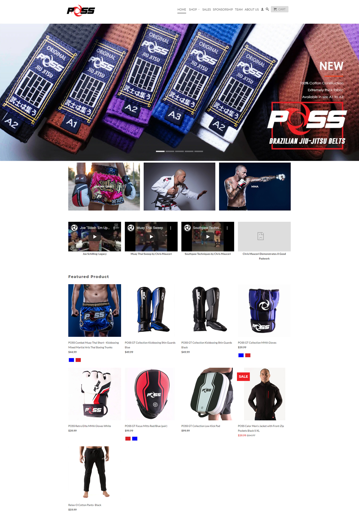
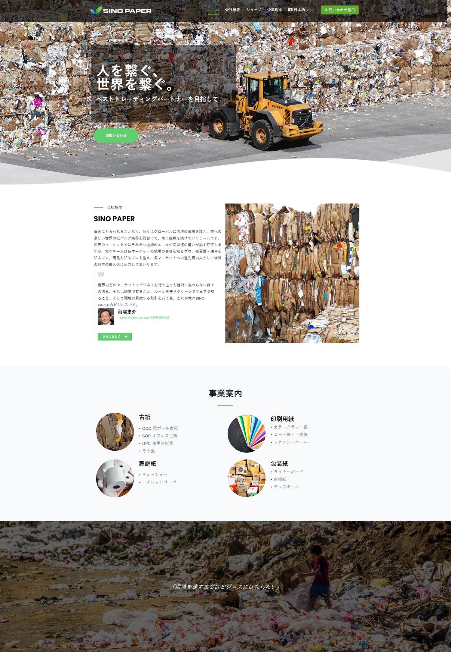
In the fast-paced world of e-commerce, we often find ourselves overwhelmed by the sheer volume of choices available to consumers. This is where the principles of minimalism come into play, offering a refreshing approach to design that prioritizes simplicity and functionality. At its core, minimalism in e-commerce design is about stripping away the unnecessary elements that can clutter a website, allowing users to focus on what truly matters: the products and their purchasing experience.
By embracing minimalism, we can create an environment that fosters clarity and ease of use, ultimately leading to higher conversion rates and customer satisfaction. As we delve deeper into the principles of minimalism, we recognize that it is not merely about reducing visual clutter; it is also about enhancing the overall user experience. A minimalist design encourages us to think critically about every element on our website, from typography to layout.
Each component must serve a purpose and contribute to the user’s journey. By adopting this mindset, we can create a cohesive and engaging online shopping experience that resonates with our audience. The goal is to guide users seamlessly through their purchasing process, ensuring that they feel confident and informed every step of the way.
Key Takeaways
- Minimalism in e-commerce design focuses on simplicity, clarity, and functionality to create a seamless user experience.
- Utilizing negative space in design helps to enhance user experience by reducing clutter and allowing for easier navigation.
- Choosing a simple and clean color palette for your website can create a cohesive and visually appealing design that is easy on the eyes.
- Streamlining navigation and user interface for easy browsing can improve user engagement and encourage longer site visits.
- Implementing high-quality imagery and concise product descriptions can help to showcase products effectively and drive conversions.
Utilizing negative space to enhance user experience
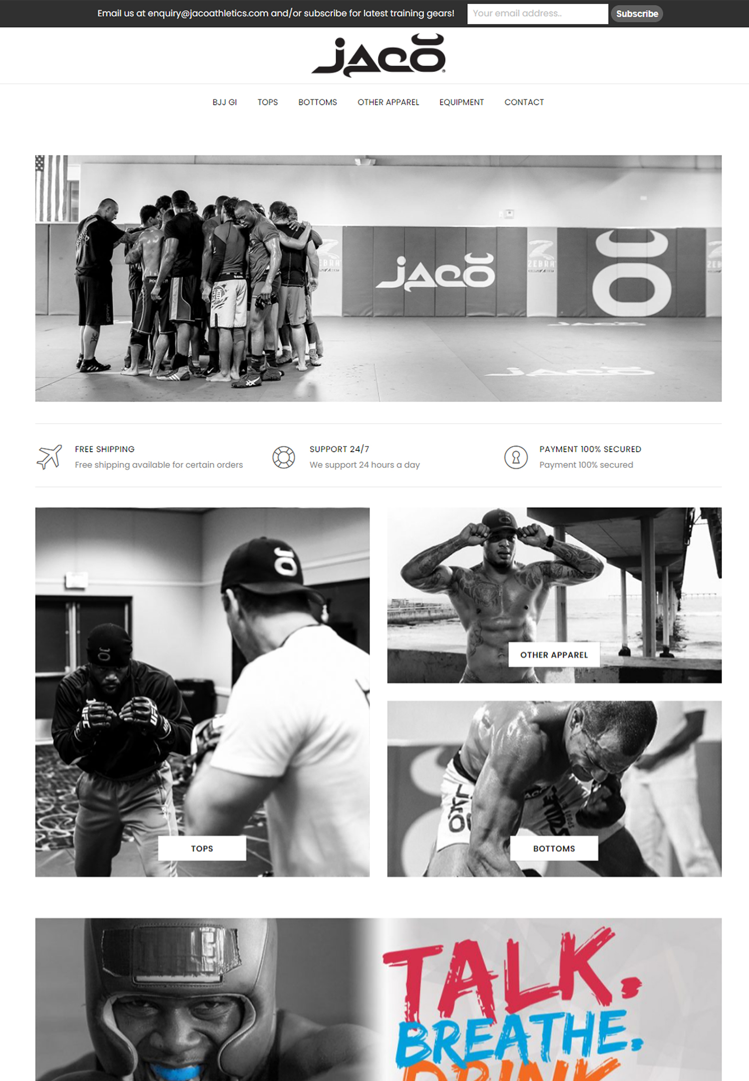
One of the most powerful tools at our disposal in minimalist e-commerce design is negative space, often referred to as white space. This concept involves intentionally leaving areas of a webpage unoccupied, allowing the content to breathe and making it easier for users to navigate. By incorporating negative space effectively, we can draw attention to key elements such as product images and calls to action, creating a more visually appealing and user-friendly interface.
This strategic use of space not only enhances aesthetics but also improves usability, as it reduces cognitive overload for our visitors. Moreover, negative space can significantly impact how users perceive our brand. A well-designed layout that utilizes ample white space conveys a sense of sophistication and professionalism, which can instill trust in potential customers.
When we create an environment where users can easily focus on the products without distractions, we foster a more enjoyable shopping experience. This approach encourages users to explore our offerings further, ultimately leading to increased engagement and higher conversion rates.
Choosing a simple and clean color palette for your website
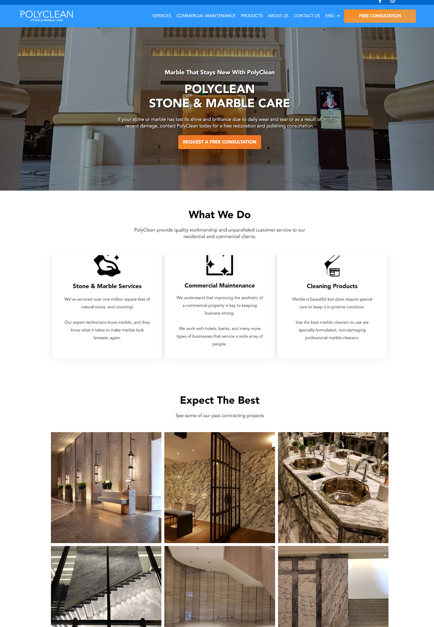
The color palette we choose for our e-commerce website plays a crucial role in shaping the overall aesthetic and emotional response of our visitors. In minimalist design, simplicity is key; therefore, we should opt for a clean and cohesive color scheme that reflects our brand identity while remaining visually appealing. By selecting a limited number of colors—typically two or three primary shades—we can create a harmonious look that enhances readability and guides users through their shopping journey.
In addition to aesthetics, color psychology is an essential consideration when designing our e-commerce site. Different colors evoke various emotions and associations, which can influence consumer behavior. For instance, blue often conveys trust and reliability, while green is associated with health and sustainability.
By thoughtfully choosing our color palette, we can align our brand message with the emotions we want to evoke in our customers. This strategic approach not only enhances the visual appeal of our website but also strengthens our brand identity and fosters a deeper connection with our audience.
Streamlining the navigation and user interface for easy browsing
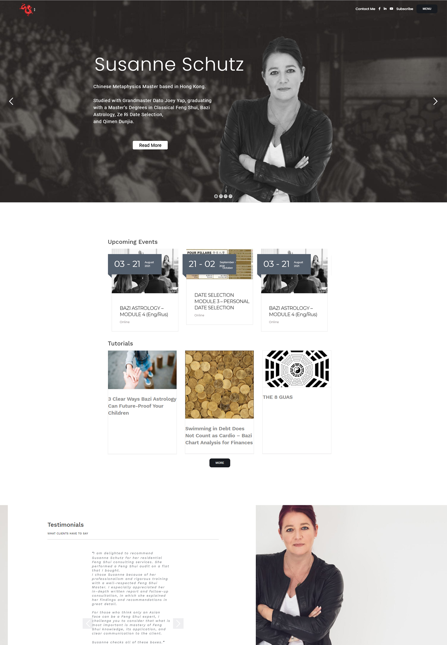
A streamlined navigation system is vital for any e-commerce website, especially one that embraces minimalism. We must ensure that users can easily find what they are looking for without feeling overwhelmed by excessive options or complicated menus. By organizing our products into clear categories and subcategories, we can create a logical flow that guides users through their browsing experience.
Additionally, incorporating a search bar prominently on our site allows users to quickly locate specific items, further enhancing usability. The user interface (UI) should also reflect our commitment to simplicity. We should prioritize intuitive design elements that make it easy for users to interact with our site.
This includes using clear labels for buttons and links, ensuring that they are easily identifiable and accessible. By minimizing distractions and focusing on essential elements, we can create an environment where users feel comfortable exploring our offerings. Ultimately, a well-structured navigation system combined with an intuitive UI will lead to a more enjoyable shopping experience and encourage repeat visits.
Implementing high-quality imagery and concise product descriptions
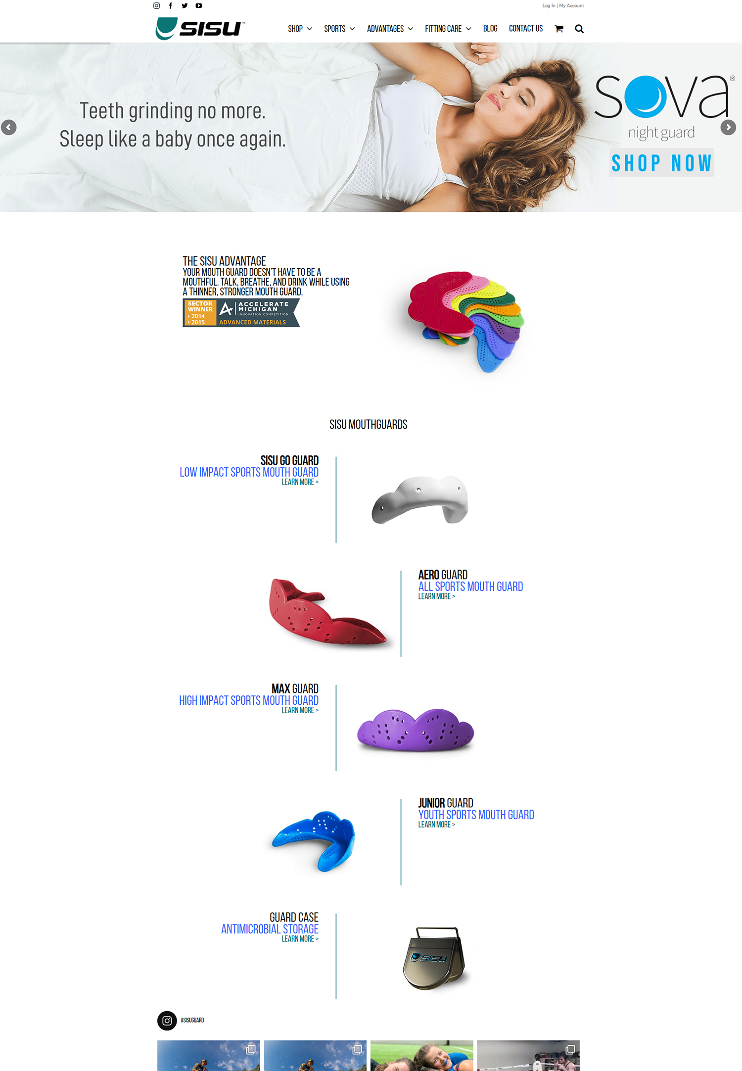
In the realm of e-commerce, visuals are paramount. High-quality imagery serves as the primary means through which we showcase our products, making it essential to invest in professional photography that captures the essence of what we offer. Clear, well-lit images allow customers to see details they might otherwise miss, fostering trust in the quality of our products.
Additionally, incorporating multiple angles or lifestyle shots can help customers envision how the product fits into their lives, enhancing their desire to make a purchase. Alongside compelling imagery, concise product descriptions are equally important in conveying essential information without overwhelming users with text. We should aim to provide clear and informative descriptions that highlight key features and benefits while maintaining brevity.
By focusing on what truly matters to our customers—such as size, material, and usage—we can create descriptions that resonate with their needs and desires. This combination of high-quality visuals and succinct descriptions not only enhances the overall shopping experience but also increases the likelihood of conversion.
Optimizing the checkout process for a seamless customer journey
A seamless checkout process is critical in minimizing cart abandonment rates and ensuring customer satisfaction. We must strive to create an efficient experience that allows users to complete their purchases with minimal friction. This begins with simplifying the checkout form by only requesting essential information from customers.
By reducing the number of fields they need to fill out, we can streamline the process and make it less daunting. Additionally, offering multiple payment options can cater to diverse customer preferences, further enhancing convenience during checkout. We should also consider implementing features such as guest checkout or saved payment information for returning customers to expedite future purchases.
By prioritizing a smooth checkout experience, we not only reduce barriers to conversion but also foster customer loyalty by demonstrating our commitment to their convenience.
Incorporating subtle and strategic calls to action for conversion
Calls to action (CTAs) are essential components of any e-commerce website, guiding users toward desired actions such as making a purchase or signing up for a newsletter. In minimalist design, it is crucial that these CTAs are both subtle and strategic; they should stand out without overwhelming the overall aesthetic of the site. We can achieve this by using contrasting colors or bold typography while ensuring that they align with our chosen color palette.
Moreover, the placement of CTAs plays a significant role in their effectiveness. We should position them strategically throughout the user journey—such as near product images or at key decision points—to encourage engagement without being intrusive. By crafting compelling copy that communicates urgency or value—such as “Limited Time Offer” or “Free Shipping on Orders Over $50”—we can motivate users to take action while maintaining the minimalist ethos of our design.
Testing and refining your minimalistic design for optimal performance
Finally, it is essential for us to continuously test and refine our minimalist e-commerce design to ensure optimal performance. User feedback is invaluable in this process; by gathering insights from real customers about their experiences on our site, we can identify areas for improvement. A/B testing different design elements—such as button colors or layout variations—allows us to determine what resonates best with our audience.
Additionally, we should regularly analyze website analytics to track user behavior and identify potential bottlenecks in the shopping journey. By monitoring metrics such as bounce rates or conversion rates, we can make data-driven decisions that enhance our design over time. Embracing a culture of continuous improvement ensures that our minimalist e-commerce site remains effective in meeting customer needs while adapting to changing trends in online shopping.
In conclusion, by understanding and implementing the principles of minimalism in e-commerce design, we can create an engaging online shopping experience that prioritizes clarity and functionality. Through thoughtful use of negative space, a clean color palette, streamlined navigation, high-quality imagery, optimized checkout processes, strategic calls to action, and ongoing testing and refinement, we position ourselves for success in an increasingly competitive digital landscape.


