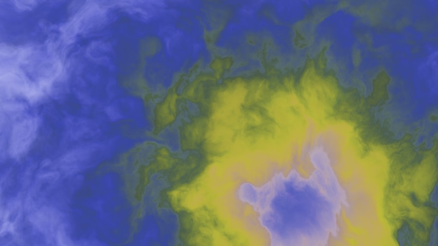
Heat maps are powerful visual tools that allow us to understand user behavior on our websites by representing data in a color-coded format. Essentially, they provide a graphical representation of where users click, scroll, and hover on a webpage. By using different colors to indicate varying levels of activity, heat maps help us quickly identify which areas of our site are attracting attention and which are being ignored.
The warmer colors, such as red and orange, signify high levels of interaction, while cooler colors like blue and green indicate less engagement. The technology behind heat maps is relatively straightforward. They collect data through tracking user interactions on our websites, often using JavaScript code embedded in the site’s HTML.
This code records user actions and sends the data back to a server for analysis. Once the data is aggregated, it is transformed into a visual format that we can easily interpret. This process allows us to see not just where users are clicking, but also how far down the page they scroll and how long they spend on different sections.
By analyzing these patterns, we can gain valuable insights into user preferences and behaviors.
Key Takeaways
- Heat maps are visual representations of data that show the intensity of user interaction on a website, with warmer colors indicating higher activity.
- Using heat maps can help identify website loss points, such as areas where users are not engaging or where they are dropping off.
- Interpreting and analyzing heat map data involves looking for patterns and trends in user behavior, such as where users are clicking, scrolling, or spending the most time.
- Common website loss points that can be identified using heat maps include ineffective call-to-action buttons, confusing navigation, and overlooked content.
- Best practices for using heat maps to improve website performance include regularly analyzing and updating heat map data, testing different design elements, and using heat maps in conjunction with other analytics tools.
- Case studies of successful use of heat maps to identify and address website loss points can demonstrate the effectiveness of heat map analysis in improving user experience and conversion rates.
- Tools and resources for implementing heat maps on your website include various software and plugins that offer heat map functionality, as well as tutorials and guides for interpreting heat map data.
- The future of heat map technology holds potential for more advanced features, such as real-time heat maps and integration with artificial intelligence, which could further enhance website optimization efforts.
The benefits of using heat maps to identify website loss points
Utilizing heat maps offers us a multitude of benefits when it comes to identifying website loss points. One of the most significant advantages is their ability to provide immediate visual feedback on user engagement. Instead of sifting through raw data or relying solely on analytics reports, we can see at a glance which elements of our site are performing well and which are not.
This visual representation allows us to make informed decisions about where to focus our optimization efforts. Moreover, heat maps can help us uncover unexpected user behaviors that we might not have anticipated. For instance, we may assume that a prominent call-to-action button is receiving ample clicks, only to discover through heat map analysis that users are ignoring it in favor of other elements on the page.
This insight can prompt us to rethink our design choices and improve the overall user experience. By identifying these loss points early on, we can implement changes that enhance user engagement and ultimately drive conversions.
How to interpret and analyze heat map data
Interpreting heat map data requires us to look beyond the colors and patterns presented on the screen. While the visual representation provides a quick overview, we must delve deeper into the context of the data to draw meaningful conclusions. For instance, if we notice a high concentration of clicks in a specific area, we should consider what elements are present there and whether they align with our goals for that page.
Are users clicking on a link that leads to valuable content, or are they mistakenly clicking on an image that doesn’t serve a purpose? Additionally, we should analyze heat map data in conjunction with other metrics, such as bounce rates and conversion rates. By cross-referencing these figures, we can gain a more comprehensive understanding of user behavior.
For example, if a section of our site shows high click activity but also has a high bounce rate, it may indicate that users are not finding what they expected after clicking. This discrepancy can guide us in making necessary adjustments to improve user satisfaction and retention.
Common website loss points that can be identified using heat maps
There are several common website loss points that heat maps can help us identify effectively. One prevalent issue is ineffective call-to-action buttons. If our buttons are not receiving clicks or engagement, it may signal that they are not prominently placed or visually appealing enough to attract attention.
Heat maps can reveal whether users are overlooking these critical elements or if they are simply not compelling enough to encourage action. Another common loss point is content placement and readability. Heat maps can show us how far down the page users typically scroll and where their attention tends to linger.
If we find that users are not scrolling past the first few paragraphs of text, it may indicate that our content is not engaging or relevant enough to hold their interest. By identifying these areas, we can make strategic adjustments to improve content layout and ensure that essential information is easily accessible.
Best practices for using heat maps to improve website performance
To maximize the effectiveness of heat maps in improving website performance, we should adhere to several best practices. First and foremost, it’s essential to set clear objectives before implementing heat map analysis. By defining what we want to achieve—whether it’s increasing conversions, reducing bounce rates, or enhancing user engagement—we can tailor our analysis accordingly.
Additionally, we should regularly review and update our heat map data to ensure that we’re capturing current user behavior trends. User preferences can change over time due to various factors such as design updates or shifts in market trends. By continuously monitoring heat map data, we can stay ahead of these changes and make timely adjustments to our website.
Furthermore, combining heat map analysis with A/B testing can yield even more significant insights. By testing different variations of a webpage while monitoring heat map data, we can determine which design elements resonate best with our audience. This iterative approach allows us to refine our website continually based on real user feedback.
Case studies of successful use of heat maps to identify and address website loss points
Numerous case studies illustrate the successful application of heat maps in identifying and addressing website loss points. One notable example involves an e-commerce site that was experiencing high cart abandonment rates. By utilizing heat maps, the team discovered that users were frequently clicking on product images but were not proceeding to checkout.
Further analysis revealed that the images were not linked correctly to product details, leading to frustration among potential buyers. Armed with this insight, the team made necessary adjustments by ensuring that product images were properly linked and enhancing the overall user experience on the product pages. As a result, they saw a significant decrease in cart abandonment rates and an increase in completed purchases.
Another case study highlights a news website that was struggling with low engagement levels on its articles. Through heat map analysis, the editorial team identified that users were primarily clicking on headlines but were not scrolling down to read the full articles. This insight prompted them to experiment with different headline formats and improve the layout of their articles for better readability.
The changes led to increased time spent on pages and higher overall engagement metrics.
Tools and resources for implementing heat maps on your website
Implementing heat maps on our website has become increasingly accessible thanks to various tools and resources available today. Some popular options include Hotjar, Crazy Egg, and Mouseflow, each offering unique features tailored to different needs. Hotjar provides comprehensive insights through heat maps, session recordings, and feedback polls, allowing us to gather qualitative data alongside quantitative metrics.
Crazy Egg is another excellent choice for those looking for straightforward heat mapping solutions combined with A/B testing capabilities. Its intuitive interface makes it easy for us to visualize user interactions and make informed decisions based on real-time data. Mouseflow stands out for its ability to track user sessions in addition to providing heat maps.
This feature allows us to see exactly how users navigate through our site, giving us deeper insights into their behavior patterns.
The future of heat map technology and its potential impact on website optimization
As technology continues to evolve, so too does the potential for heat map technology in website optimization. We anticipate advancements in artificial intelligence and machine learning will enhance the accuracy and depth of insights provided by heat maps. For instance, AI-driven algorithms could analyze user behavior patterns more effectively, allowing us to predict future trends based on historical data.
Moreover, as virtual reality (VR) and augmented reality (AR) become more integrated into online experiences, we may see new forms of heat mapping that cater specifically to these technologies. This evolution could provide us with even richer insights into how users interact with immersive content. In conclusion, as we embrace these advancements in heat map technology, we will be better equipped to optimize our websites for improved user experiences and higher conversion rates.
By leveraging these tools effectively today, we position ourselves for success in an ever-changing digital landscape.