

As we embark on our journey to understand heat maps, we find ourselves delving into a powerful tool that visualizes data in a way that is both intuitive and informative. Heat maps are graphical representations of data where individual values are represented by colors. This method allows us to quickly identify patterns, trends, and areas of interest within a dataset. In the context of web analytics, heat maps provide us with a visual overview of user interactions on our websites, revealing where visitors click, scroll, and spend their time.
The beauty of heat maps lies in their simplicity. By converting complex data into easily digestible visuals, they enable us to grasp user behavior at a glance. For instance, a heat map can show us which parts of our webpage attract the most attention, indicated by warmer colors like red and orange, while cooler colors like blue and green signify less engagement. This immediate visual feedback can be invaluable for anyone looking to enhance their online presence, as it allows us to make informed decisions based on actual user behavior rather than assumptions.
Key Takeaways
- Heat maps visually represent data using color to show the intensity of activity on a website
- Heat maps can help analyze website traffic by showing where users are clicking, scrolling, and spending the most time
- Optimizing user experience on a website can be achieved by using heat maps to identify areas for improvement
- Heat map insights can provide valuable information about audience behavior and preferences
- Content creation can be enhanced by using heat map data to understand what users are most interested in
How to Use Heat Maps to Analyze Website Traffic
When we consider how to use heat maps for analyzing website traffic, we realize that these tools can provide us with insights that traditional analytics might overlook. By integrating heat maps into our web analytics strategy, we can gain a deeper understanding of how users interact with our content. For example, we can identify which sections of our homepage are most engaging and which elements may be causing frustration or confusion. This information is crucial for optimizing our website layout and content strategy.
Moreover, heat maps can help us track user engagement over time. By comparing heat maps from different periods, we can observe changes in user behavior and assess the impact of any modifications we’ve made to our site. This longitudinal analysis allows us to refine our approach continuously, ensuring that we are always aligned with our audience’s preferences and needs. By leveraging heat maps in this way, we can create a more user-centric website that fosters engagement and encourages visitors to explore further.
Using Heat Maps to Optimize User Experience on Your Website
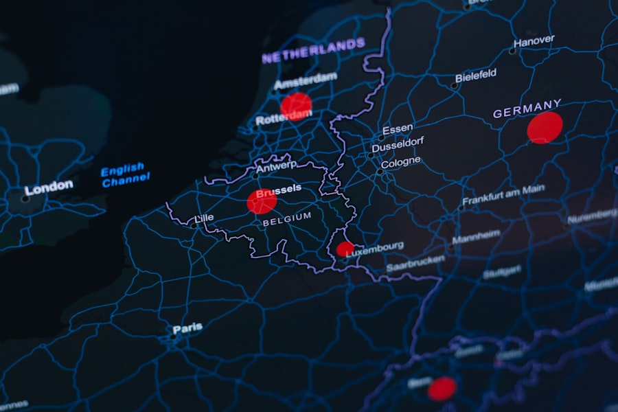
Optimizing user experience is a primary goal for any website owner, and heat maps serve as an essential tool in achieving this objective. By analyzing the data presented in heat maps, we can pinpoint areas where users may be experiencing difficulties or where they are losing interest. For instance, if we notice that users are frequently clicking on non-clickable elements or scrolling past important information, it signals a need for redesign or reorganization.
Additionally, heat maps can guide us in enhancing the overall aesthetic and functionality of our site. By understanding which elements draw attention and which do not, we can strategically place calls to action (CTAs) and other important features in high-traffic areas. This not only improves the user experience but also increases the likelihood of conversions. Ultimately, by utilizing heat maps to inform our design choices, we create a more seamless and enjoyable experience for our visitors.
Heat Map Insights: What They Can Tell You About Your Audience
The insights gleaned from heat maps extend far beyond mere clicks and scrolls; they offer a window into the preferences and behaviors of our audience. By analyzing these visual data representations, we can uncover valuable information about what captivates our visitors’ attention and what drives them away. For instance, if a particular blog post consistently garners high engagement on specific sections, it may indicate that our audience is particularly interested in that topic or format.
Furthermore, heat maps can reveal demographic trends based on user interactions. By segmenting our audience and analyzing their behavior through heat maps, we can tailor our content and marketing strategies to better meet their needs. This level of personalization not only enhances user satisfaction but also fosters loyalty among our audience. As we continue to gather insights from heat maps, we can refine our approach to ensure that we are consistently delivering value to our visitors.
Creating Content Based on Heat Map Data
| Blog Post Ideas | Heat Map Insights |
|---|---|
| 1. Understanding Heat Maps | Exploring the basics of heat maps and how they provide insights into user behavior on websites. |
| 2. Heat Map Analysis Tools | Reviewing different tools and software for analyzing heat maps and extracting valuable data. |
| 3. Heat Map Case Studies | Examining real-life examples of how businesses have used heat map insights to improve their websites and user experience. |
| 4. Heat Map Best Practices | Sharing tips and best practices for effectively using heat maps to optimize website design and content. |
Once we have gathered insights from heat map data, the next logical step is to create content that resonates with our audience. By understanding which topics or formats generate the most engagement, we can tailor our content strategy accordingly. For example, if heat maps indicate that users are spending significant time on infographics or videos, we might consider producing more visual content to cater to this preference.
Moreover, heat map data can inform us about the ideal length and structure of our articles. If we notice that users tend to drop off after a certain point in longer posts, it may be beneficial for us to break up content into shorter sections or incorporate more engaging elements such as images or bullet points. By aligning our content creation efforts with the insights derived from heat maps, we can ensure that we are meeting the needs of our audience while also enhancing overall engagement.
The Impact of Heat Maps on Conversion Rate Optimization
In the realm of digital marketing, conversion rate optimization (CRO) is paramount for success, and heat maps play a crucial role in this process. By analyzing user interactions through heat maps, we can identify potential barriers to conversion and make necessary adjustments to improve performance. For instance, if we observe that users are clicking on a CTA but not completing the desired action, it may indicate that the CTA is not compelling enough or that there are obstacles preventing users from following through.
Additionally, heat maps allow us to test different variations of our landing pages or CTAs effectively. By implementing A/B testing alongside heat map analysis, we can determine which designs or messages resonate best with our audience. This iterative approach enables us to refine our strategies continually and optimize conversion rates over time. Ultimately, by leveraging heat maps in our CRO efforts, we can create a more effective sales funnel that drives results.
Heat Map Case Studies: Real-Life Examples of Successful Insights
To illustrate the power of heat maps in action, let’s explore some real-life case studies that highlight successful insights derived from this tool. One notable example involves an e-commerce website that utilized heat maps to analyze user behavior on their product pages. By examining the data, they discovered that users were frequently clicking on product images but not engaging with the product descriptions. Armed with this insight, they decided to enhance their image gallery and incorporate more interactive elements into their product descriptions. As a result, they saw a significant increase in both engagement and sales.
Another compelling case study comes from a news website that used heat maps to assess reader engagement with their articles. They found that readers were primarily focused on headlines and images but often skimmed through the text itself. In response, they restructured their articles to include more engaging visuals and concise summaries at the beginning of each piece. This strategic adjustment led to longer time spent on page and increased social shares, demonstrating how heat map insights can drive meaningful changes in content strategy.
Advanced Techniques for Utilizing Heat Map Data in Blog Posts
As we become more adept at using heat map data, we can explore advanced techniques for integrating these insights into our blog posts effectively. One approach involves creating targeted content based on specific user interactions identified through heat maps. For instance, if we notice that certain topics generate higher engagement levels among specific demographics, we can craft tailored blog posts that speak directly to those audiences.
Additionally, incorporating interactive elements within our blog posts can enhance user engagement further. By using tools such as quizzes or polls alongside heat map analysis, we can create a dynamic experience that encourages readers to interact with our content actively. This not only keeps users engaged but also provides us with additional data points to analyze in future iterations of our content strategy.
In conclusion, as we navigate the world of heat maps and their applications in web analytics and content creation, it becomes clear that these tools offer invaluable insights into user behavior and preferences. By understanding how to leverage heat maps effectively, we can optimize our websites for better user experiences and improved conversion rates while continuously refining our content strategies based on real-time data. The journey into the realm of heat maps is one filled with opportunities for growth and innovation in the digital landscape.