When we think about the digital landscape, one of the most crucial elements that often comes to mind is the Call to Action (CTA). This simple yet powerful tool serves as a bridge between our content and our audience’s next steps. The primary purpose of a CTA is to guide users toward a specific action that aligns with our goals, whether that be signing up for a newsletter, making a purchase, or downloading a resource.
By clearly defining what we want our audience to do, we can create a more focused and effective user experience. Moreover, CTAs are not just about directing traffic; they are about conversion. They help us transform passive readers into active participants in our brand narrative.
A well-crafted CTA can significantly increase engagement rates and drive conversions, making it an essential component of our marketing strategy. Understanding the purpose of a CTA allows us to tailor our approach, ensuring that we resonate with our audience and encourage them to take meaningful actions that benefit both them and us.
Key Takeaways
- A clear CTA purpose guides user actions and drives conversions.
- Effective CTA buttons combine eye-catching design with concise, persuasive copy.
- Strategic placement of CTAs on the page maximizes visibility and engagement.
- A/B testing and data analysis are essential for optimizing CTA performance.
- Using visuals, urgency, and scarcity can significantly boost CTA effectiveness.
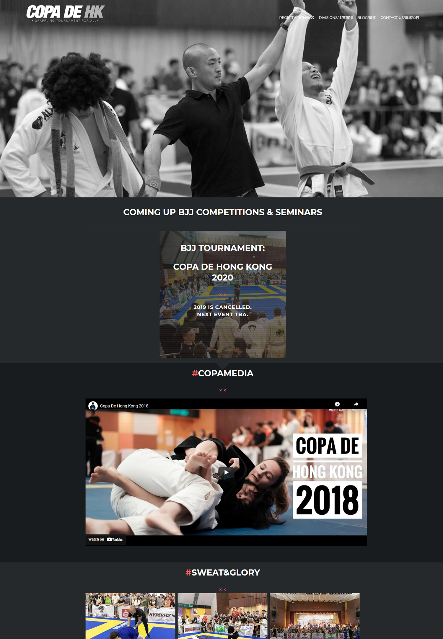
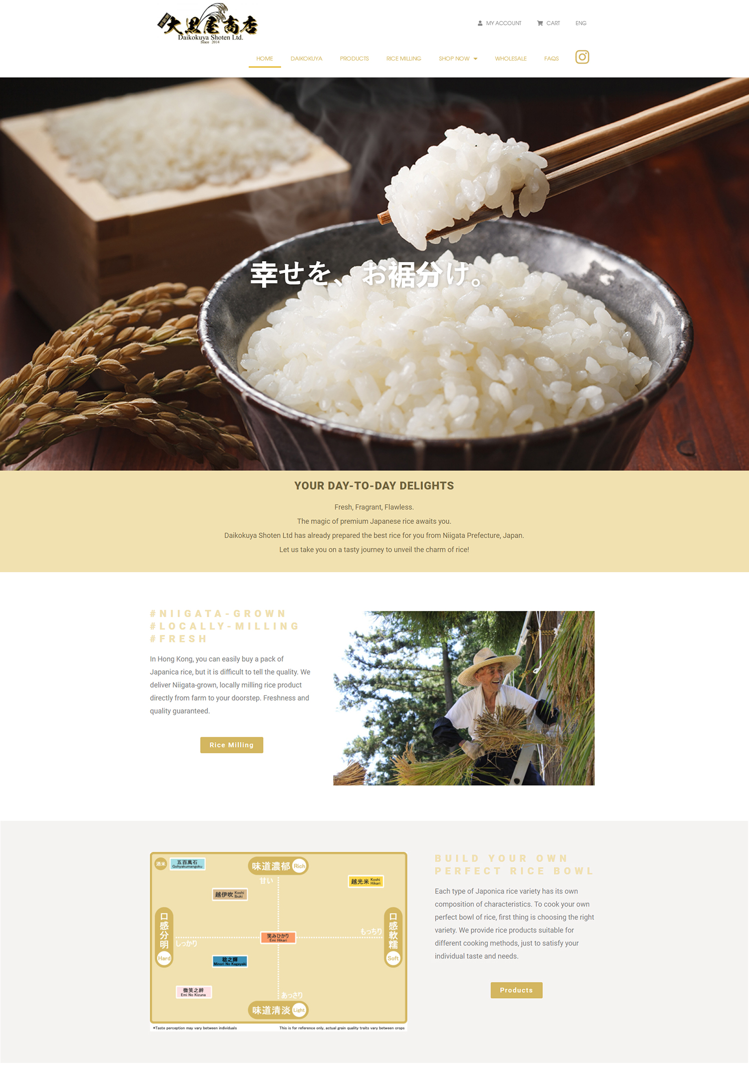
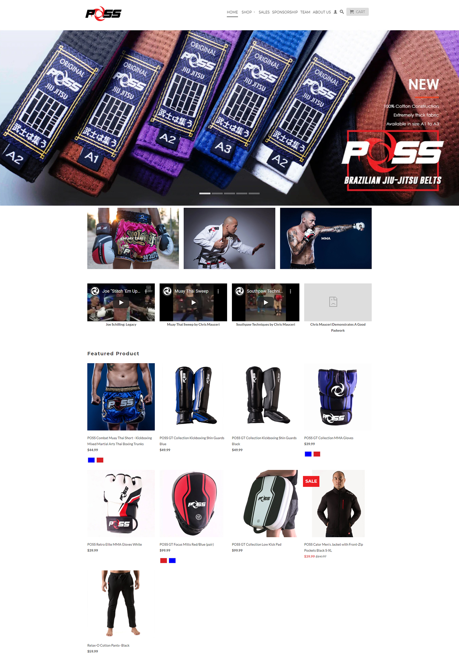
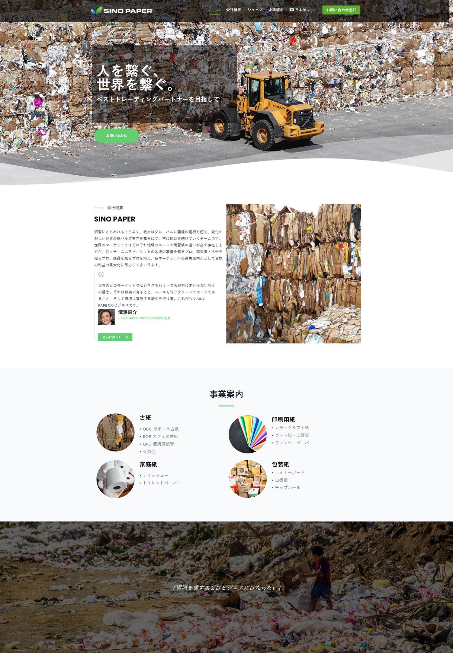
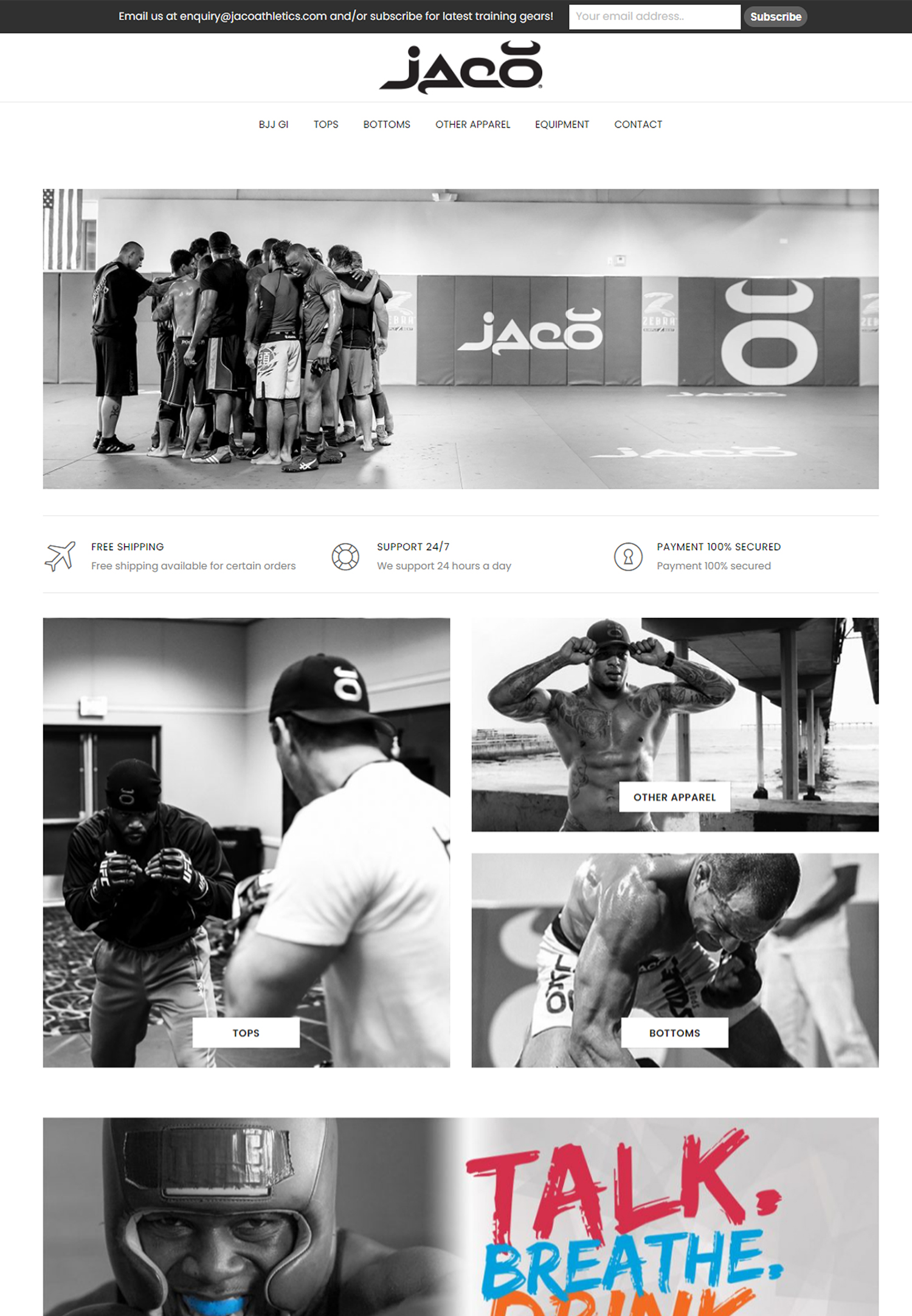
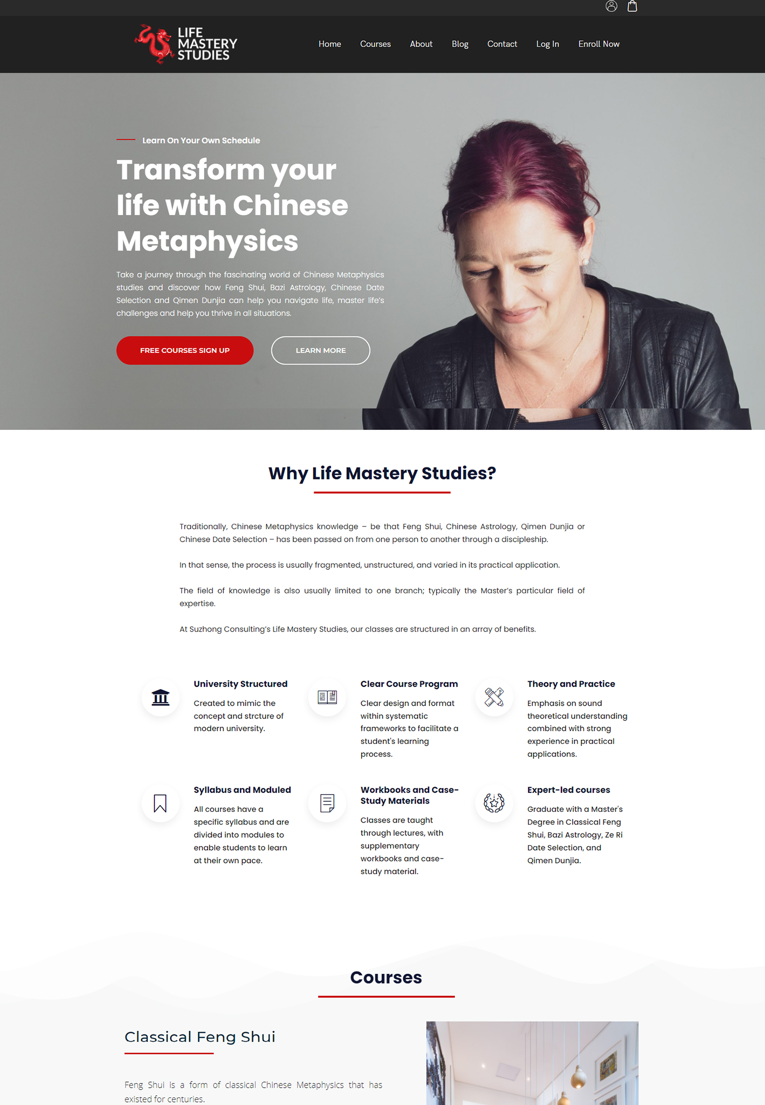
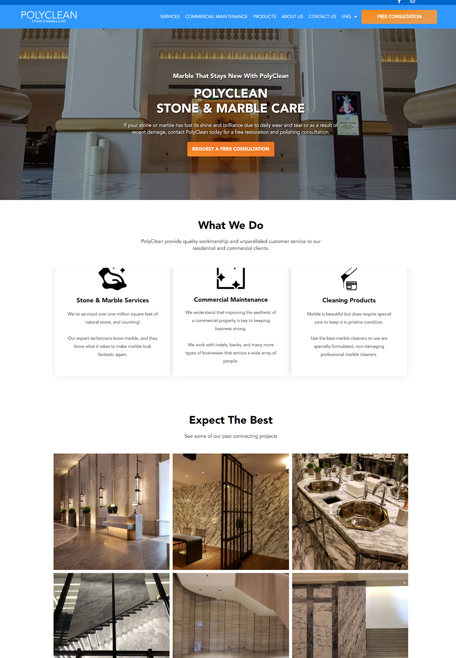
Designing a compelling CTA button
The design of our CTA button plays a pivotal role in its effectiveness. A compelling CTA button should stand out on the page, drawing the user’s attention immediately. We can achieve this by using contrasting colors that align with our overall branding while still being visually distinct.
The size of the button is also important; it should be large enough to be easily clickable but not so large that it overwhelms the surrounding content. By striking the right balance, we can create a button that invites interaction without being intrusive. In addition to color and size, we should consider the shape and placement of our CTA button.
Rounded corners often convey a sense of friendliness and approachability, while sharp edges can suggest professionalism and urgency. Furthermore, placing the button in a prominent location—such as above the fold or at the end of a persuasive section—ensures that it is easily accessible when users are most engaged. By thoughtfully designing our CTA buttons, we can enhance their visibility and effectiveness, ultimately leading to higher conversion rates.
Creating persuasive CTA copy
The words we choose for our CTA copy are just as important as the design of the button itself. Persuasive language can evoke emotions and prompt users to take action. We should aim for clarity and conciseness, using action-oriented verbs that convey a sense of urgency or benefit.
Phrases like “Get Started,” “Join Now,” or “Claim Your Free Trial” not only tell users what to do but also highlight the value they will receive by taking that action. Additionally, we can personalize our CTA copy to resonate more deeply with our audience. By understanding their needs and desires, we can craft messages that speak directly to them.
For instance, instead of a generic “Subscribe,” we might use “Join Our Community of Innovators” to create a sense of belonging. This tailored approach not only makes our CTAs more appealing but also fosters a connection with our audience, increasing the likelihood that they will follow through with the desired action.
Placing CTAs strategically on the page
Strategic placement of CTAs is crucial for maximizing their effectiveness. We need to consider the user journey and where they are most likely to engage with our content. For instance, placing a CTA at the end of a blog post can capture users who have just consumed valuable information and are primed for further engagement.
Alternatively, we might include CTAs in the middle of long-form content to break up text and provide opportunities for interaction without requiring users to scroll back up. Another effective strategy is to use multiple CTAs throughout a page, each tailored to different segments of our audience or stages in the buyer’s journey. For example, we might have one CTA for new visitors encouraging them to subscribe to our newsletter and another for returning visitors inviting them to explore premium content.
By strategically placing CTAs based on user behavior and intent, we can create a seamless experience that guides users toward conversion while keeping them engaged with our content.
A/B testing and optimizing CTAs
| Metric | Description | Recommended Best Practice | Example |
|---|---|---|---|
| CTA Button Text | Words used on the call-to-action button | Use clear, action-oriented, and benefit-driven text (e.g., “Get Started”, “Download Now”) | “Start Free Trial” |
| Button Color Contrast | Contrast between CTA button and background | Use high contrast colors to make the CTA stand out | Bright orange button on white background |
| Placement | Location of CTA on the page | Place above the fold and near relevant content for easy access | Centered below headline on homepage |
| Size | Dimensions of the CTA button | Make buttons large enough to be easily clickable on all devices | Minimum 44×44 pixels |
| Urgency | Use of urgency or scarcity in CTA | Incorporate time-sensitive language to encourage immediate action | “Sign Up Today – Limited Spots” |
| Supporting Text | Additional text near CTA to reduce friction | Use brief, reassuring copy to address concerns (e.g., “No credit card required”) | “Try risk-free for 30 days” |
| Click-Through Rate (CTR) | Percentage of visitors who click the CTA | Track and optimize to improve engagement | Industry average: 2-5% |
| Mobile Optimization | CTA usability on mobile devices | Ensure buttons are easily tappable and visible on small screens | Responsive design with large tap targets |
To ensure that our CTAs are performing at their best, we must embrace A/B testing as an essential part of our optimization strategy. This process involves creating two versions of a CTA—varying elements such as copy, design, or placement—and measuring their performance against each other. By analyzing user interactions with each version, we can gain valuable insights into what resonates most with our audience.
Through A/B testing, we can identify which elements lead to higher conversion rates and refine our approach accordingly. For instance, we might discover that changing the color of our CTA button from blue to green results in a significant increase in clicks. Armed with this knowledge, we can make data-driven decisions that enhance the effectiveness of our CTAs over time.
Continuous testing and optimization not only improve performance but also demonstrate our commitment to understanding and meeting the needs of our audience.
Using visuals to enhance CTAs
Visual elements can significantly enhance the effectiveness of our CTAs by drawing attention and creating an emotional connection. Incorporating images or icons alongside our CTA buttons can provide context and reinforce the message we want to convey. For example, using an arrow pointing toward the button can guide users’ eyes and encourage them to take action.
Additionally, visuals can evoke emotions that align with our brand message, making the CTA more compelling. We should also consider using contrasting backgrounds or overlays to make our CTAs pop against the rest of the page. A well-placed image or graphic can create visual interest and highlight the importance of taking action.
However, it’s essential to strike a balance; too many visuals can distract from the CTA itself. By thoughtfully integrating visuals into our CTA strategy, we can create an engaging experience that captures attention and drives conversions.
Incorporating urgency and scarcity in CTAs
Creating a sense of urgency or scarcity can be an effective tactic for motivating users to act quickly. When we incorporate phrases like “Limited Time Offer” or “Only 5 Spots Left,” we tap into psychological triggers that encourage immediate action. This sense of urgency compels users to overcome hesitation and make decisions more swiftly, which can lead to increased conversions.
However, it’s important for us to use urgency and scarcity authentically. Misleading claims can damage trust and harm our brand reputation in the long run. Instead, we should focus on genuine offers that create excitement without compromising integrity.
By effectively incorporating urgency and scarcity into our CTAs, we can inspire users to take action while fostering a sense of trust in our brand.
Analyzing and measuring CTA effectiveness
Finally, analyzing and measuring the effectiveness of our CTAs is crucial for ongoing improvement. We should track key metrics such as click-through rates (CTR), conversion rates, and user engagement levels to gauge how well our CTAs are performing. Tools like Google Analytics can provide valuable insights into user behavior, allowing us to see which CTAs are driving traffic and conversions.
By regularly reviewing this data, we can identify trends and patterns that inform our future strategies. For instance, if we notice that certain CTAs consistently outperform others, we can analyze what makes them successful—be it their wording, design, or placement—and apply those insights across other areas of our marketing efforts. Continuous analysis not only helps us optimize individual CTAs but also contributes to a broader understanding of user preferences and behaviors, ultimately leading to more effective marketing strategies overall.
In conclusion, mastering the art of crafting effective CTAs requires a multifaceted approach that encompasses design, copywriting, strategic placement, testing, visuals, urgency, and ongoing analysis. By understanding each element’s role in driving user engagement and conversions, we can create compelling calls to action that resonate with our audience and achieve our marketing goals. As we continue to refine our strategies based on data-driven insights, we will be better equipped to connect with users meaningfully and guide them toward taking action that benefits both them and us.