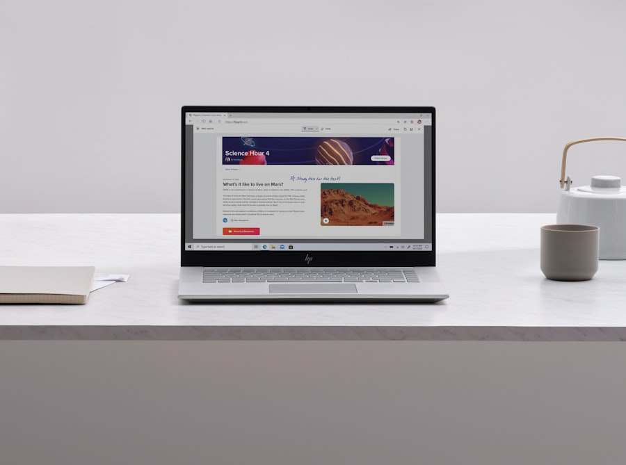
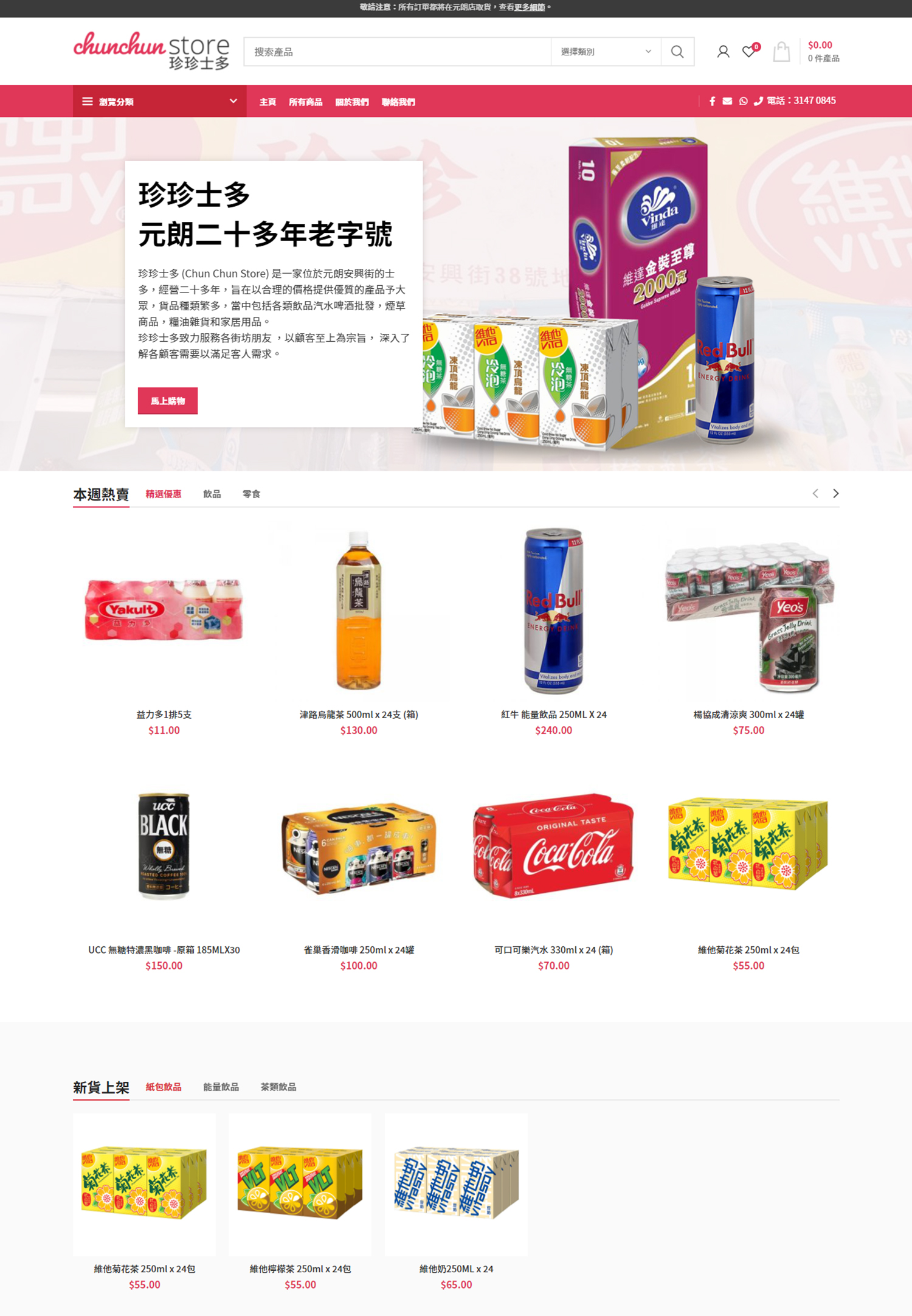
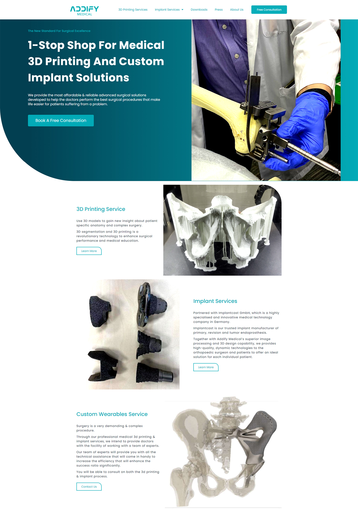
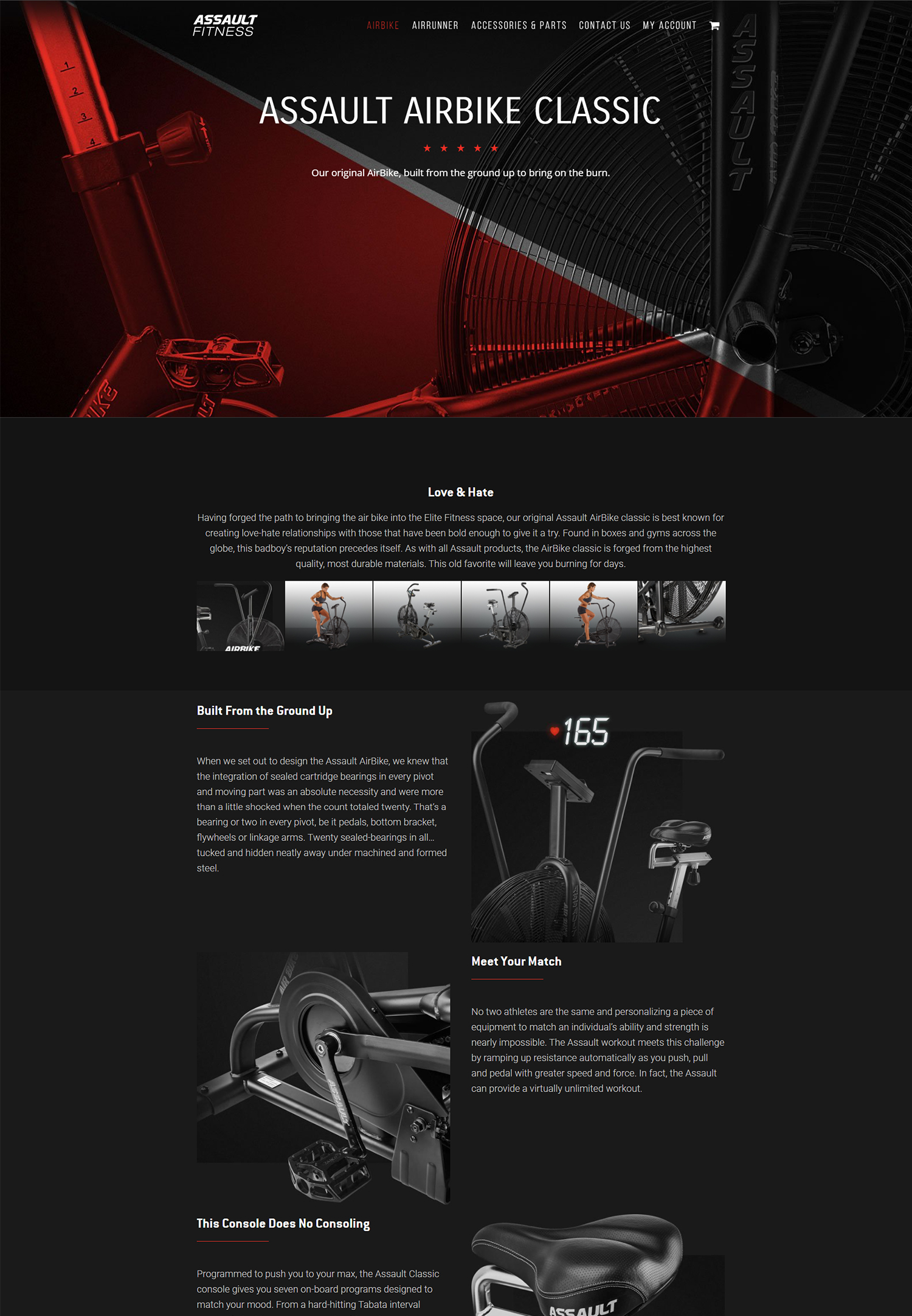
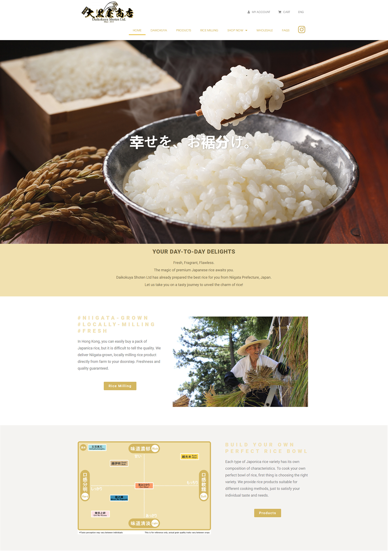
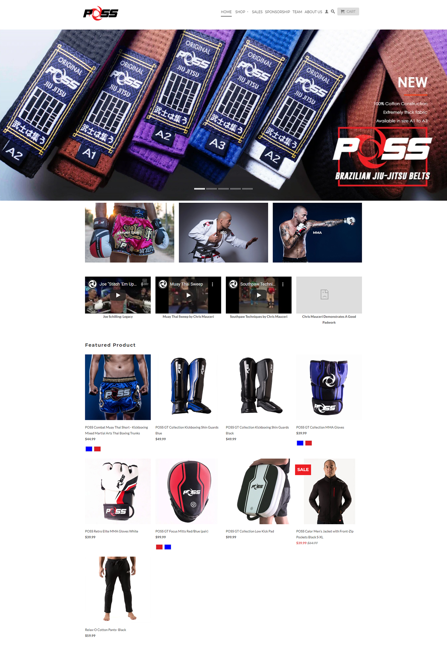
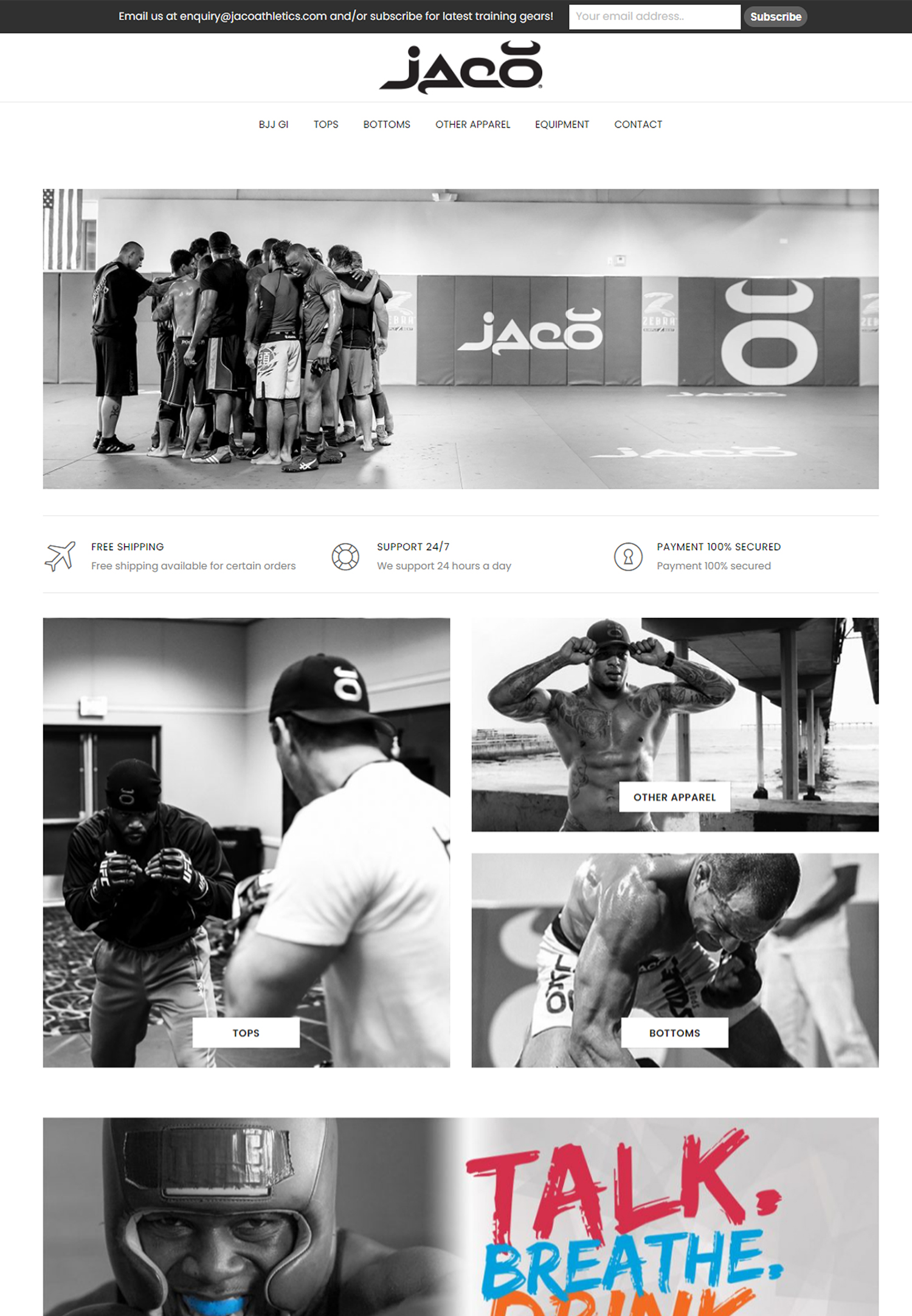
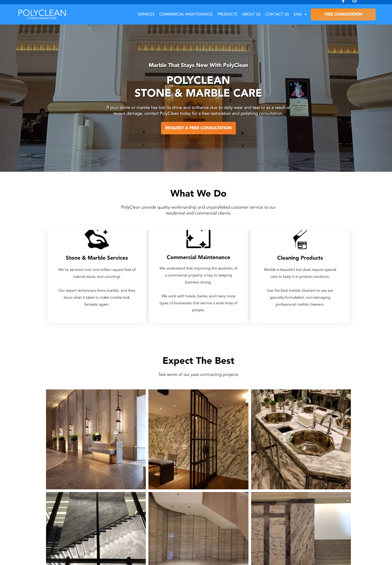
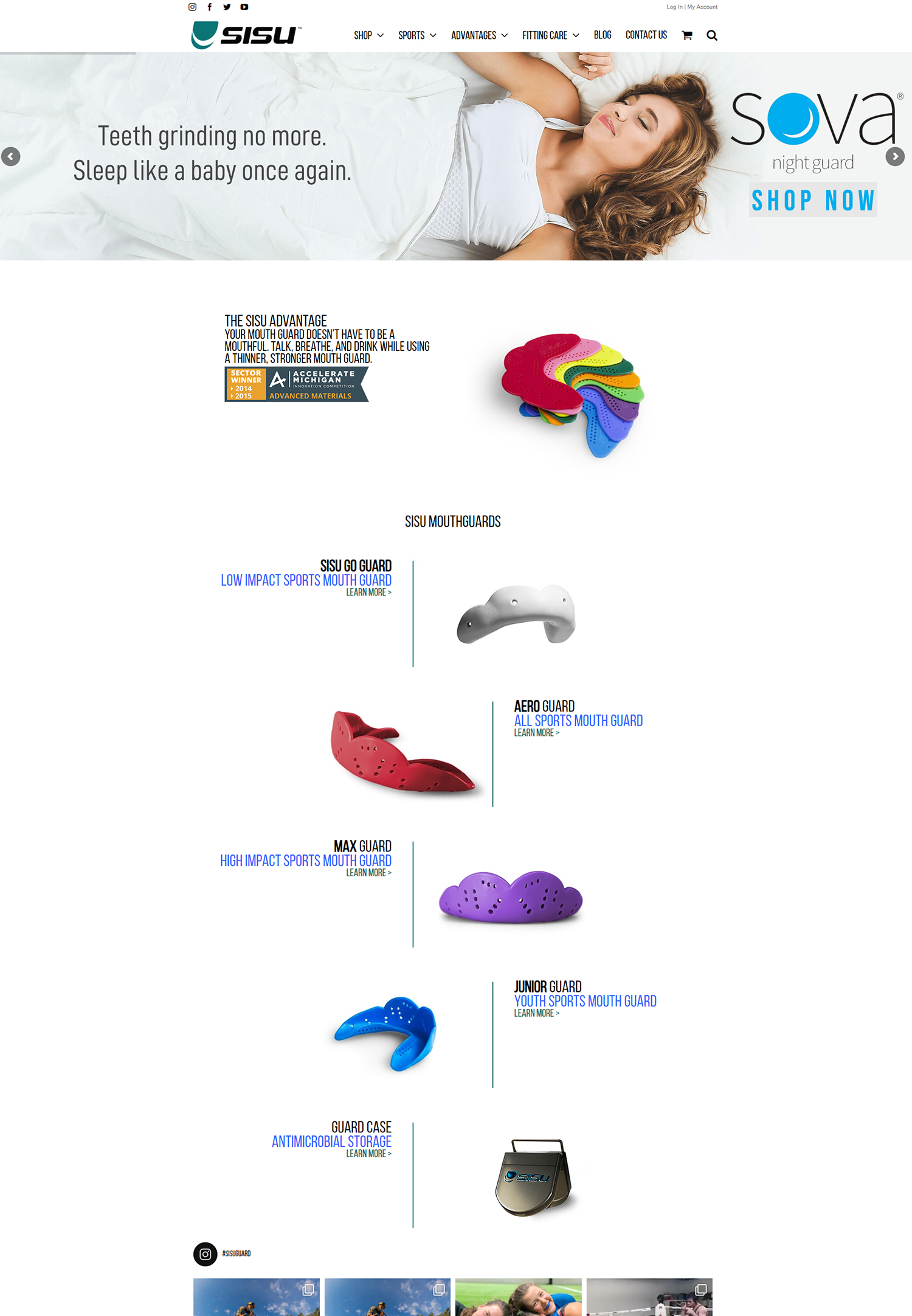
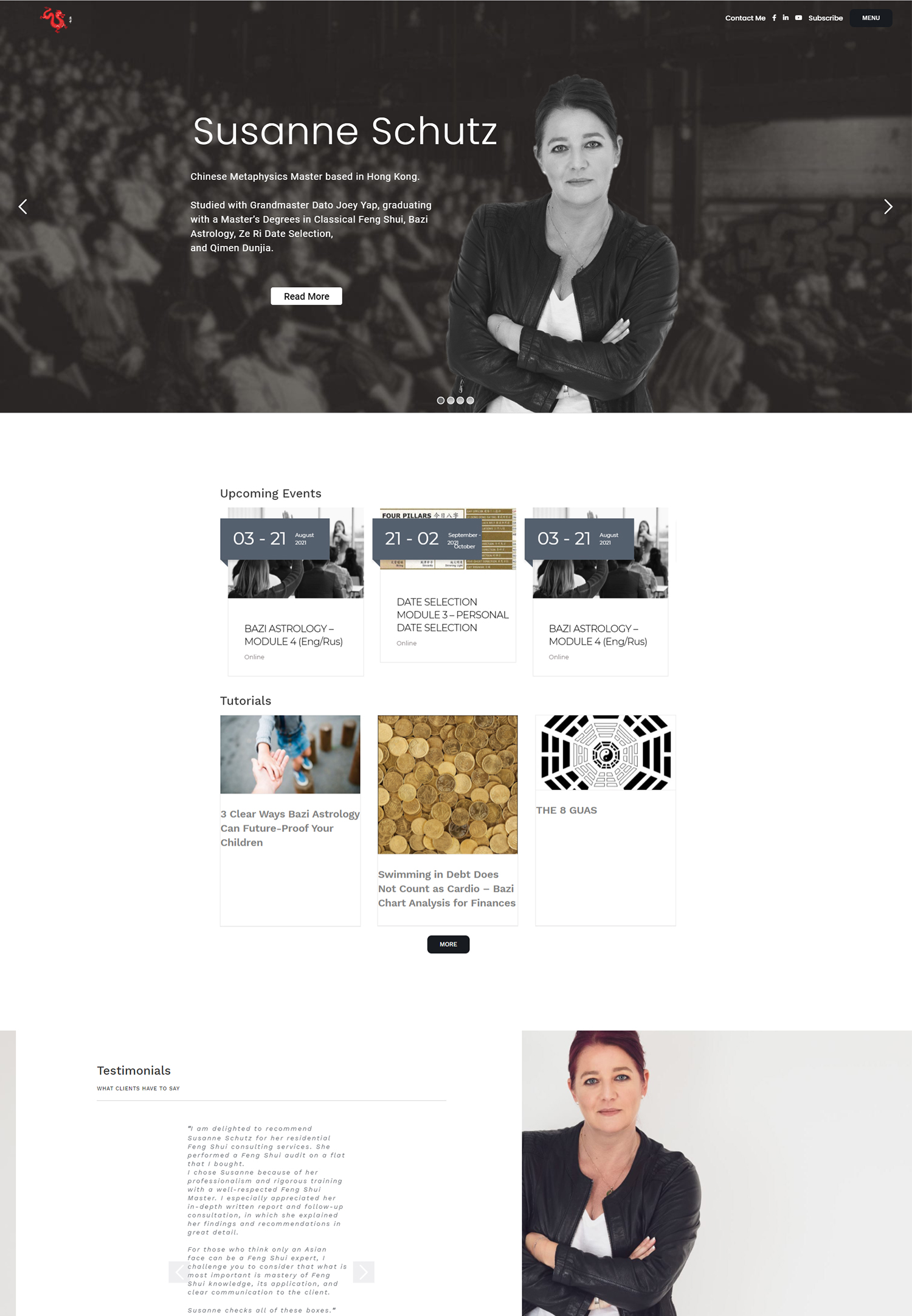
In the ever-evolving landscape of web design, minimalism has emerged as a powerful trend that resonates with both designers and users alike. As we delve into the world of minimalistic websites, we find ourselves drawn to their clean lines, uncluttered layouts, and a focus on essential content. This design philosophy strips away the superfluous, allowing the core message to shine through.
By prioritizing simplicity, minimalistic websites not only enhance aesthetic appeal but also improve functionality, making them a popular choice for businesses and individuals seeking to create a lasting impression. The essence of minimalism lies in its ability to convey information effectively without overwhelming the user. In a digital age where attention spans are fleeting, we recognize that users are more likely to engage with content that is straightforward and easy to navigate.
Minimalistic design encourages us to think critically about what elements are truly necessary, leading to a more intentional approach to web development. As we explore the various facets of minimalistic websites, we will uncover how this design philosophy impacts user experience, credibility, and brand perception.
Key Takeaways
- Minimalistic websites focus on simplicity and clean design, with a minimal use of elements and content.
- Minimalistic design can improve user experience by reducing clutter and distractions, leading to faster load times and easier navigation.
- Minimalism can enhance credibility by conveying a sense of professionalism, trustworthiness, and attention to detail.
- White space in minimalistic websites helps to create a sense of balance, harmony, and focus on key elements.
- Minimalistic websites use visual hierarchy to guide users’ attention and emphasize important content, leading to a better user experience.
The Impact of Minimalistic Design on User Experience
When we consider user experience, minimalistic design plays a pivotal role in creating an intuitive and enjoyable interaction with a website. By eliminating distractions and focusing on essential elements, we can guide users seamlessly through their journey. A well-executed minimalistic website allows for faster loading times and easier navigation, which are crucial factors in retaining visitors.
As we engage with these sites, we often find that our attention is directed toward the content that matters most, enhancing our overall experience. Moreover, minimalism fosters a sense of clarity and purpose. When we encounter a website that embraces this design philosophy, we are less likely to feel overwhelmed by excessive information or visual clutter.
Instead, we can appreciate the thoughtful arrangement of elements that prioritize usability. This clarity not only improves our interaction with the site but also encourages us to explore further, leading to increased engagement and satisfaction. In essence, minimalistic design transforms user experience into a streamlined process that invites exploration rather than frustration.
The Psychological Effect of Minimalism on Credibility
As we navigate the digital realm, the credibility of a website is paramount in establishing trust with users. Minimalistic design can significantly influence our perception of a site’s reliability and professionalism. When we encounter a website that employs clean lines and a straightforward layout, we often associate these qualities with competence and attention to detail.
The absence of clutter allows us to focus on the content without distractions, reinforcing our belief in the site’s authority. Furthermore, minimalism can evoke feelings of sophistication and modernity. As we engage with a well-designed minimalistic website, we may perceive the brand behind it as innovative and forward-thinking.
This psychological effect can enhance our overall impression of the brand’s credibility, making us more likely to engage with their products or services. In a world where first impressions are crucial, minimalistic design serves as a powerful tool for establishing trust and fostering positive associations with a brand.
The Role of White Space in Minimalistic Websites
White space, often referred to as negative space, is a fundamental element of minimalistic design that plays a crucial role in enhancing visual appeal and functionality. As we explore minimalistic websites, we notice how white space creates breathing room for content, allowing us to absorb information without feeling overwhelmed. This intentional use of space not only improves readability but also draws our attention to key elements on the page.
In addition to improving aesthetics, white space contributes to a more organized layout. When we encounter ample white space surrounding text and images, it becomes easier for us to navigate the site and locate important information. This clarity fosters a sense of calm and order, encouraging us to engage more deeply with the content presented.
Ultimately, the strategic use of white space in minimalistic websites enhances our overall experience by creating an inviting atmosphere that encourages exploration.
How Minimalistic Websites Enhance Visual Hierarchy
Visual hierarchy is an essential aspect of web design that guides users through content in a logical and engaging manner. In minimalistic websites, this hierarchy is often achieved through the careful arrangement of elements, contrasting colors, and varying font sizes. As we interact with these sites, we can easily discern which information is most important based on its placement and prominence on the page.
By prioritizing visual hierarchy, minimalistic design allows us to navigate content intuitively. We find ourselves naturally drawn to headlines and calls-to-action that stand out against the backdrop of simplicity. This intentional structuring not only enhances our understanding of the content but also encourages us to take desired actions, such as signing up for newsletters or making purchases.
In this way, minimalistic websites effectively guide our journey while ensuring that we remain engaged and informed.
The Influence of Minimalism on Brand Perception
The impact of minimalism extends beyond aesthetics; it profoundly influences how we perceive brands in the digital landscape. When we encounter a minimalistic website, we often associate it with qualities such as sophistication, innovation, and professionalism. This perception can significantly shape our attitudes toward the brand itself.
A clean and uncluttered design communicates that the brand values clarity and efficiency, which can resonate positively with users seeking reliable products or services. Moreover, minimalism allows brands to convey their core message without unnecessary embellishments. As we engage with these websites, we appreciate the focus on essential information that aligns with our needs and preferences.
This alignment fosters a sense of connection between us and the brand, enhancing our likelihood of loyalty and repeat engagement. In essence, minimalistic design serves as a powerful vehicle for shaping brand perception and establishing lasting relationships with users.
Case Studies: Successful Minimalistic Websites
To illustrate the effectiveness of minimalistic design, we can examine several successful case studies that have embraced this philosophy. One notable example is Apple’s website, which exemplifies clean lines and an emphasis on product imagery. By showcasing their products against a simple backdrop, Apple allows users to focus on what truly matters—their innovative technology.
This approach not only enhances user experience but also reinforces Apple’s brand identity as a leader in design and functionality. Another compelling case is that of Dropbox, whose website employs minimalism to convey its core message clearly. With ample white space and straightforward navigation, Dropbox ensures that users can easily understand its offerings without feeling overwhelmed by excessive information.
This clarity has contributed to Dropbox’s reputation as a reliable cloud storage solution, demonstrating how minimalistic design can effectively communicate value while enhancing user engagement.
Tips for Creating a Minimalistic Website that Builds Credibility
As we consider embarking on our own journey toward creating a minimalistic website that builds credibility, there are several key tips to keep in mind. First and foremost, we should prioritize simplicity in both design and content. By focusing on essential elements and eliminating unnecessary distractions, we can create an inviting atmosphere that encourages exploration.
Additionally, we must pay careful attention to typography and color choices. Selecting legible fonts and a cohesive color palette can enhance readability while reinforcing our brand identity. Furthermore, incorporating ample white space will allow us to create a sense of balance and organization throughout the site.
Finally, it’s crucial for us to ensure that our website is responsive across various devices. A seamless experience on both desktop and mobile platforms will enhance user satisfaction and reinforce our credibility as a brand that values accessibility. In conclusion, as we navigate the world of minimalistic websites, we discover their profound impact on user experience, credibility, and brand perception.
By embracing simplicity and intentional design choices, we can create engaging online experiences that resonate with users while establishing trust and fostering lasting connections. Through thoughtful implementation of these principles, we can harness the power of minimalism to elevate our digital presence in an increasingly crowded online landscape.


