Effective call-to-actions (CTAs) are crucial in the digital world, where people’s attention spans are short and competition is intense. This is why The Art & Science of Call-to-Actions: A Comprehensive Guide is so important. Whether a visitor wants to download a resource, buy something, or sign up for a newsletter, CTAs act as the link between their initial interest and the desired action. For both business owners and marketers, it is essential to comprehend the importance of CTAs.
Key Takeaways
- A clear and compelling call-to-action is crucial for guiding website visitors towards desired actions.
- Visually appealing call-to-actions with contrasting colors and clear fonts can attract more attention and engagement.
- Persuasive copywriting techniques, such as using action-oriented language and addressing pain points, can significantly improve the effectiveness of call-to-actions.
- Strategic placement of call-to-actions, such as above the fold and at the end of content, can increase conversion rates on landing pages.
- A/B testing different variations of call-to-actions can help identify the most effective design, copy, and placement for optimal results.
They are strategic tools intended to direct users through a website; they are more than just buttons or links. A well-written call to action (CTA) can dramatically increase conversion rates and convert infrequent browsers into loyal customers. Also, CTAs are crucial in determining the user experience. They can offer direction & clarity when carefully designed, facilitating users’ fluid navigation of content.
In a time when people are constantly exposed to information from various sources, this is especially crucial. A compelling and unambiguous call to action (CTA) can break through the clutter & provide a clear path forward. Businesses that recognize the value of call-to-action (CTA) can develop more successful marketing campaigns that draw in visitors and turn them into devoted clients.
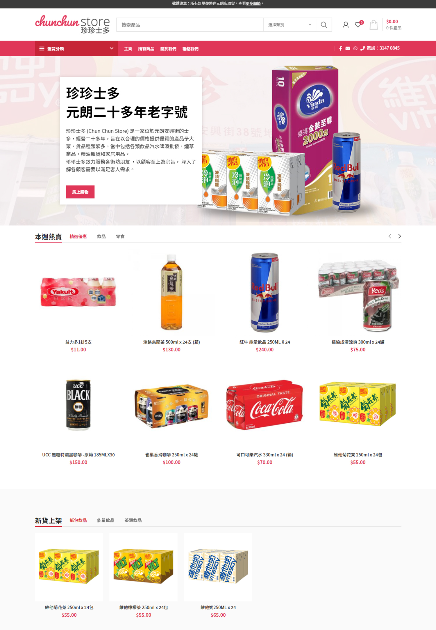
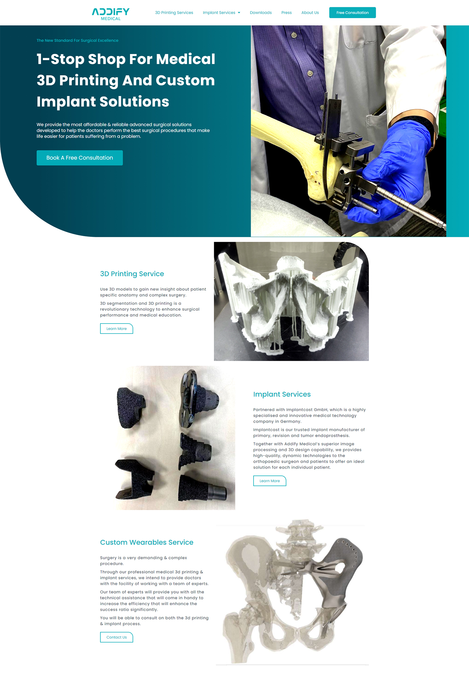
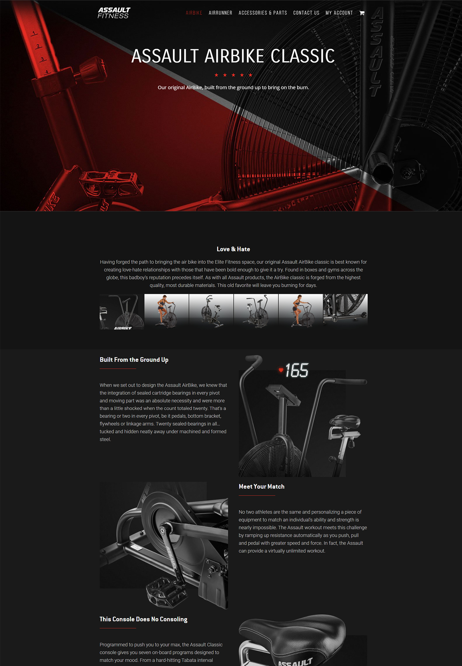
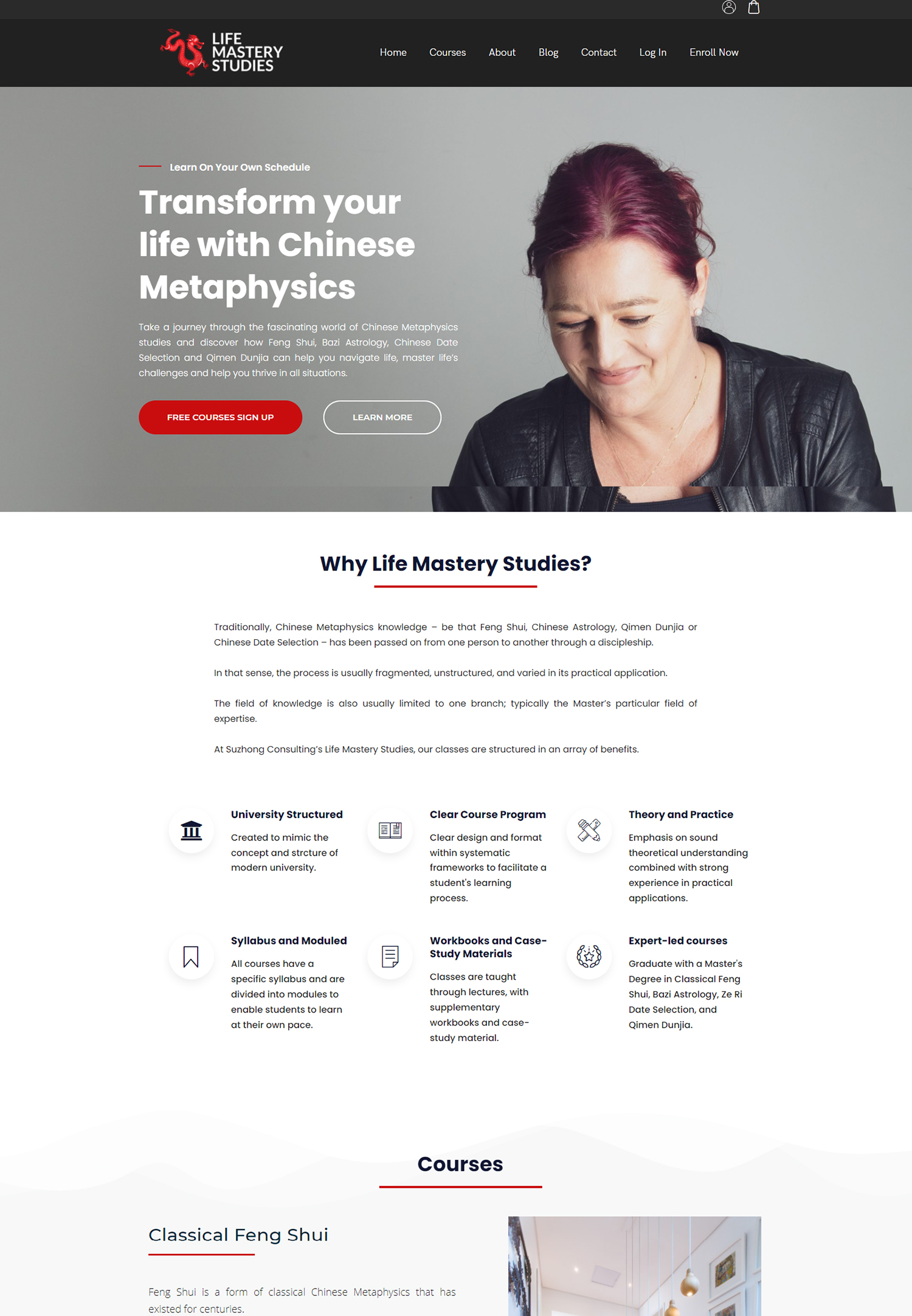
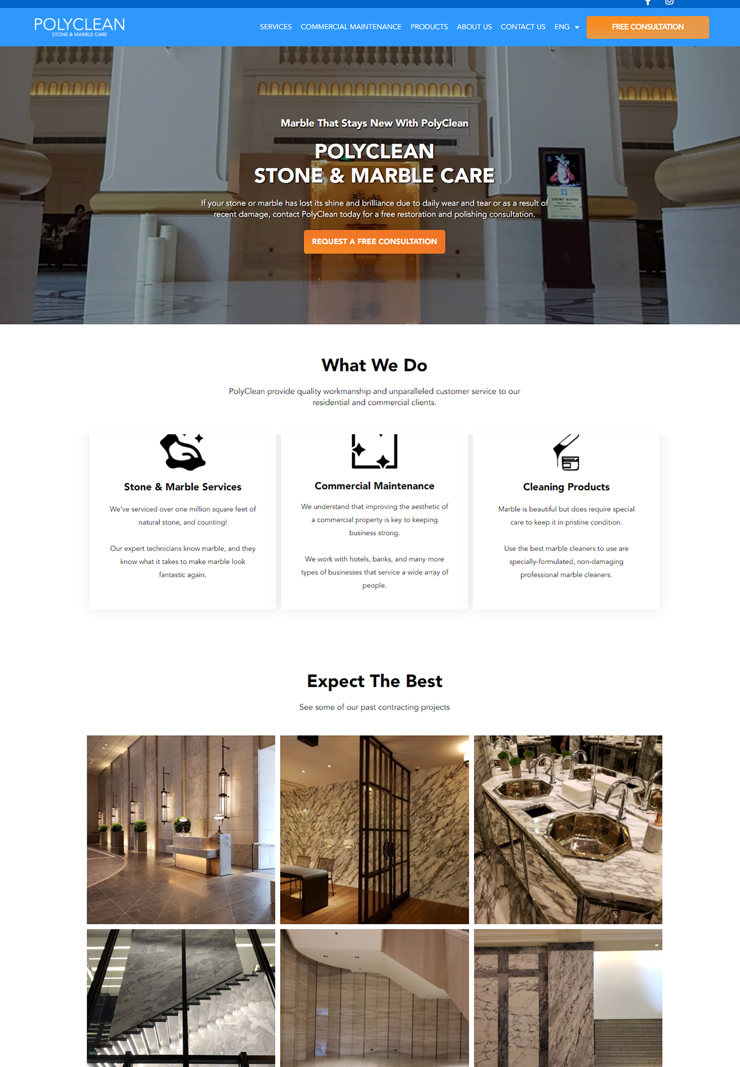
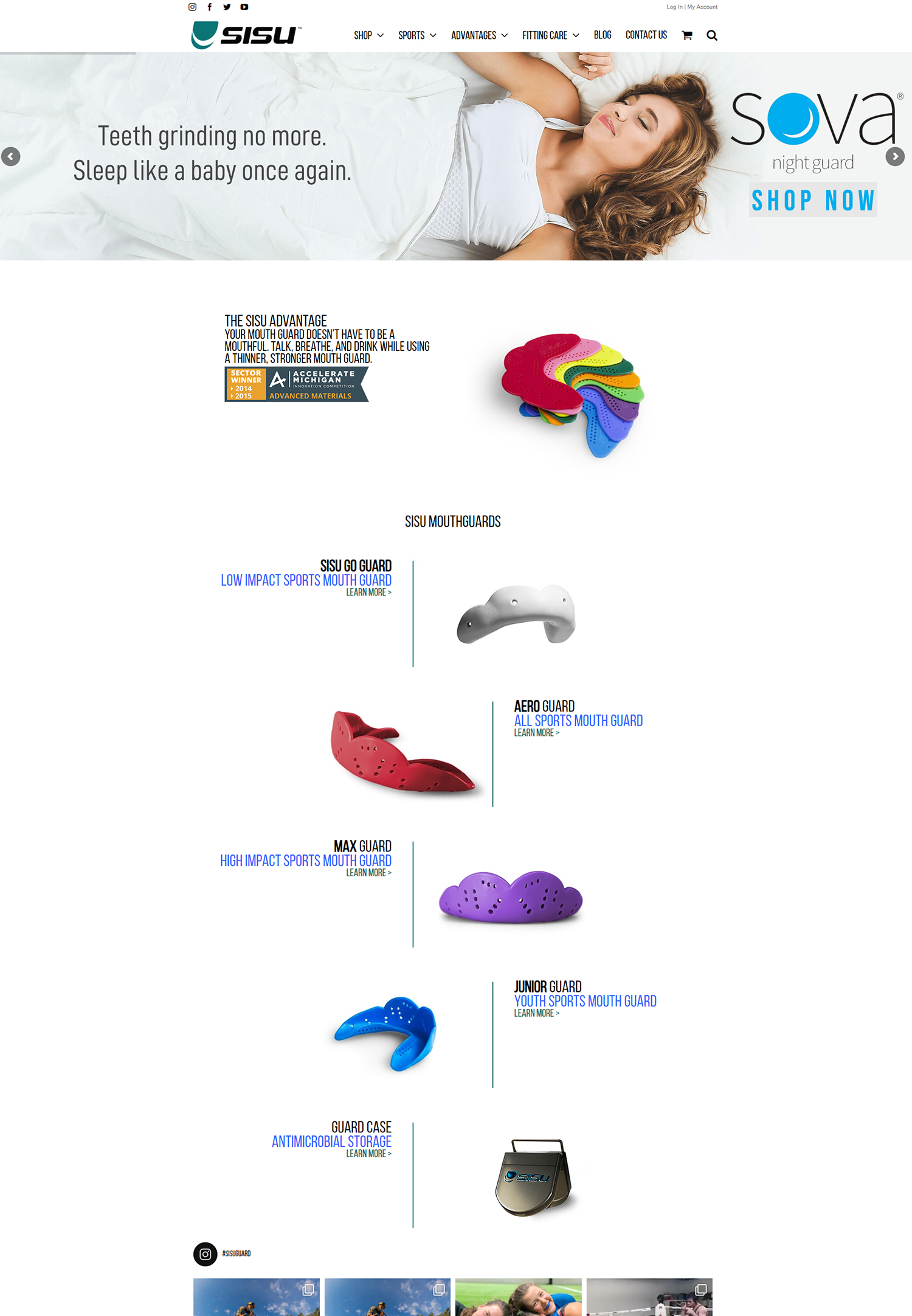
In order to grab users’ attention, a call-to-action’s visual design is crucial. A call to action needs to be prominent on the page while maintaining the website’s overall design. Bold typography, contrasting colors, and well-placed elements can all help achieve this balance.
The eye can be drawn straight to the CTA button, for example, by using a vivid color that stands out against the background. Moreover, using larger fonts can improve the text’s readability and friendliness. Users should be compelled to act right away by the design’s excitement or sense of urgency. Its effectiveness is also greatly influenced by the CTA button’s size and shape, in addition to color & typeface. Whereas sharp edges may imply professionalism and seriousness, rounded corners frequently suggest friendliness and accessibility. The size shouldn’t be so big that it overpowers other content on the page, but it should be big enough to click on with ease on desktop & mobile devices.
Adding images or icons to the text can improve its visual appeal and give the requested action context. In the end, a visually appealing call to action should complement the brand’s identity and message in addition to drawing attention. Clear & Action-Oriented Wording. Language that is persuasive should be succinct, understandable, and action-oriented. Words like “Get Started,” “Download Now,” or “Join Free for a Month” give users a sense of urgency and motivate them to act right away.
Emotional triggers and value communication. In order for users to comprehend the benefits of clicking on the call to action, it is imperative that the value proposition be communicated in a concise manner. Rather than just saying “Sign Up,” “Join Our Community for Exclusive Tips” might be a stronger recommendation. CTA copy can become more persuasive by including emotional triggers. Phrases that arouse curiosity, excitement, or even FOMO (fear of missing out) can spur users to take immediate action.
Customization and Audience Understanding.
“Limited Time Offer” and “Don’t Miss Out” are examples of phrases that can compel users to click by instilling a sense of urgency. Using “you” or “your” to address the user directly can also personalize the copy, build rapport, and make the call to action seem more pertinent to their needs. Persuasive copywriting is ultimately about knowing your audience and creating messages that appeal to them. CTA placement on landing pages is essential to optimizing their efficacy. By placing the call to action at the ideal point in the user’s journey, it can dramatically boost conversion rates.
CTAs should normally be placed above the fold, where users can see them without scrolling, so they are present as soon as they land on the page. However, it’s also advantageous to include extra calls to action (CTAs) throughout the content, particularly following important points or strong arguments that emphasize the advantages of acting. Also, when choosing where to place a call to action, user behavior must be taken into account.
Where users are most likely to interact with calls to action (CTAs) can be determined by examining how they navigate your landing page. For example, you can grab users’ attention when they are most interested in your content by including a call to action (CTA) at the conclusion of an engaging blog post or after an educational video. Also, unobtrusive reminders to take action can be achieved by using sticky CTAs, which stay visible as users scroll down the page. Knowing user flow & placing CTAs where they will have the biggest impact are key components of strategic placement. An essential technique for improving call-to-actions and increasing their efficacy over time is A/B testing.
This approach entails developing two CTA variations—for example, with different colors, copy, or placements—and comparing them to see which one generates higher conversion rates. Through methodical examination of user reactions to these variations, marketers can learn more about what appeals to their target audience. CTAs can be continuously improved & refined using this data-driven approach, which is based on actual user behavior rather than conjecture. Also, A/B testing can cover more extensive modifications like distinct landing page designs or complete user flows; it shouldn’t be restricted to just one element at a time. To precisely evaluate a variable’s effect on performance, it is necessary to test it one at a time.
Businesses can use A/B test results to guide their future marketing strategies & make well-informed choices regarding their call to action. By adopting a culture of experimentation and analysis, businesses can make sure that their calls to action (CTAs) continue to work in the constantly changing digital landscape. Adding elements of scarcity and urgency to call-to-actions can greatly increase their effectiveness by encouraging users to take immediate action. People tend to act faster to avoid missing out on opportunities when they believe that they are limited, whether because of time constraints or availability issues. Words like “Only 3 Spots Left!” and “Sale Ends Tonight!” instill a sense of urgency in users, prompting them to act sooner than they otherwise might.
FOMO, or the fear of missing out, is a psychological trigger that can be a strong motivator for increasing conversions. But it’s crucial to apply scarcity and urgency in a morally and openly responsible manner. Falsely scaring users can undermine trust and result in unfavorable opinions about your company.
Instead, concentrate on sincere offers that represent current restrictions or unique opportunities. For example, make sure your calls to action (CTAs) make it clear that you are running a limited-time promotion or that you have a limited quantity of products available. Effective use of urgency and scarcity can help companies craft strong calls to action that appeal to consumers without compromising their integrity. The Influence of Social Proof. A strong psychological phenomenon known as “social proof” occurs when people use the deeds and behaviors of others to influence their own choices.
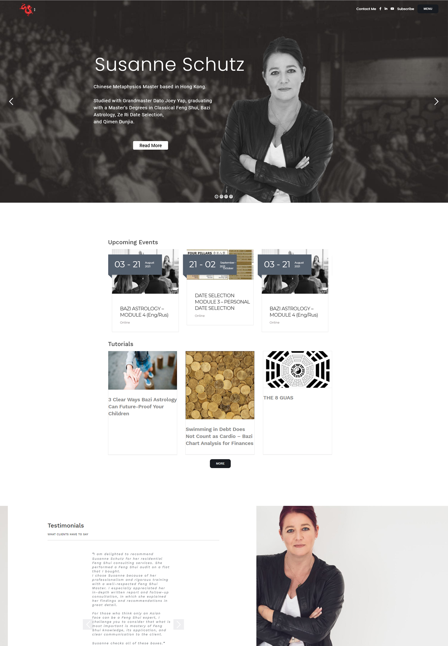
Adding social proof to call-to-actions can boost their legitimacy and motivate users to act by highlighting other people’s positive experiences. Testimonials, user reviews, or data showing the number of people who have already benefited from an offer could be examples of this. Good CTA Examples of Social Proof. For example, “Join 10,000 Happy Customers!” is a CTA that gives prospective customers confidence in their choice in addition to social validation. Visual components like customer testimonials or star ratings can also be used to further support social proof in CTAs.
Users are more likely to feel confident about selecting a product or service themselves when they observe that others have benefited from it. advantages in online shopping environments. This tactic works especially well in online retail environments where prospective customers might be hesitant because they are unsure about the quality of the products or the dependability of the services.
Social proof can be incorporated into CTAs to help businesses tell an engaging story that entices users to become part of a community of happy customers. establishing confidence and trust. Businesses can gain the confidence and trust of potential clients by highlighting the positive experiences of others. More conversions and a better reputation for the brand may result from this in the end.
In-depth measurement and analysis procedures are necessary for businesses to fully comprehend how call-to-actions affect conversion rates. CTA performance on landing pages can be better understood by looking at key performance indicators (KPIs) like click-through rates (CTR), conversion rates, and bounce rates. Marketers can find trends and patterns that guide future CTA optimization strategies by monitoring these metrics over time. For example, it might be necessary to redesign or rewrite a CTA to better meet user expectations if it routinely performs worse than others.
Also, using resources like heat mapping software or Google Analytics can offer more in-depth understanding of user behavior related to CTAs. By using heat maps to visually depict the areas of a page where users click the most, marketers can determine whether call-to-actions are positioned correctly or if they need to be moved for increased visibility. Also, examining user input from surveys or direct comments can provide qualitative information to support quantitative measurements.
Businesses can gain a thorough understanding of the efficacy of their CTAs and make well-informed decisions for continuous optimization by integrating these analytical techniques. Finally, in today’s cutthroat digital landscape, any company hoping to succeed must learn how to use call-to-actions. Every element, from comprehending their significance to creating aesthetically pleasing components & crafting compelling copy, is essential in directing users toward desired actions.
Companies can create effective calls-to-action that increase conversions and build enduring relationships with customers by carefully placing CTAs on landing pages, optimizing with A/B testing, utilizing urgency and scarcity, integrating social proof, & closely monitoring results.
When crafting compelling call-to-actions on your landing pages, it’s crucial to understand the broader context of digital marketing and website design. An excellent resource that complements this topic is an article that discusses the essential questions to ask a website design company. This article, which you can read in full here, provides insights into what makes a website effective and how to ensure your website aligns with your business goals. Understanding these fundamentals can significantly enhance how you implement call-to-actions on your site, ensuring they are both effective and aligned with your overall digital strategy.


