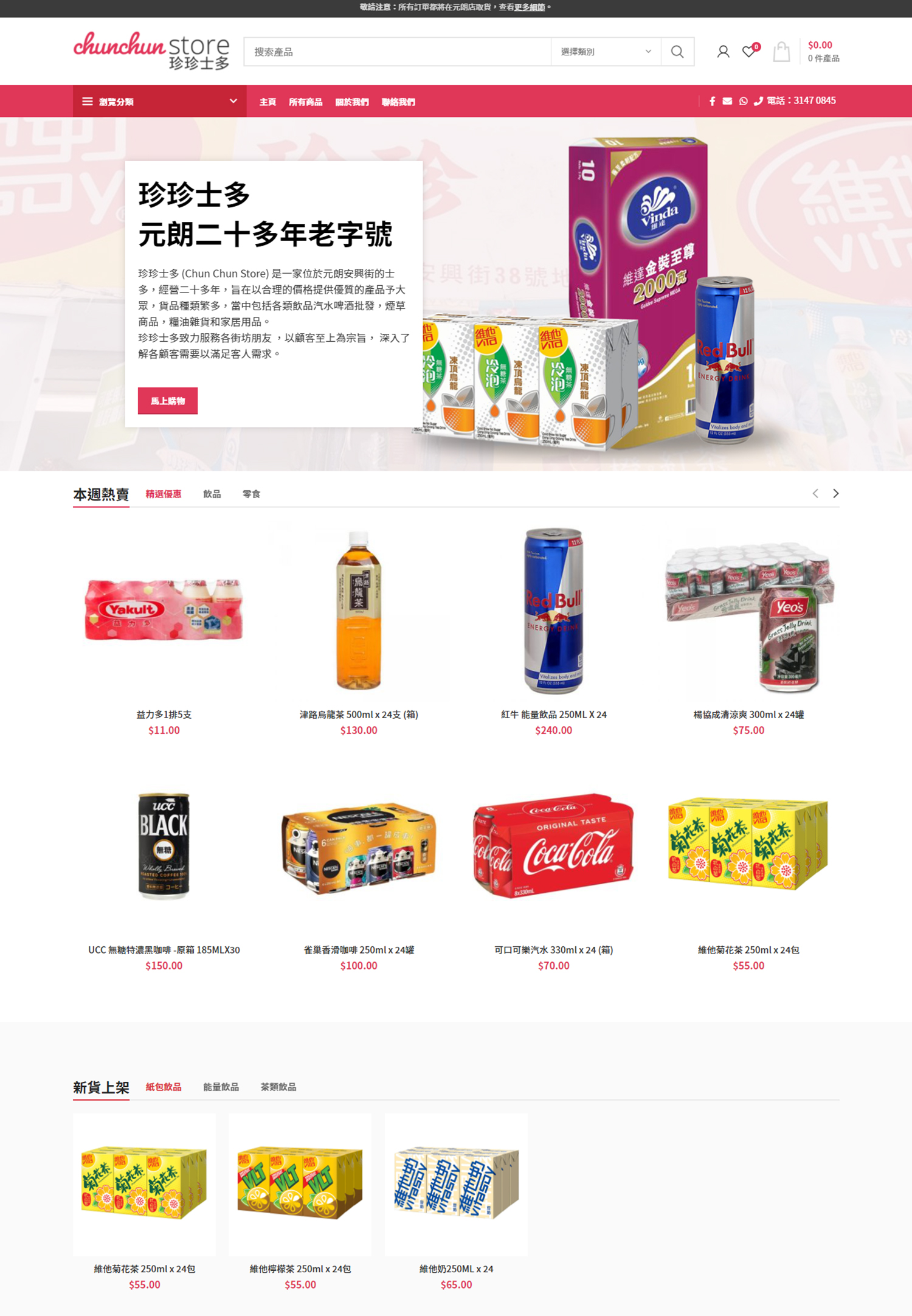
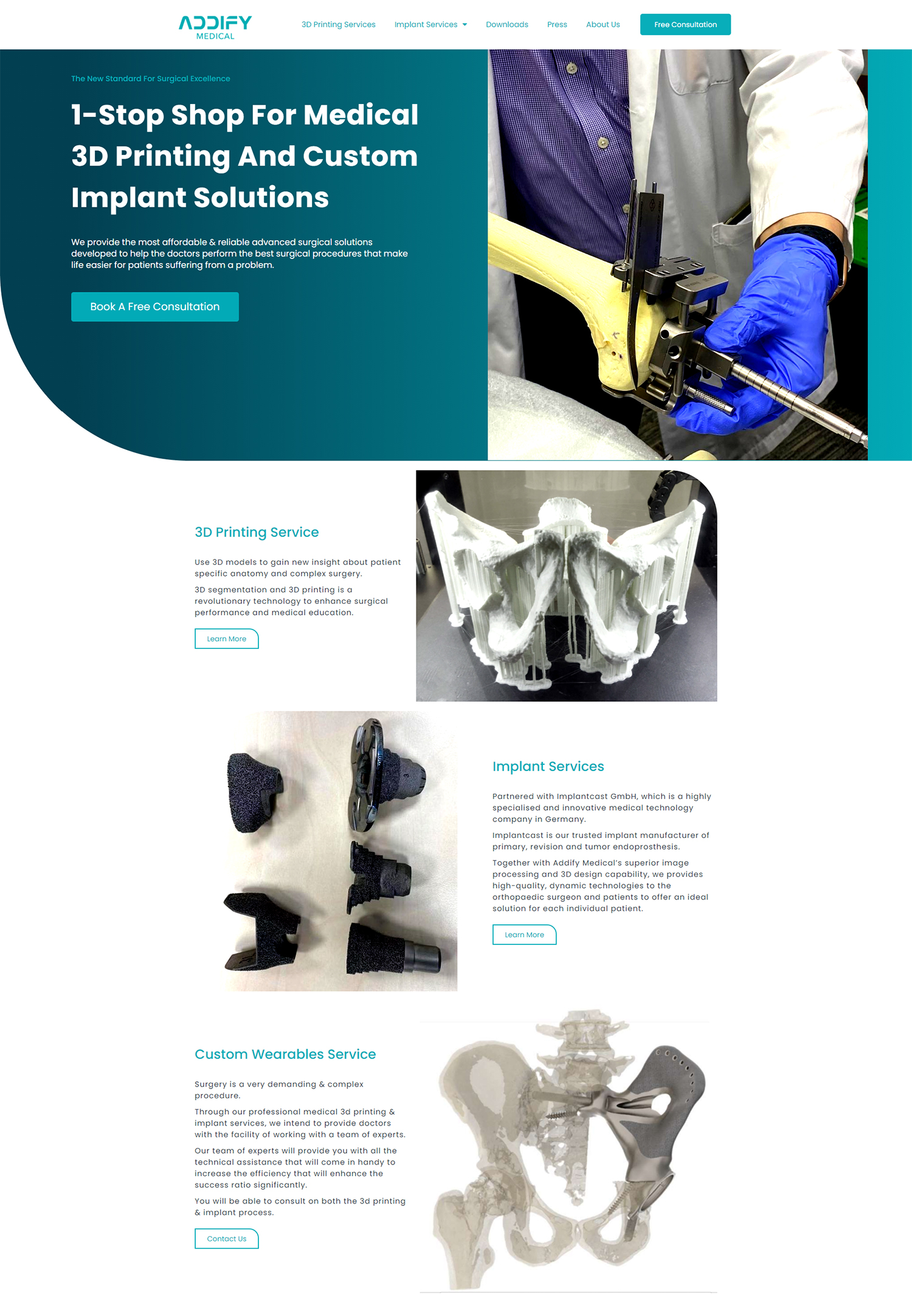
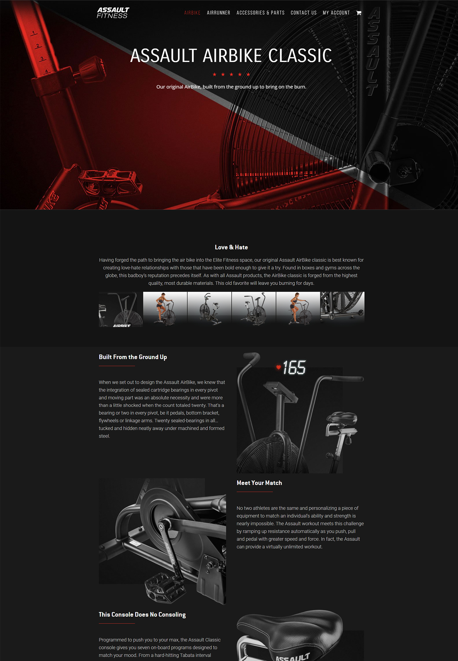
Minimalism in design is a concept that focuses on simplicity and the removal of unnecessary elements. It is a design approach that emphasizes clean lines, ample white space, and a limited color palette. Minimalist design has gained popularity in recent years due to its ability to create a sleek and modern aesthetic. In the world of branding, minimalist design plays a crucial role in creating a strong and memorable brand identity.
The Basics of Minimalism in Design
Minimalism in design can be defined as a style that uses simple and clean elements to create a visually appealing composition. It is characterized by the use of basic shapes, limited color palettes, and a focus on negative space. Minimalist design aims to convey the essence of an idea or message without any unnecessary distractions.
Some key characteristics of minimalist design include:
1. Simplicity: Minimalist designs are stripped down to their essential elements, eliminating any unnecessary details or embellishments.
2. Clean Lines: Minimalist designs often feature straight lines and geometric shapes, creating a sense of order and balance.
3. Limited Color Palette: Minimalist designs typically use a limited color palette, often consisting of neutral colors such as black, white, and gray.
Examples of minimalist design can be seen in various fields such as architecture, interior design, and graphic design. One famous example is the work of Swiss graphic designer Josef Müller-Brockmann, who is known for his minimalist posters that use simple shapes and typography to convey information.
The Role of White Space in Minimalist Design
White space, also known as negative space, refers to the empty space between design elements. In minimalist design, white space plays a crucial role in creating balance and harmony within a composition. It allows the viewer’s eyes to rest and helps to highlight the important elements of the design.
White space is not just empty space; it is an intentional design element that adds visual interest and enhances the overall composition. It can be used to create a sense of elegance, sophistication, and clarity in minimalist designs.
Examples of effective use of white space in minimalist design can be seen in the branding of companies such as Apple and Nike. Both brands use ample white space in their logos and advertisements, allowing their iconic symbols to stand out and make a strong impact.
How to Use White Space Effectively in Design
Using white space effectively in minimalist design requires careful consideration and attention to detail. Here are some tips for using white space effectively:
1. Give Elements Room to Breathe: Allow enough space between design elements to create a sense of balance and clarity. Avoid overcrowding the composition with too many elements.
2. Use White Space to Guide the Viewer’s Eye: Use white space strategically to direct the viewer’s attention to the most important elements of the design. This can be achieved by creating a focal point or using white space to create a visual hierarchy.
3. Experiment with Different Layouts: Play around with different arrangements of elements and white space to find the most visually pleasing composition. Don’t be afraid to try unconventional layouts that challenge traditional design norms.
Examples of effective use of white space in different design elements include using ample white space around text to improve readability, using white space between images to create a sense of separation, and using white space around a logo to make it stand out.
The Benefits of Minimalist Design for Your Brand
Minimalist design offers several advantages for branding purposes. Here are some benefits of minimalist design for your brand:
1. Clarity and Simplicity: Minimalist designs are easy to understand and communicate your brand message clearly. By removing unnecessary elements, you can focus on what is essential and create a strong visual identity for your brand.
2. Timelessness: Minimalist designs have a timeless quality that can withstand changing trends and fads. By focusing on simplicity and clean lines, your brand can maintain a modern and fresh look for years to come.
3. Versatility: Minimalist designs are versatile and can be easily adapted to different mediums and platforms. Whether it’s a logo, packaging, or website design, minimalist elements can be scaled and adjusted to fit any format.
Examples of successful brands that use minimalist design include Coca-Cola, Airbnb, and Google. These brands have embraced minimalism to create memorable and recognizable brand identities.
The Psychology Behind Minimalism in Design

Minimalist design has a psychological impact on viewers and can evoke certain emotions and perceptions. The simplicity and clarity of minimalist designs can create a sense of calmness, order, and sophistication.
Minimalist design also appeals to our desire for simplicity in a world that is often cluttered with information and distractions. By removing unnecessary elements, minimalist designs allow us to focus on what is essential and meaningful.
In terms of consumer behavior, minimalist design can create a sense of trust and credibility. The clean and uncluttered aesthetic of minimalist designs can convey a sense of professionalism and attention to detail, which can positively influence consumer perceptions of a brand.
The Impact of Minimalism on User Experience
Minimalist design has a significant impact on user experience (UX). By removing unnecessary elements and focusing on what is essential, minimalist designs can improve usability and make it easier for users to navigate and interact with a website or application.
Minimalist design also helps to reduce cognitive load by presenting information in a clear and organized manner. This allows users to process information more efficiently and make decisions more easily.
Examples of minimalist design in user interfaces can be seen in popular apps such as Instagram and Spotify. Both apps use clean layouts, simple icons, and ample white space to create an intuitive user experience.
The Dos and Don’ts of Minimalist Design
When creating minimalist designs, it’s important to follow certain guidelines to ensure effectiveness. Here are some dos and don’ts of minimalist design:
Dos:
– Do use ample white space to create a sense of balance and clarity.
– Do use a limited color palette to create a cohesive and harmonious design.
– Do focus on typography and use it as a design element.
– Do experiment with different layouts and compositions to find the most visually pleasing arrangement.
Don’ts:
– Don’t overcrowd the composition with too many elements.
– Don’t use unnecessary embellishments or decorative elements.
– Don’t sacrifice readability for the sake of minimalism.
– Don’t be afraid to break the rules and try unconventional layouts.
The Importance of Consistency in Minimalist Design
Consistency is crucial in minimalist design to create a strong and cohesive brand identity. Consistent use of typography, color palette, and layout helps to establish brand recognition and build trust with consumers.
Consistency also helps to create a seamless user experience across different touchpoints. Whether it’s a website, social media, or packaging, maintaining consistency in minimalist design ensures that your brand is easily recognizable and memorable.
Examples of consistent minimalist design can be seen in brands such as Apple and Muji. Both brands have established a consistent visual identity that is instantly recognizable and reflects their core values.
How to Create Minimalist Designs That Stand Out
Creating unique minimalist designs requires thinking outside the box and pushing the boundaries of traditional design norms. Here are some tips for creating minimalist designs that stand out:
1. Experiment with Typography: Typography plays a crucial role in minimalist design. Try using unique fonts or experimenting with different letterforms to create a distinctive look.
2. Play with Negative Space: Use white space creatively to create interesting shapes or patterns within your design. This can add visual interest and make your design more memorable.
3. Incorporate Texture: While minimalist designs typically focus on simplicity, adding subtle textures can create depth and visual interest. Experiment with different textures to add a tactile element to your design.
Examples of minimalist designs that stand out include the branding of brands such as Nike and Adidas. Both brands have managed to create minimalist designs that are instantly recognizable and have become iconic in their respective industries.
The Future of Minimalism in Design and Branding
Minimalism in design and branding is expected to continue to grow in popularity in the future. As technology advances and attention spans shorten, minimalist design offers a solution to cut through the noise and deliver a clear and concise message.
Trends in minimalist design include the use of bold typography, asymmetrical layouts, and the incorporation of motion and animation. These trends add a dynamic element to minimalist designs and help to create a more engaging user experience.
In terms of branding, minimalist design will continue to be favored for its simplicity, timelessness, and versatility. Brands will continue to embrace minimalism to create strong and memorable brand identities that resonate with consumers.
In conclusion, minimalist design plays a crucial role in branding by creating a strong and memorable brand identity. By focusing on simplicity, clean lines, and ample white space, minimalist designs convey clarity, sophistication, and order.
White space is an essential element in minimalist design as it helps to create balance, highlight important elements, and enhance the overall composition. Effective use of white space requires careful consideration and attention to detail.
Minimalist design offers several benefits for brands, including clarity, timelessness, and versatility. It has a psychological impact on viewers and can positively influence consumer behavior.
To create effective minimalist designs, it’s important to follow certain guidelines and avoid common mistakes. Consistency is also crucial in minimalist design to establish brand recognition and build trust with consumers.
Creating unique minimalist designs requires thinking outside the box and experimenting with different elements such as typography, negative space, and texture.
The future of minimalism in design and branding looks promising, with trends focusing on bold typography, asymmetrical layouts, and the incorporation of motion and animation.
In a world that is often cluttered with information and distractions, minimalist design offers a solution to cut through the noise and deliver a clear and concise message. By embracing minimalism, brands can create a strong and memorable visual identity that resonates with consumers.
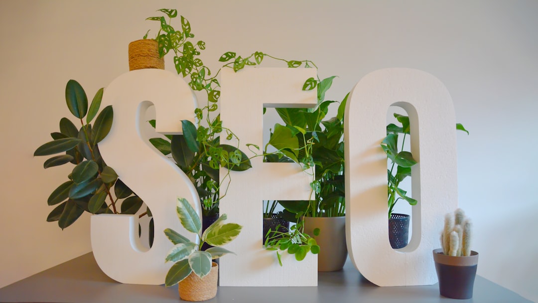
If you’re interested in learning more about the effective use of white space in web design, you might also find this article on “7 Reasons Why Your Coaching Business Needs a Website and Digital Marketing” helpful. It discusses the importance of creating a professional online presence for your coaching business and how strategic web design, including the use of white space, can enhance your brand image and attract more clients. Check it out here.
FAQs
What is white space?
White space, also known as negative space, is the area between design elements in a layout that is left intentionally blank.
Why is white space important in design?
White space helps to improve the readability and visual appeal of a design by creating a sense of balance and hierarchy. It also helps to draw attention to important elements and makes the design look less cluttered.
How can white space be used effectively?
White space can be used effectively by using it to create a clear visual hierarchy, separating different elements, and emphasizing important content. It can also be used to create a sense of flow and guide the viewer’s eye through the design.
What are some common mistakes when using white space?
Common mistakes when using white space include not leaving enough space, leaving too much space, and not using it consistently throughout the design. It’s important to strike a balance between using enough white space to create a clean and organized design, but not so much that it looks empty or unfinished.
Can white space be used in all types of design?
Yes, white space can be used in all types of design, including print, web, and mobile. It’s a fundamental design principle that can be applied to any medium.