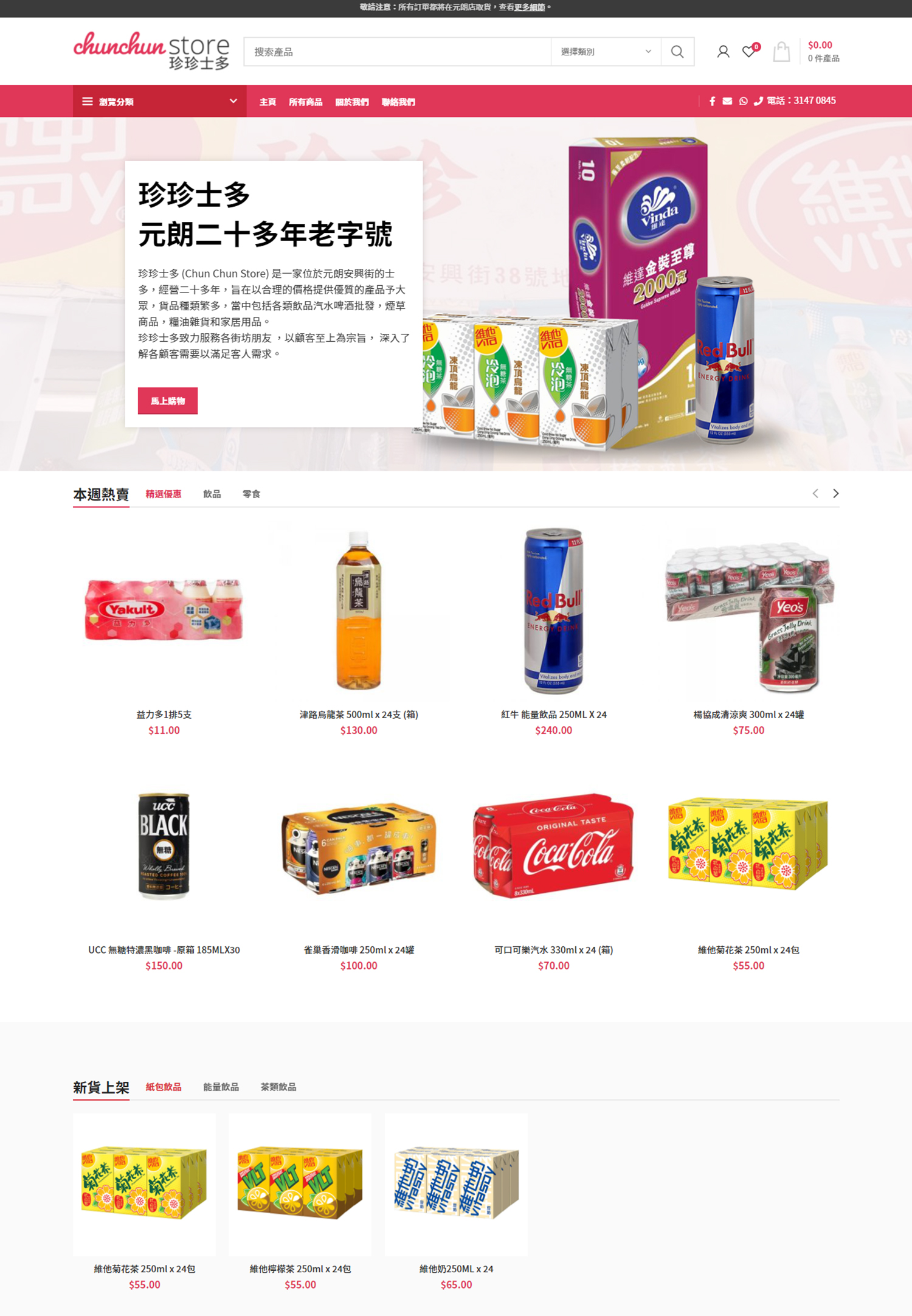
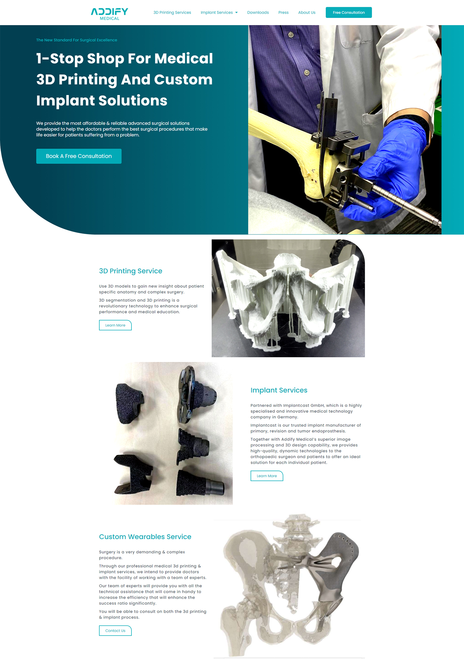
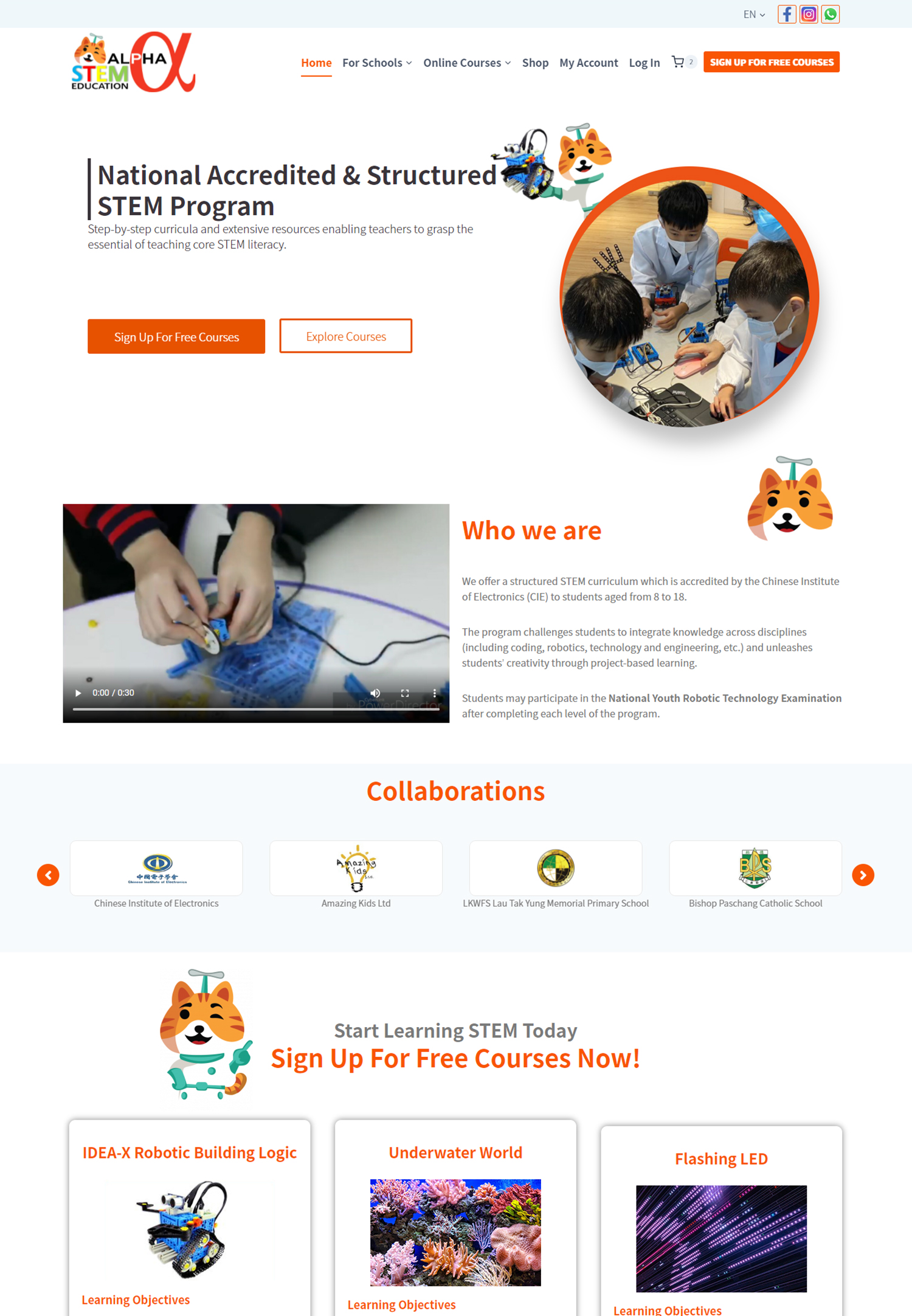
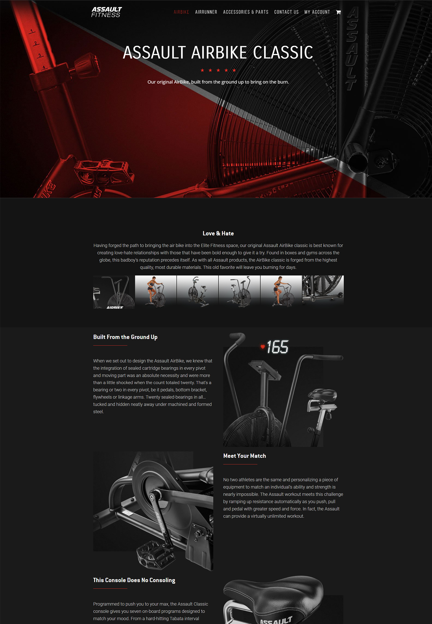
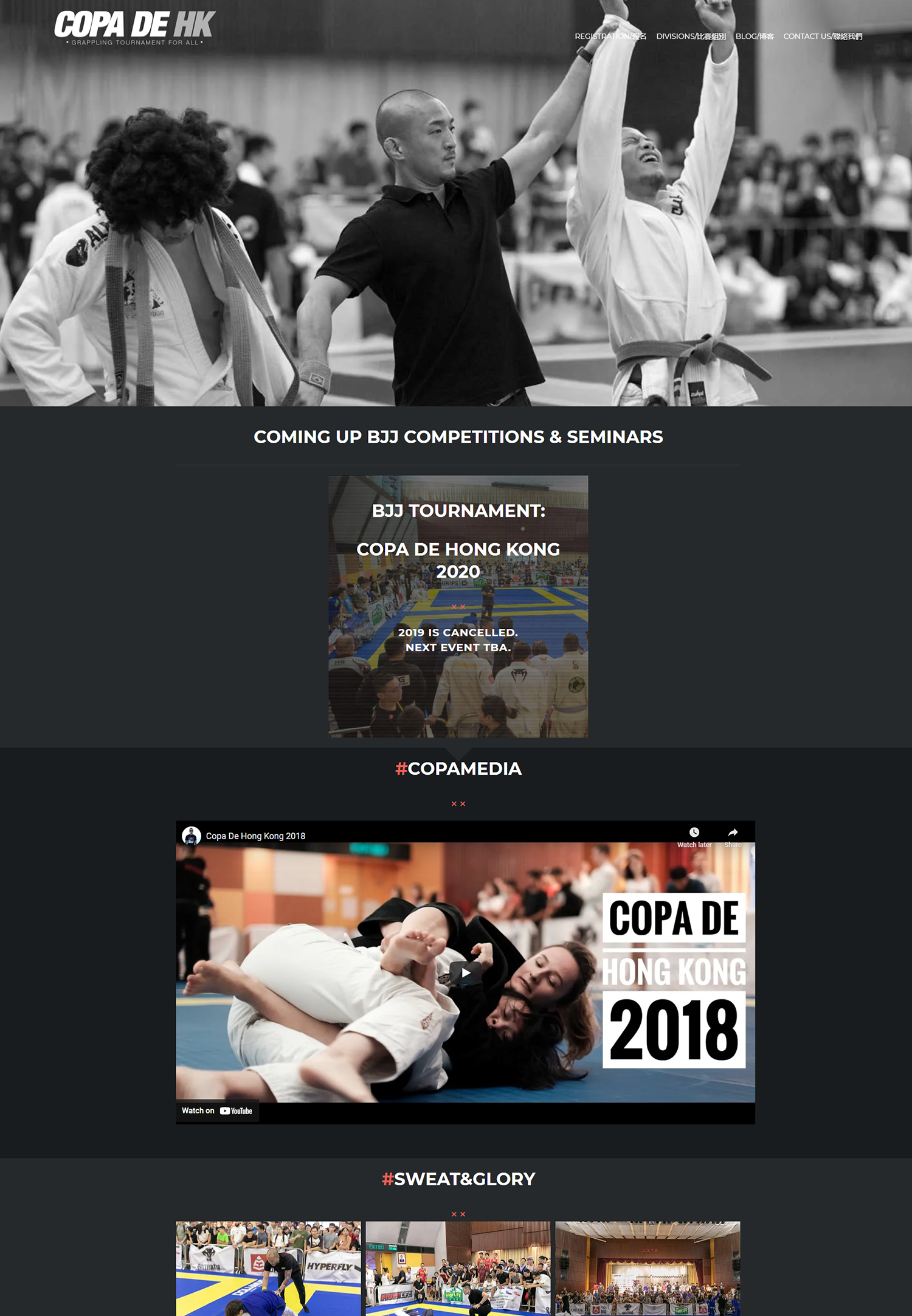
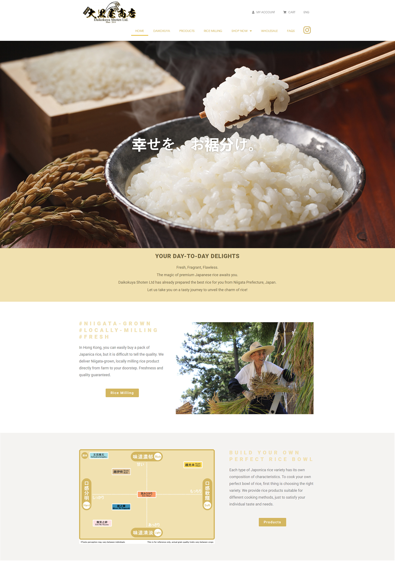
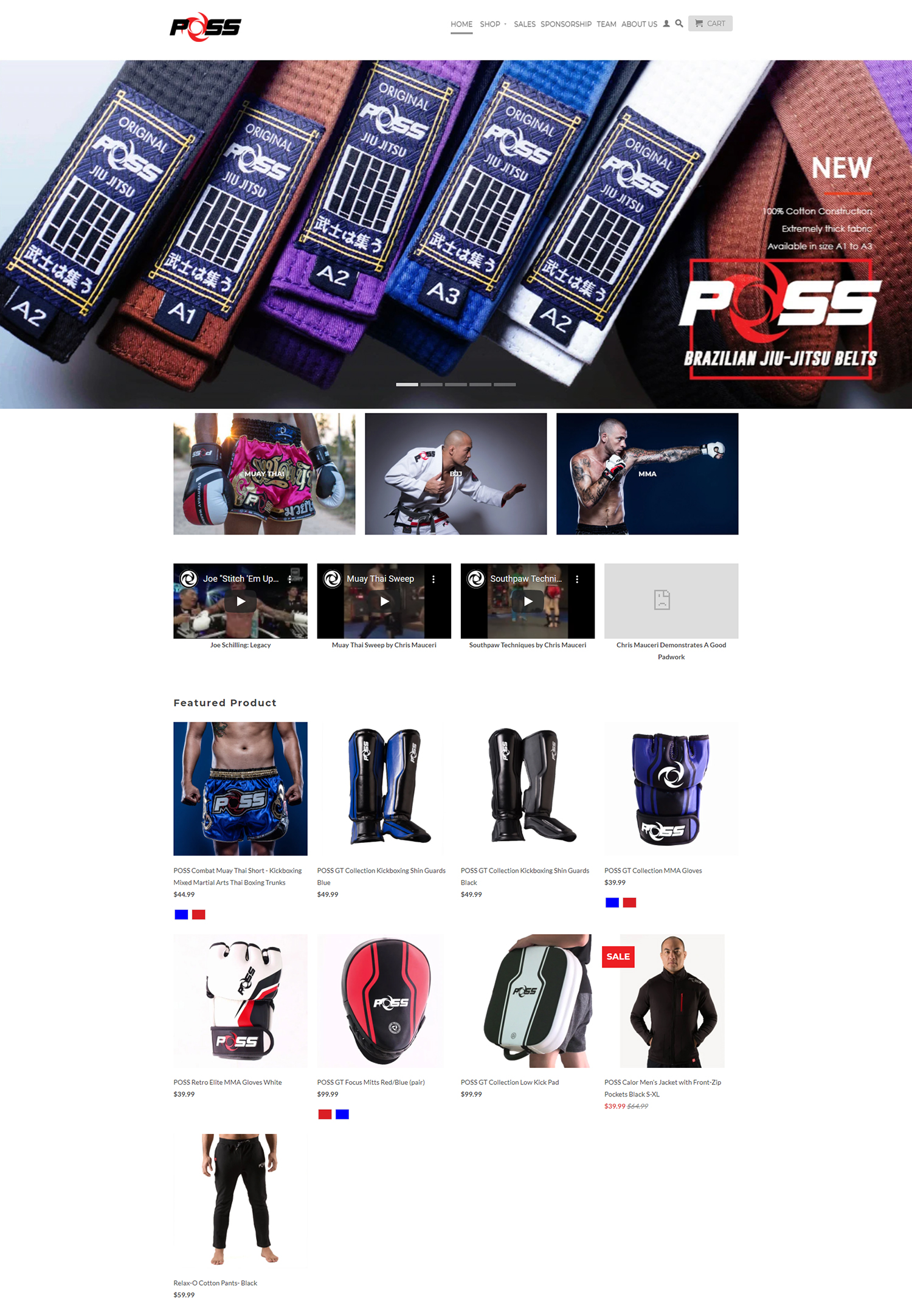
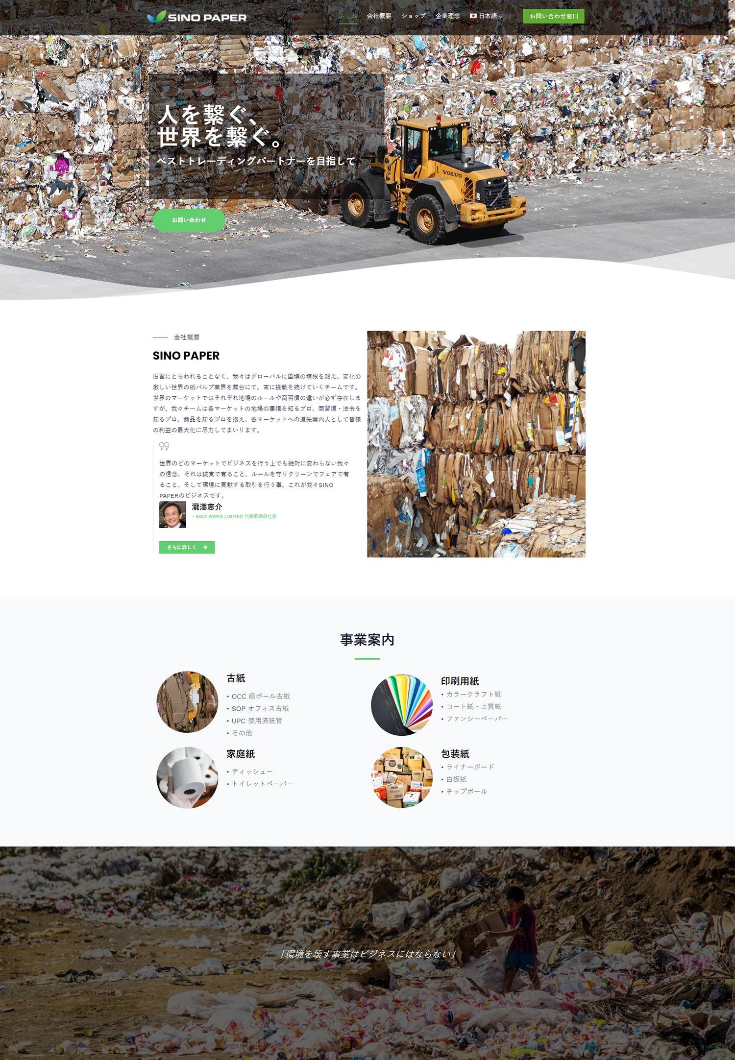
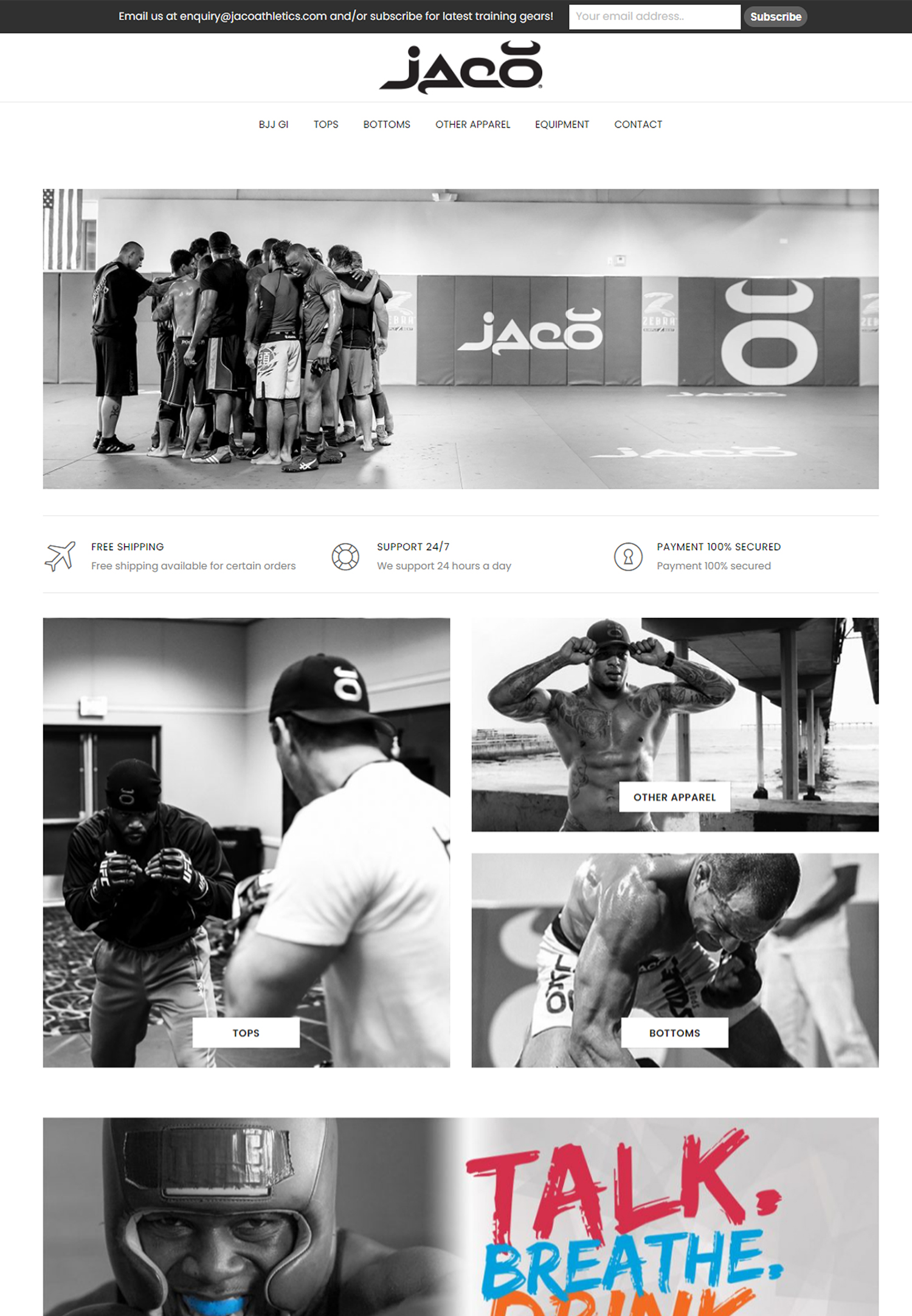
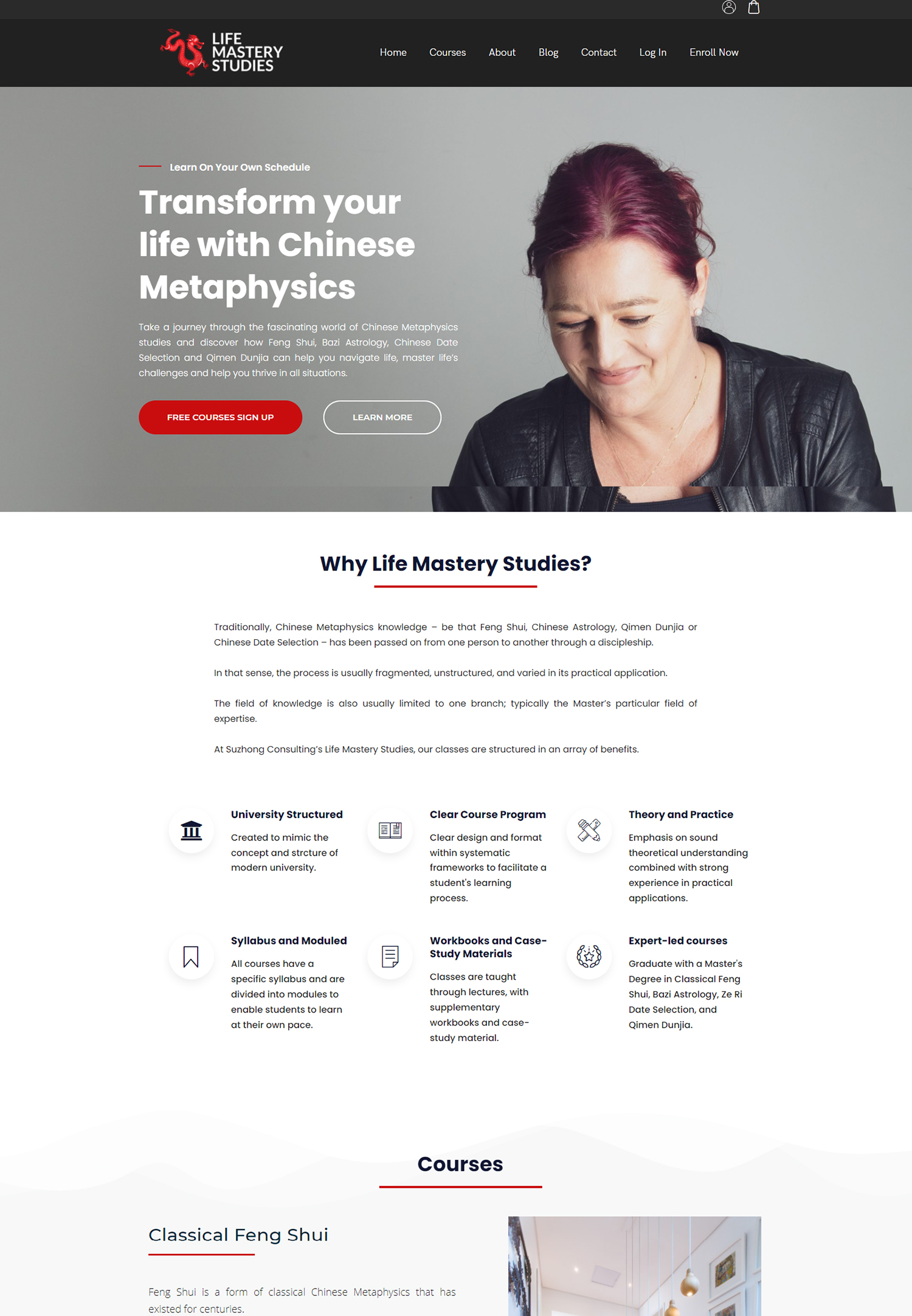
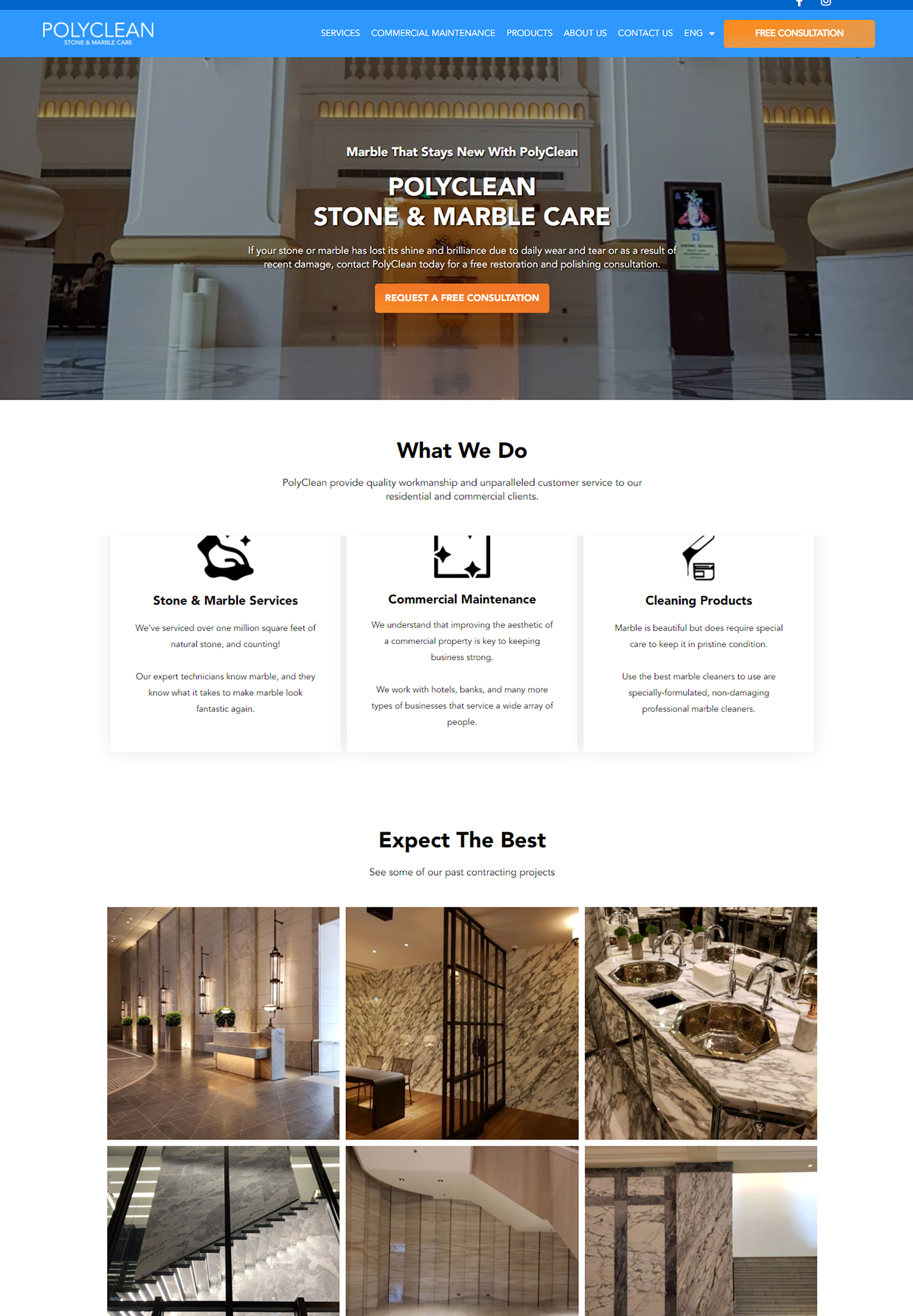
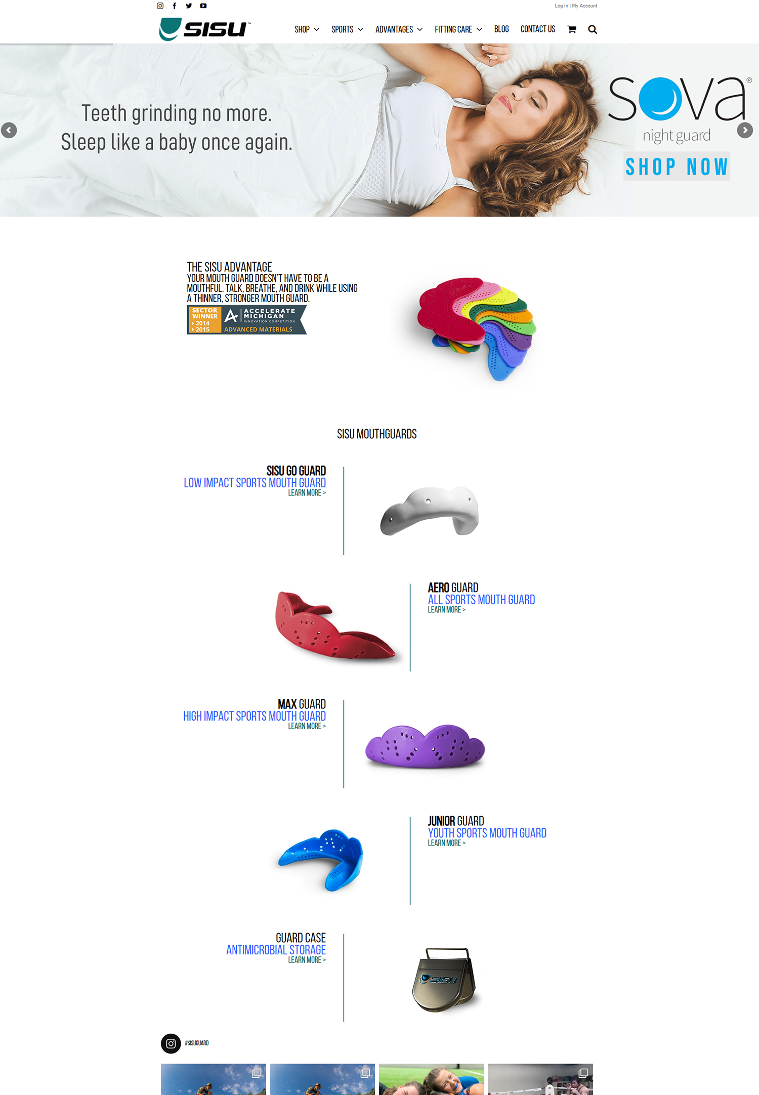
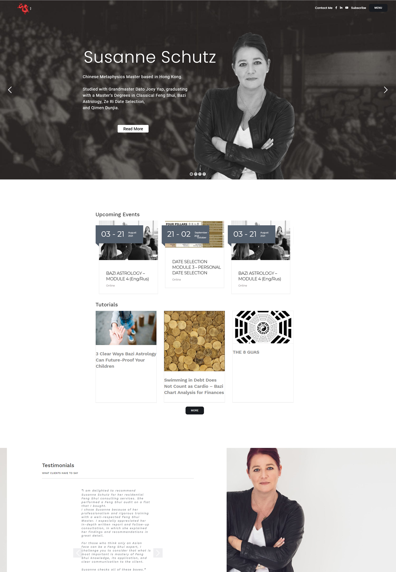
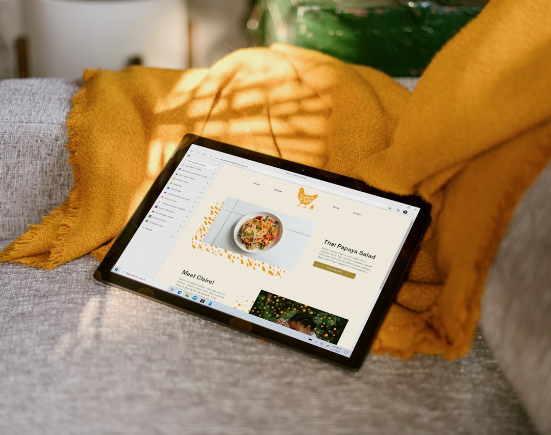
Web design trends are continuously evolving, influenced by technological advancements, user behavior patterns, and shifting aesthetic preferences. The expanding digital landscape challenges web designers to innovate and create websites that balance visual appeal with functionality and user-friendliness. Recent years have witnessed a trend towards minimalist and clean layouts, responsive design for mobile compatibility, video content integration, bold typography usage, localized content and language incorporation, and a focus on user experience and accessibility.
These elements have become fundamental in contemporary web design, influencing website development and user interaction. The increasing prevalence of mobile users has made responsive design a critical component of web design. Given the diverse range of devices and screen sizes available, websites must adapt to provide a consistent experience across all platforms.
This necessity has led to the development of responsive design techniques that enable websites to automatically adjust their layout and content based on the user’s device. This trend has not only enhanced user experience but has also become a standard practice in web design, ensuring broader accessibility.
Key Takeaways
- Web design trends are constantly evolving and it’s important to stay updated with the latest developments.
- Responsive design is crucial for ensuring a seamless experience for mobile users.
- Minimalistic and clean layouts are popular as they provide a clutter-free and visually appealing interface.
- Integration of video content can enhance user engagement and provide dynamic visual elements.
- Bold typography can make a strong visual impact and improve readability on websites.
- Incorporating localized content and language can help in reaching and engaging with specific target audiences.
- Emphasizing user experience and accessibility is essential for creating inclusive and user-friendly websites.
Responsive Design for Mobile Users
Why Responsive Design Matters
Responsive design has become the go-to solution for ensuring that websites are accessible and functional across all devices. This approach allows web designers to create flexible layouts that can adapt to different screen sizes, ensuring that users have a consistent experience regardless of the device they are using.
Key Benefits of Responsive Design
By utilizing fluid grids, flexible images, and media queries, responsive design enables websites to dynamically adjust their content and layout, providing an optimal viewing experience for users. In addition to improving user experience, responsive design also has practical benefits for website owners. By having a single website that can cater to all devices, businesses can save time and resources on managing multiple versions of their site.
A Fundamental Aspect of Web Design
This not only streamlines the development process but also makes it easier to maintain and update the website in the long run. With mobile usage continuing to grow, responsive design has become a fundamental aspect of web design, ensuring that websites remain relevant and accessible in today’s digital landscape.
Minimalistic and Clean Layouts
In recent years, there has been a noticeable shift towards minimalistic and clean layouts in web design. This trend emphasizes simplicity and clarity, focusing on essential elements and removing unnecessary clutter. Minimalistic designs often feature ample white space, simple typography, and a limited color palette, creating a clean and uncluttered aesthetic.
This approach not only enhances visual appeal but also improves usability by making it easier for users to navigate and digest content. The rise of minimalistic and clean layouts can be attributed to several factors, including the need for faster loading times, improved readability, and a focus on content. By stripping away unnecessary elements and distractions, web designers can create websites that are visually engaging and easy to use.
This trend has also been influenced by the rise of mobile usage, as minimalistic designs tend to perform well on smaller screens and slower connections. As a result, minimalistic and clean layouts have become a popular choice for modern websites, reflecting a shift towards simplicity and functionality in web design.
Integration of Video Content
Video content has become an integral part of web design, offering a dynamic and engaging way to communicate with users. The integration of video content allows websites to convey information in a more compelling and immersive manner, capturing the attention of visitors and enhancing the overall user experience. Whether used for product demonstrations, storytelling, or background visuals, videos have the power to convey emotions and messages in a way that static images and text cannot.
The rise of video content in web design can be attributed to advancements in technology, increased internet speeds, and the growing popularity of video platforms such as YouTube and Vimeo. These factors have made it easier for web designers to incorporate video content into their websites, leading to a surge in video backgrounds, video headers, and video-based storytelling. This trend has not only added a new dimension to web design but has also provided an opportunity for businesses to showcase their products and services in a more engaging and memorable way.
As video continues to play a significant role in online communication, its integration into web design is expected to remain a prominent trend in the years to come.
Use of Bold Typography
Typography has always been an essential element of web design, but in recent years there has been a noticeable shift towards bold typography. This trend emphasizes large, attention-grabbing typefaces that make a strong visual impact and serve as a focal point on the page. Bold typography is often used for headlines, banners, and call-to-action elements, drawing attention to key messages and creating a sense of hierarchy within the content.
The use of bold typography in web design can be attributed to several factors, including advancements in web fonts, increased browser support for custom typography, and the need for visual differentiation in a crowded digital landscape. Bold typefaces have the power to convey personality and establish brand identity, making them an effective tool for capturing the attention of users. This trend has also been influenced by the rise of mobile usage, as bold typography tends to perform well on smaller screens and limited space.
As a result, bold typography has become a popular choice for modern websites, reflecting a shift towards impactful and expressive visual communication.
Incorporation of Localized Content and Language
Personalized Experiences through Localization
By integrating localized content such as currency, date formats, and imagery, websites can create a more personalized experience that resonates with their target audience.
Driving Global Reach and Relevance
The incorporation of localized content and language in web design is driven by the need for global reach and relevance. As businesses expand their online presence to reach international markets, it becomes essential to consider the cultural nuances and language preferences of different regions.
Building Trust through Localization
By embracing localized content and language, websites can build trust with their audience and demonstrate an understanding of their unique needs and preferences.
Emphasis on User Experience and Accessibility
In today’s digital age, user experience (UX) and accessibility have become paramount considerations in web design. The emphasis on UX focuses on creating intuitive and enjoyable experiences for users, ensuring that websites are easy to navigate, visually appealing, and functional across all devices. Accessibility, on the other hand, aims to make websites inclusive and usable for people with disabilities, providing equal access to information and services.
The emphasis on user experience and accessibility in web design is driven by the need to cater to diverse audiences and provide an inclusive online experience. This trend has led to the adoption of best practices such as clear navigation, intuitive interfaces, fast loading times, and adherence to web accessibility standards such as WCAG (Web Content Accessibility Guidelines). By prioritizing UX and accessibility, web designers can create websites that are not only visually appealing but also user-friendly and inclusive.
This trend reflects a commitment to putting the needs of users first and ensuring that everyone can access and enjoy the content available online. In conclusion, web design trends continue to evolve in response to changes in technology, user behavior, and aesthetic preferences. The rise of responsive design for mobile users, minimalistic and clean layouts, integration of video content, use of bold typography, incorporation of localized content and language, and an emphasis on user experience and accessibility have become essential elements in modern web design.
These trends reflect a shift towards simplicity, functionality, engagement, personalization, inclusivity, and user-centric design principles. As technology continues to advance and user expectations evolve, it is likely that new trends will emerge in web design, shaping the way websites are developed and experienced by users in the future.
If you’re a small business owner in Hong Kong looking to improve your online presence, you may also be interested in learning how to earn money online. Check out this article on earning money online to discover new opportunities for generating income through digital channels. And for more tips on enhancing your digital marketing strategy, visit Populis Digital for insights on how a website and digital marketing can benefit your health and beauty center.


