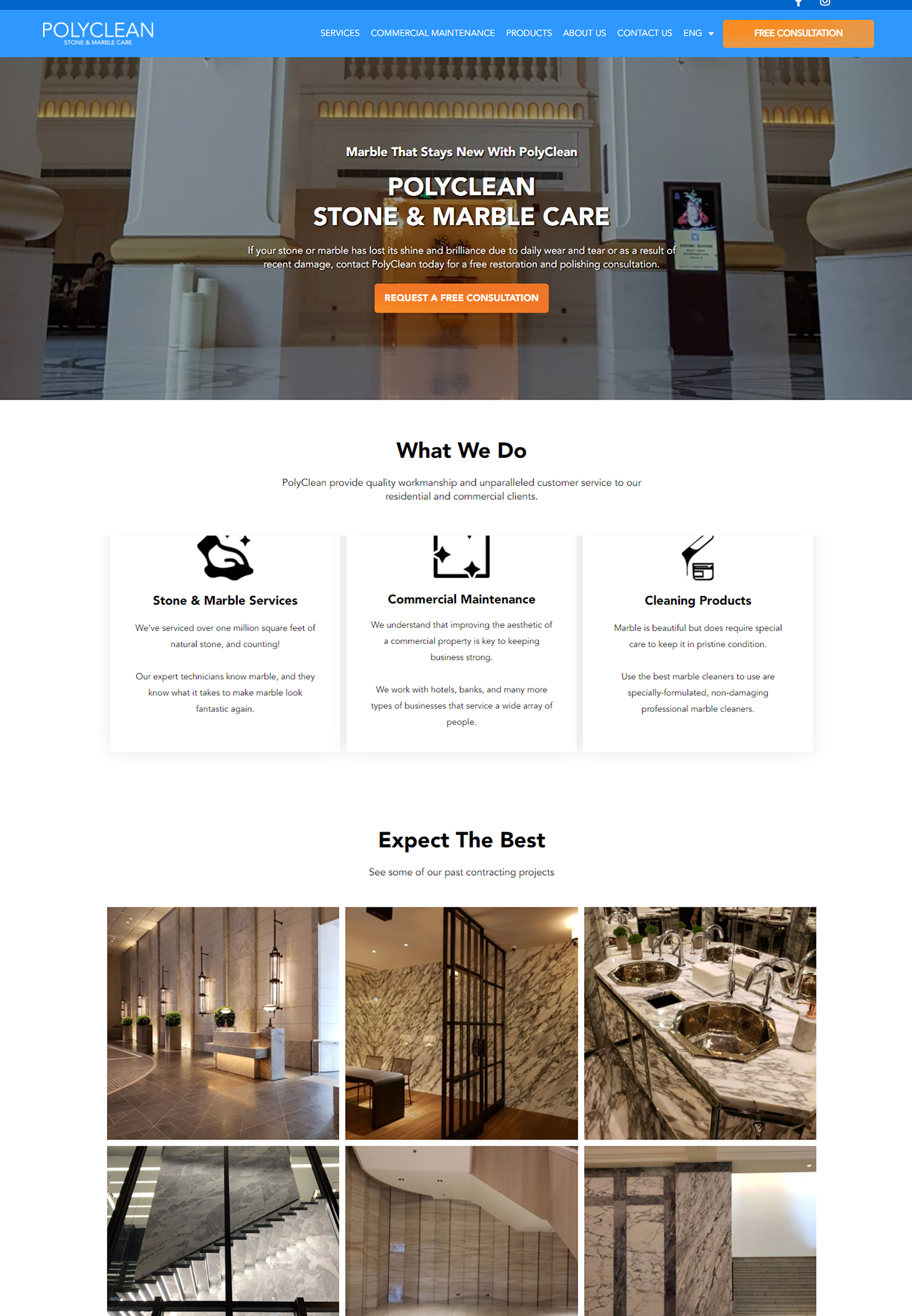
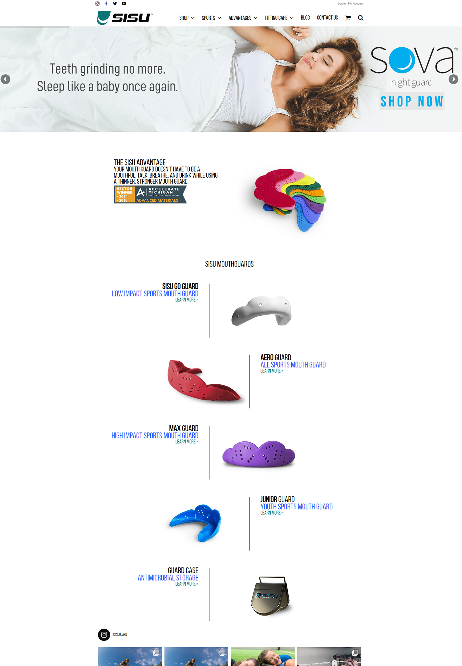
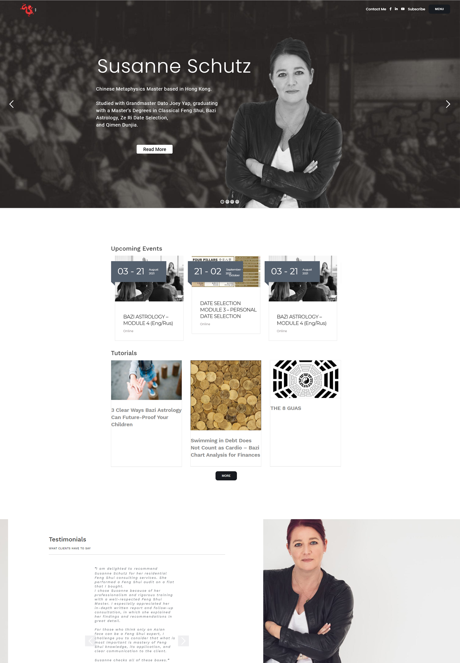
User-friendly navigation and information architecture are crucial elements of a successful website. When users visit a website, they expect to find the information they need quickly and easily. If a website has poor navigation and information architecture, users may become frustrated and leave the site, resulting in lost opportunities for engagement and conversion. On the other hand, a website with clear and concise navigation and information architecture can greatly enhance the user experience, leading to increased engagement, improved conversion rates, and better search engine optimization.
Why User-Friendly Navigation and Information Architecture is Important for Your Website
Poor navigation and information architecture can have a significant impact on the user experience and overall performance of a website. If users are unable to find the information they are looking for or if the navigation is confusing and disorganized, they are likely to leave the site and look for alternatives. This can result in high bounce rates, low engagement, and decreased conversion rates.
On the other hand, a website with clear and concise navigation and information architecture can greatly enhance the user experience. When users can easily navigate through a website and find the information they need, they are more likely to stay on the site longer, engage with the content, and take desired actions such as making a purchase or filling out a form. Additionally, a well-organized website with intuitive navigation can also improve search engine optimization by making it easier for search engines to crawl and index the site.
Understanding the Basics of Information Architecture
Information architecture refers to the organization and structure of content on a website. It involves determining how information should be categorized, labeled, and presented to users in order to facilitate easy navigation and access to information.
The key components of information architecture include organization, labeling, and navigation. Organization involves structuring content in a logical manner so that users can easily find what they are looking for. This can be done through categorization, grouping related content together, and creating a hierarchy of information. Labeling involves using clear and descriptive labels for navigation menus, links, and content categories. Navigation refers to the system of menus, links, and buttons that allow users to move through the website and access different pages and sections.
The Role of Navigation in Enhancing User Experience
Navigation plays a crucial role in enhancing the user experience on a website. It is the primary means by which users move through a website and access different pages and sections. If the navigation is confusing, disorganized, or difficult to use, users may become frustrated and leave the site.
On the other hand, intuitive navigation can greatly improve user engagement and conversion rates. When users can easily find what they are looking for and navigate through a website without any obstacles, they are more likely to stay on the site longer, explore more content, and take desired actions such as making a purchase or filling out a form.
How to Create a Clear and Concise Navigation System
Creating a clear and concise navigation system is essential for improving the user experience on your website. Here are some tips for designing a user-friendly navigation system:
1. Use clear labels: Make sure that your navigation labels are descriptive and easy to understand. Avoid using jargon or ambiguous terms that may confuse users.
2. Organize content logically: Group related content together and create a logical hierarchy of information. This will make it easier for users to find what they are looking for.
3. Minimize the number of clicks required to access information: Try to minimize the number of clicks required for users to access the information they need. This can be done by reducing the number of levels in your navigation menu or by providing quick links or shortcuts to commonly accessed content.
The Benefits of Streamlining Your Website’s Navigation
Streamlining your website’s navigation can have several benefits. Firstly, it improves the user experience by making it easier for users to find what they are looking for. When users can easily navigate through a website and access the information they need, they are more likely to stay on the site longer, engage with the content, and take desired actions.
Secondly, a streamlined navigation system can also improve search engine optimization. When search engines crawl and index a website, they rely on the website’s navigation structure to understand the hierarchy and organization of content. If the navigation is clear and concise, it makes it easier for search engines to crawl and index the site, resulting in better search engine rankings.
Lastly, a streamlined navigation system can also improve website performance. When users can quickly and easily find what they are looking for, they are less likely to become frustrated and leave the site. This can result in lower bounce rates, higher engagement, and increased conversion rates.
Tips for Simplifying Your Website’s Information Architecture
Simplifying your website’s information architecture is essential for improving the user experience. Here are some practical tips for simplifying your website’s information architecture:
1. Conduct a content audit: Start by conducting a thorough content audit to identify any outdated or irrelevant content that can be removed. This will help streamline your website’s content and make it easier for users to find what they are looking for.
2. Use consistent labeling: Use consistent labeling throughout your website to ensure that users can easily understand and navigate through your content. Avoid using different terms or labels for the same type of content.
3. Create a hierarchy of information: Organize your content in a logical hierarchy to make it easier for users to navigate through your website. This can be done by categorizing content into main sections and sub-sections, and providing clear links and breadcrumbs to help users understand their location within the site.
The Importance of Consistency in Navigation and Information Architecture
Consistency is key when it comes to website design, including navigation and information architecture. Consistency helps users understand how to navigate through a website and find the information they need. It also helps build brand recognition and trust.
When users visit a website, they expect to find familiar navigation elements and patterns. If the navigation is inconsistent or changes from page to page, users may become confused and frustrated. On the other hand, if the navigation is consistent and follows established patterns, users can quickly and easily navigate through the site.
Consistency in information architecture is also important for building brand recognition. When users visit a website, they should be able to easily recognize the brand’s visual identity and understand how the information is organized. This helps build trust and credibility, as users are more likely to trust a website that is consistent and well-organized.
How to Conduct User Research to Improve Navigation and Information Architecture
User research is an essential part of website design, especially when it comes to navigation and information architecture. By understanding how users interact with your website, you can make informed decisions about how to improve the user experience.
There are several methods you can use to conduct user research:
1. Surveys: Use online surveys to gather feedback from your website visitors. Ask them about their experience with your website’s navigation and information architecture, and gather insights on what can be improved.
2. User testing: Conduct user testing sessions where participants are asked to perform specific tasks on your website. Observe how they navigate through the site, where they encounter difficulties, and gather feedback on how to improve the navigation and information architecture.
3. Analytics: Use web analytics tools to gather data on how users interact with your website. Look for patterns in user behavior, such as high bounce rates or low engagement on certain pages, which may indicate issues with navigation or information architecture.
The Impact of Mobile Devices on Website Navigation and Information Architecture
With the increasing use of mobile devices for browsing the internet, it is important to consider the impact of mobile devices on website navigation and information architecture. Mobile devices have smaller screens and different interaction patterns compared to desktop computers, which can present challenges for designing navigation and information architecture.
When designing for mobile devices, it is important to prioritize simplicity and ease of use. Mobile users are often on the go and have limited time and attention span, so it is important to make it as easy as possible for them to find what they are looking for. This can be done by using clear and concise labels, minimizing the number of clicks required to access information, and using responsive design techniques to ensure that the website adapts to different screen sizes.
Best Practices for Testing and Optimizing Your Website’s Navigation and Information Architecture
Testing and optimizing your website’s navigation and information architecture is an ongoing process that requires continuous monitoring and improvement. Here are some best practices for testing and optimizing your website’s navigation and information architecture:
1. A/B testing: Conduct A/B tests to compare different versions of your navigation and information architecture. Test different labels, layouts, and organization structures to see which ones perform better in terms of user engagement and conversion rates.
2. Heat mapping: Use heat mapping tools to visualize how users interact with your website. Heat maps can show you where users click, scroll, and spend the most time on your site, which can help identify areas for improvement.
3. User feedback: Gather feedback from your website visitors through surveys or feedback forms. Ask them about their experience with your website’s navigation and information architecture, and use their feedback to make informed decisions about how to improve.
User-friendly navigation and information architecture are essential for creating a successful website. Poor navigation and information architecture can lead to a frustrating user experience, resulting in high bounce rates, low engagement, and decreased conversion rates. On the other hand, a clear and concise navigation system can greatly enhance the user experience, leading to increased engagement, improved conversion rates, and better search engine optimization.
By understanding the basics of information architecture, creating a clear and concise navigation system, streamlining your website’s navigation and information architecture, and conducting user research, you can improve the user experience on your website and achieve your business goals. Implement the tips and best practices discussed in this article to optimize your website’s navigation and information architecture and provide a seamless user experience for your visitors.
If you’re interested in improving your website’s user experience, you may also find this article on “How to Increase Online Sales for Your Ecommerce” helpful. It provides valuable insights and strategies to optimize your ecommerce website for better conversions and increased sales. Check it out here.
FAQs
What is user-friendly navigation?
User-friendly navigation refers to the ease with which users can navigate through a website or application. It involves designing a clear and intuitive interface that allows users to find the information they need quickly and easily.
What is information architecture?
Information architecture is the process of organizing and structuring content in a way that makes it easy for users to find and understand. It involves creating a logical hierarchy of information, labeling and categorizing content, and designing navigation systems that allow users to access information quickly and easily.
Why is user-friendly navigation important?
User-friendly navigation is important because it can significantly impact the user experience. A well-designed navigation system can make it easier for users to find what they are looking for, which can increase engagement and satisfaction. On the other hand, a poorly designed navigation system can frustrate users and lead to high bounce rates.
What are some best practices for user-friendly navigation?
Some best practices for user-friendly navigation include keeping the navigation simple and intuitive, using clear and descriptive labels, organizing content into logical categories, providing search functionality, and using visual cues to help users understand where they are in the navigation hierarchy.
What are some common navigation patterns?
Some common navigation patterns include top navigation, side navigation, breadcrumb navigation, and tabbed navigation. Each pattern has its own strengths and weaknesses, and the choice of pattern will depend on the specific needs of the website or application.
What is the role of user testing in navigation design?
User testing is an important part of navigation design because it allows designers to get feedback from real users on the effectiveness of their navigation system. By observing how users interact with the navigation, designers can identify areas for improvement and make changes to improve the user experience.


