Call-to-action buttons are an essential element of website design. They are designed to prompt users to take a specific action, such as making a purchase, signing up for a newsletter, or downloading a resource. These buttons serve as a direct link between the user and the desired action, making them a crucial component of any website.
The importance of call-to-action buttons in website design cannot be overstated. They are the primary tool for driving conversions and achieving the goals of a website. Without clear and compelling call-to-action buttons, users may not know what action to take or how to proceed, resulting in missed opportunities for businesses.
Importance of Clear Call-to-Action Buttons
Clear call-to-action buttons play a vital role in driving conversions on a website. When users visit a website, they typically have a specific goal in mind, whether it’s making a purchase, signing up for a service, or obtaining information. Call-to-action buttons provide users with a clear and direct path to achieve their goals.
On the other hand, unclear or confusing call-to-action buttons can have a significant negative impact on user experience. If users are unsure about what action to take or how to proceed, they may become frustrated and abandon the website altogether. This can result in lost sales and missed opportunities for businesses.
Understanding User Behavior on Websites
To design effective call-to-action buttons, it is essential to understand how users interact with websites and the psychology behind their behavior. Users typically scan websites rather than reading every word, so it is crucial to make call-to-action buttons stand out visually.
Additionally, users tend to follow visual cues and patterns when navigating websites. Placing call-to-action buttons where users expect them to be can increase their visibility and encourage clicks. Understanding these user behaviors can help designers create more effective call-to-action buttons.
Tips for Designing Effective Call-to-Action Buttons
When designing call-to-action buttons, several factors should be considered to ensure their effectiveness. Button design plays a crucial role in attracting users’ attention and encouraging them to take action. Buttons should be visually appealing, with clear and concise copy that clearly communicates the desired action.
Button size, shape, and placement are also important considerations. Buttons should be large enough to be easily clickable on both desktop and mobile devices. They should also have a shape that stands out from the surrounding content. Additionally, button placement should follow established patterns and be easily accessible to users.
Visual hierarchy is another essential aspect of button design. By using visual cues such as size, color, and placement, designers can create a hierarchy that guides users’ attention towards the call-to-action buttons.
Placement of Call-to-Action Buttons on a Webpage
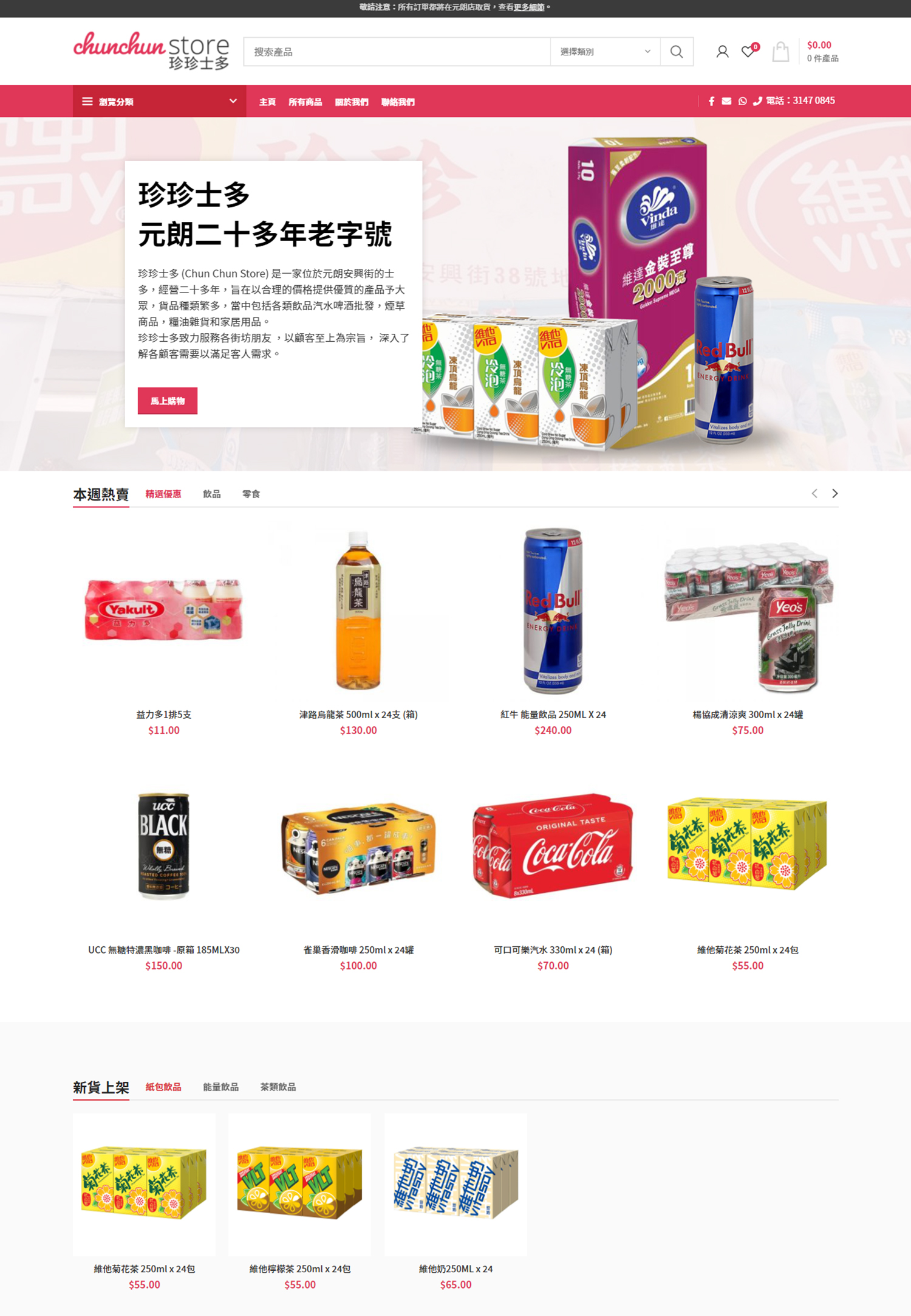
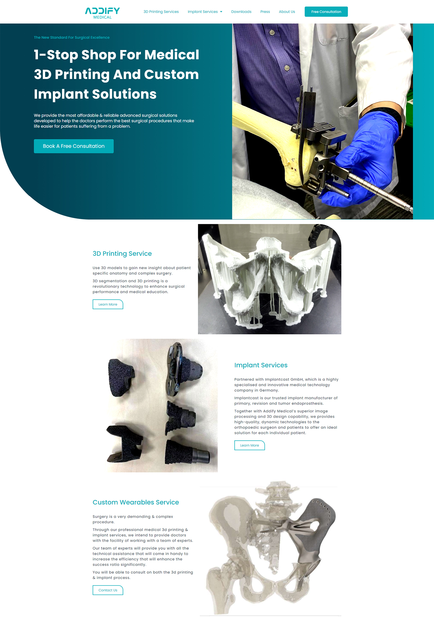
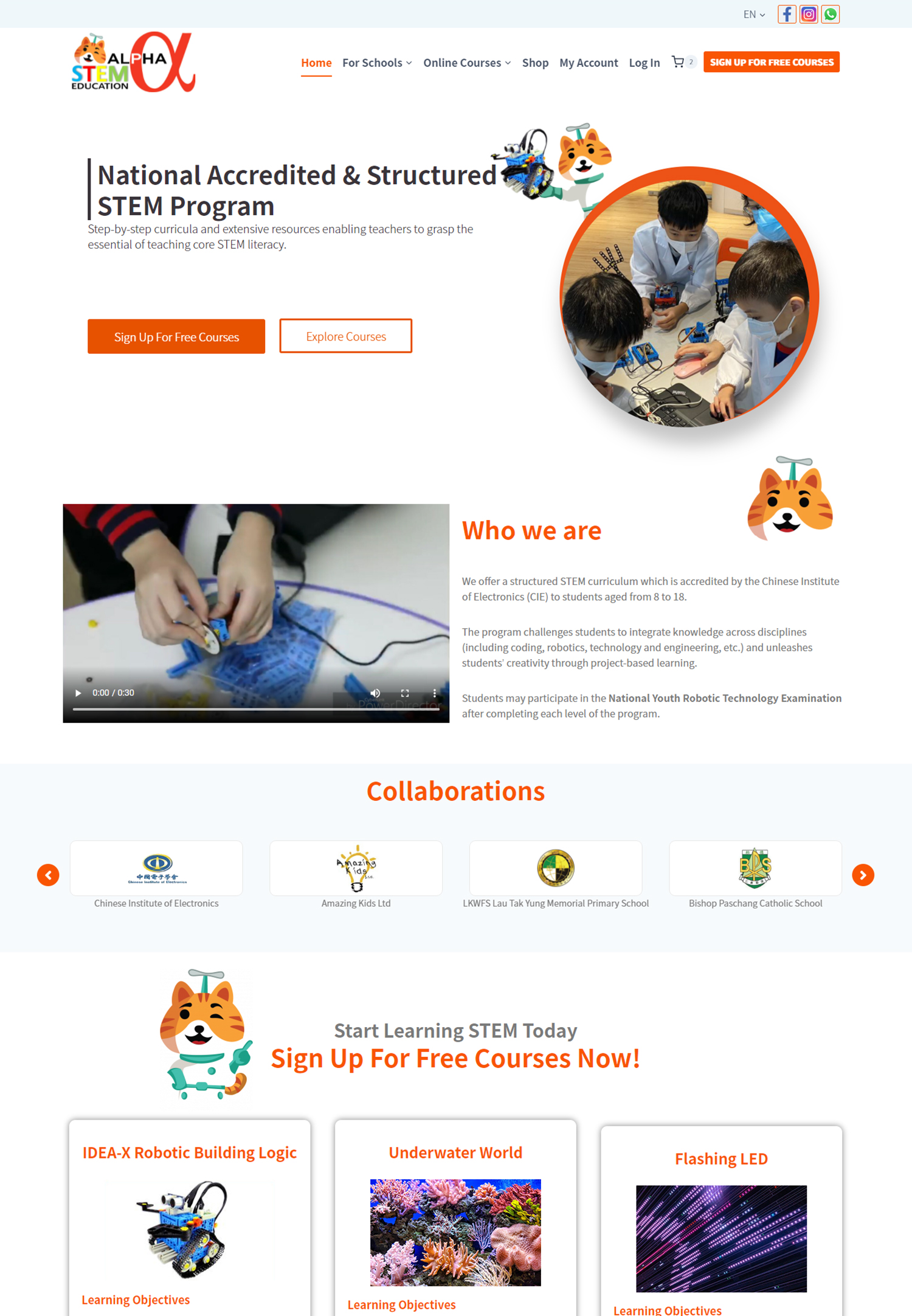
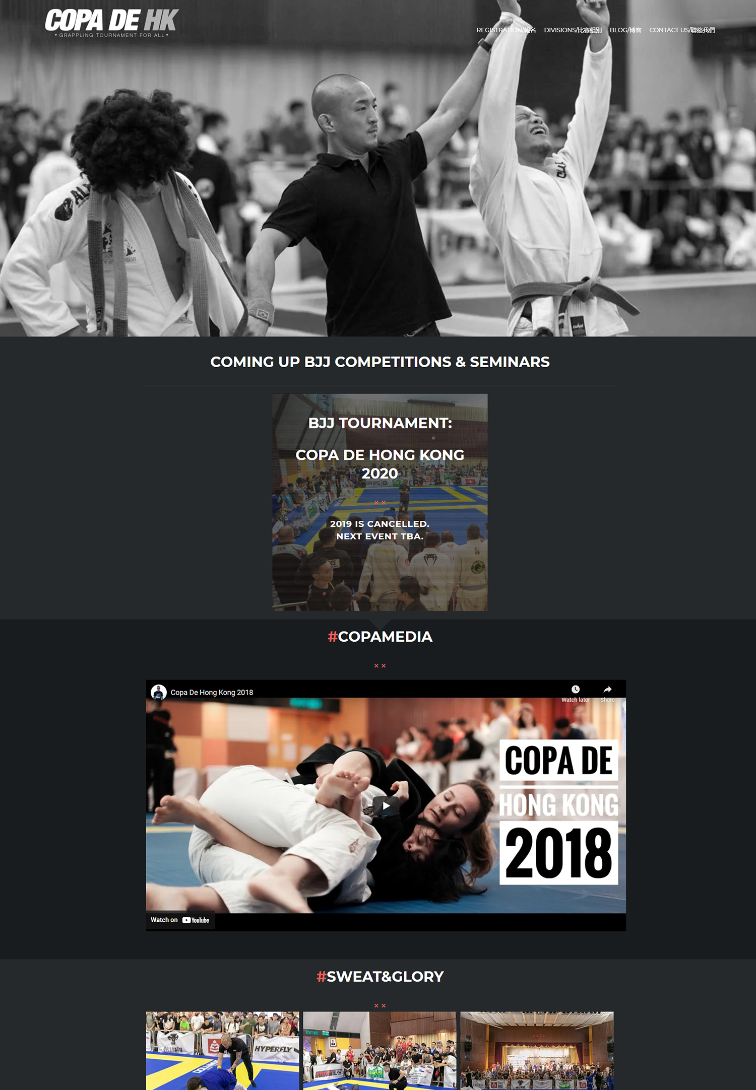
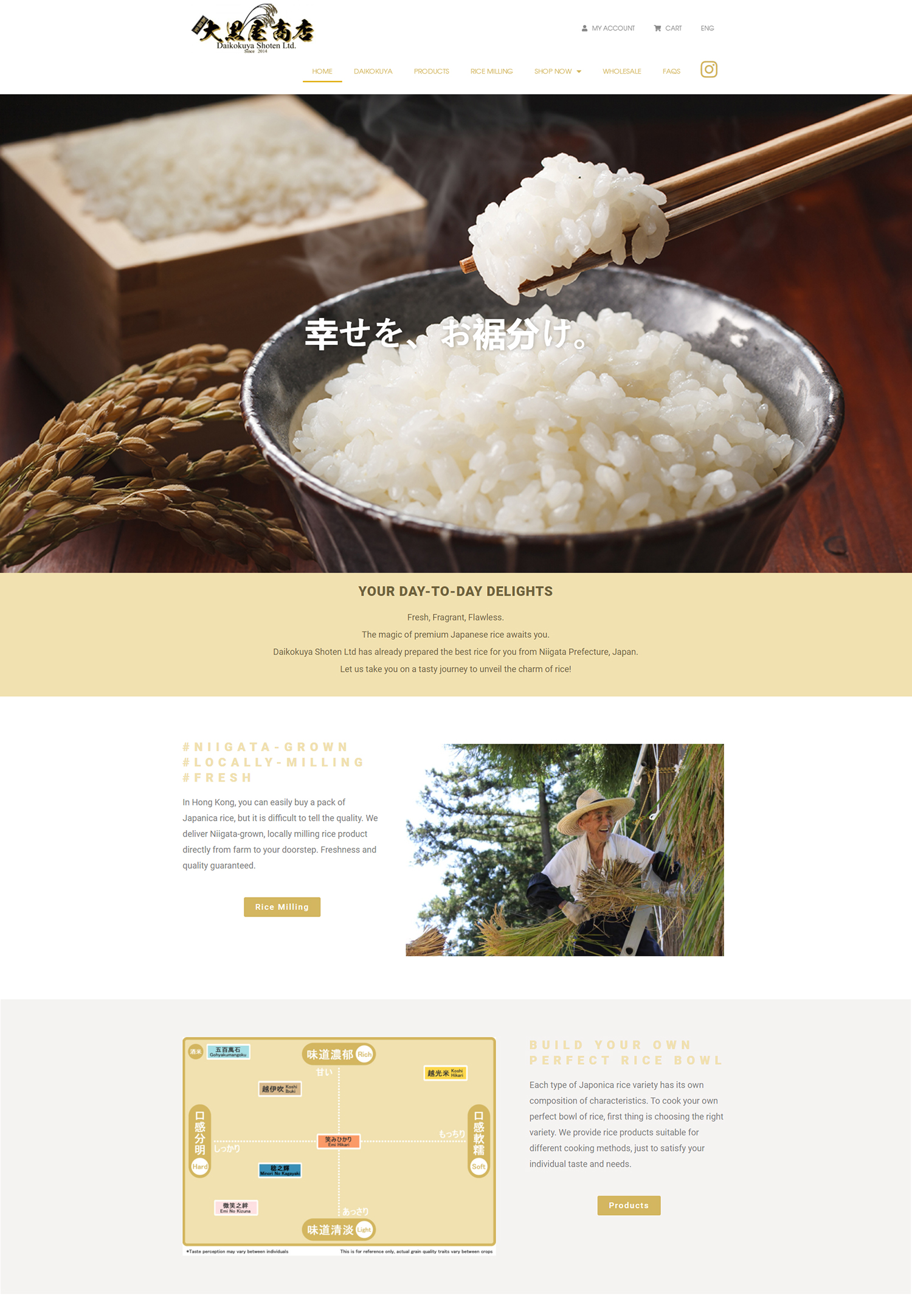
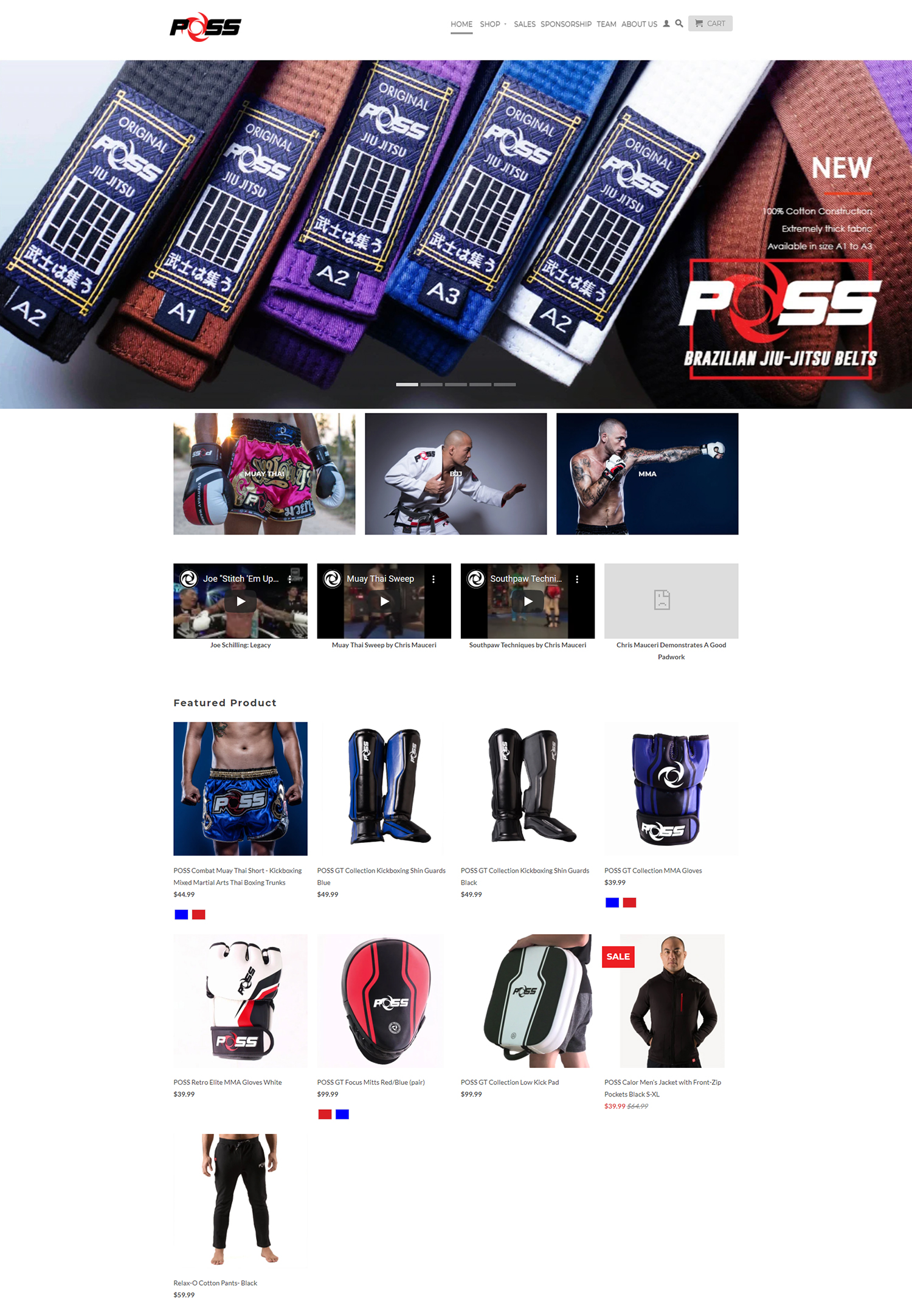
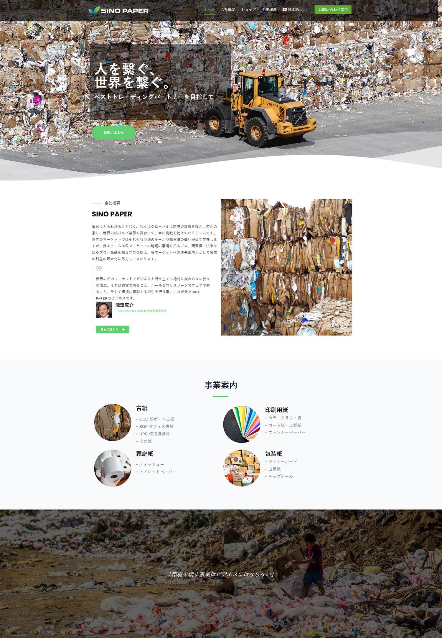
The placement of call-to-action buttons on a webpage can have a significant impact on user behavior. Placing buttons where users expect them to be can increase their visibility and encourage clicks. Typically, call-to-action buttons are placed above the fold, where they are immediately visible to users without scrolling.
However, it is also important to consider the flow of the webpage and the user’s journey. Placing call-to-action buttons at strategic points along the user’s path can increase their effectiveness. For example, placing a call-to-action button at the end of a product description can prompt users to make a purchase.
Using Color Psychology to Increase Clicks

Color plays a crucial role in user behavior on websites, including the effectiveness of call-to-action buttons. Different colors evoke different emotions and can influence users’ decisions. For example, red is often associated with urgency or importance, while green is associated with positive actions such as “go” or “submit.”
When designing call-to-action buttons, it is important to choose colors that align with the desired action and evoke the desired emotions. Using contrasting colors can also make buttons stand out and increase their visibility.
Writing Compelling Copy for Call-to-Action Buttons
The copy used on call-to-action buttons is just as important as the design. The copy should be clear, concise, and compelling, clearly communicating the desired action to users. It should also create a sense of urgency or excitement to encourage users to take immediate action.
Using action-oriented language and strong verbs can make the copy more compelling. For example, instead of using “Submit,” a button could use “Get Started” or “Claim Your Free Trial.” Additionally, using personal pronouns such as “you” or “your” can make the copy more relatable and engaging.
Testing and Measuring the Effectiveness of Call-to-Action Buttons
A/B testing is an essential tool for measuring the effectiveness of call-to-action buttons. By creating two versions of a webpage with different call-to-action buttons and measuring user behavior, designers can determine which version performs better.
Metrics such as click-through rates, conversion rates, and bounce rates can provide valuable insights into the effectiveness of call-to-action buttons. By continuously testing and iterating on button design, designers can optimize their effectiveness and drive better results.
Best Practices for Mobile Call-to-Action Buttons
With the increasing use of mobile devices, it is crucial to consider mobile design when designing call-to-action buttons. Mobile buttons should be large enough to be easily clickable on smaller screens and have enough spacing to prevent accidental clicks.
Additionally, mobile buttons should be placed in easily accessible areas of the screen, such as the bottom or center. It is also important to consider the size and placement of other elements on the screen to ensure that call-to-action buttons are not overshadowed or hidden.
Examples of Successful Call-to-Action Buttons in Action
There are numerous examples of successful call-to-action buttons in action. For example, Amazon’s “Add to Cart” button is a simple and effective call-to-action that clearly communicates the desired action. Airbnb’s “Book Now” button is another example of a compelling call-to-action that creates a sense of urgency and excitement.
Analyzing these successful examples can provide valuable insights into what makes call-to-action buttons effective. By understanding the principles behind their design and the psychology behind user behavior, designers can create more effective call-to-action buttons for their own websites.
In conclusion, call-to-action buttons are a crucial element of website design. They play a vital role in driving conversions and achieving the goals of a website. By understanding user behavior, designing visually appealing buttons, and using compelling copy, designers can create more effective call-to-action buttons that drive results. Continuous testing and optimization are also essential to ensure the ongoing effectiveness of call-to-action buttons.
If you’re looking to optimize your website’s call-to-action buttons, you may also be interested in learning about the benefits of using video on your website. Video content has become increasingly popular in recent years, and it can be a powerful tool for engaging visitors and driving conversions. To find out more about how video can enhance your website’s performance, check out this informative article: https://populisdigital.com/use-video-on-your-website/.
FAQs
What is a Call-to-Action (CTA) button?
A Call-to-Action (CTA) button is a clickable button on a website or mobile app that prompts the user to take a specific action, such as signing up for a newsletter, making a purchase, or downloading an app.
Why is having a clear CTA button important?
A clear CTA button is important because it helps guide the user towards the desired action, increasing the likelihood of conversion. A confusing or unclear CTA button can lead to frustration and a higher bounce rate.
What makes a CTA button clear?
A clear CTA button should be visually distinct from other elements on the page, use concise and action-oriented language, and be placed in a prominent location. It should also be easy to click on, with a size and shape that is easy to interact with on both desktop and mobile devices.
What are some examples of effective CTA button language?
Effective CTA button language includes phrases like “Sign Up Now,” “Get Started,” “Download the App,” and “Buy Now.” These phrases are action-oriented and clearly communicate the desired action to the user.
How can I test the effectiveness of my CTA button?
You can test the effectiveness of your CTA button by conducting A/B testing, where you create two versions of the same page with different CTA buttons and measure which one performs better. You can also use analytics tools to track user behavior and see how often the CTA button is clicked.